
UI for Blazor
Blazor TreeView
- Let users navigate across the pages in your app and even outside of it with the Blazor TreeView component.
- Part of the Telerik UI for Blazor library along with 120+ professionally-designed UI components.
- Includes support, documentation, demos, virtual classrooms, Visual Studio Code Extensions and more!

-
Drag and Drop
Moving nodes in the TreeView with the Drag and Drop functionality eases the workflow of the component. The feature is enabled from the Draggable parameter which then allows the user to drag and drop nodes within the TreeView or between TreeViews. The feature uses the OnDrop event which is fired when the node is dropped.
-
Represent Flat and Hierarchical Data in a Tree-like Structure with Blazor TreeView
The Blazor TreeView is a UI component that allows you to represent flat and hierarchical data in a tree-like structure in both WebAssembly (WASM) and server-side Blazor apps. It offers multiple built-in features such as navigation through the items and their children, loading data on demand, customization with templates for the individual nodes and keyboard navigation.

-
TreeView Data Binding
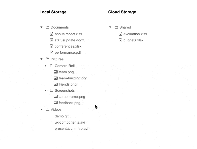
The TreeView component can be bound to any flat data source (collection of items available at one level) and hierarchy (multi-level parent-child relationship collection of items).

-
TreeView Multiple Level Bindings
The TreeView component allows you to additionally define different binding settings for the different levels of nodes. This provides great flexibility, as the children of a node can consume a different data field or model than their parent.
Example of Blazor TreeView hierarchical data that uses different models for the parent and child.
-
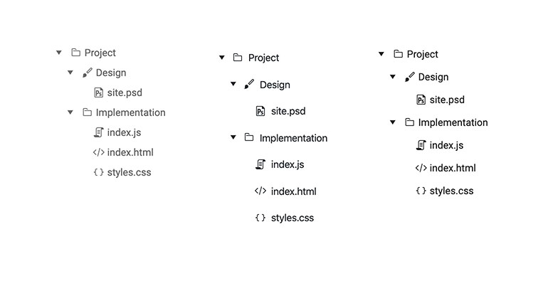
Customizing TreeView Templates
The TreeView component gives you full control over the look and feel of the nodes through it templates. You can define a common template for all TreeView nodes or a different template for each node level. Furthermore, the template can be used to render specific content according to your application's logic. You can use components in it and thus provide rich content instead of plain text.
Example of customizing Blazor TreeView component using templates.
-
TreeView Load Data on Demand
The TreeView component allows you to fetch all the items at once, or load data on demand as the user expands the tree nodes. For cases when you need to load large volumes of data, you can boost the performance by using lazing loading (loading data on demand) and loading only expanded subset of child items.

-
Blazor TreeView Events
The Telerik UI for Blazor TreeView set of events enables smooth and transparent interaction with the component. Here is a list of all events:
- OnExpand – fires when the user expands or collapses a node (either with the mouse or with the keyboard)
- OnItemClick – fires when the user clicks, presses Enter or taps (for mobile devices) on a TreeView node (item)
- OnItemDoubleClick – fires when the user double-clicks or double-taps a TreeView node
- OnItemContextMenu – fires when the user right-clicks on a TreeView node, presses the context menu keyboard button or taps and holds on a mobile device
- OnItemRender – fires upon rendering the nodes of the TreeView component
- SelectedItemsChanged – fires when the selection mode of the component is enabled and the user clicks on a new item
- CheckedItemsChanged – fires every time the user uses a checkbox to select a new item
- ExpandedItemsChanged – fires every time the user expands or collapses a TreeView item
- DragStart event – fires when the user starts dragging a node. It provides details for the dragged items and allows you to cancel the event.
- OnDrag event – fires continuously while the user is dragging a node.
- DragEnd event – fires when a drag operation is ended by releasing the mouse button.
- OnDrop event – fires when dropping a node into a new location. That allows you to manipulate the data collection based on where the user dropped the element.
-
CheckBox Selection
Add a checkbox to each row of your TreeView to let users select multiple items or even entire hierarchies of items in order to execute a single operation on them.
Explore the Blazor TreeView Checkbox in this demo
-
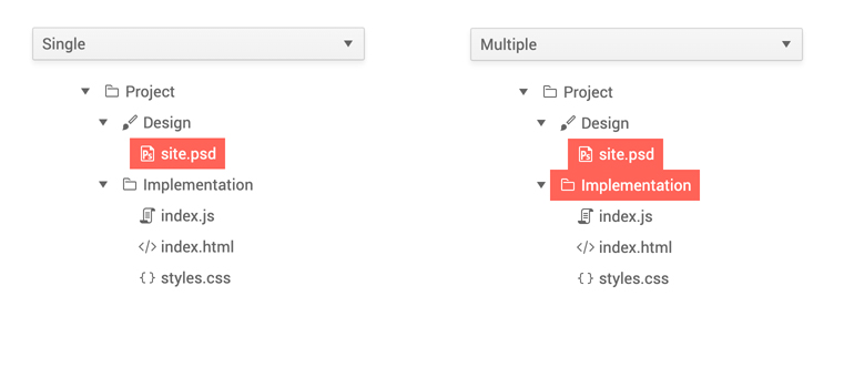
Blazor TreeView Selection of Nodes
Nodes in the TreeView can be Selected so they can be processed in some way – e.g. selecting an item in TreeView displaying file and folder structure can open the file contents in a separate component.
-
TreeView Accessibility and Keyboard Navigation
Like all other Telerik UI for Blazor components, the TreeView component supports out of the box Keyboard Navigation and web accessibility standards implementation (WCAG, Section 508 and WAI-ARIA attributes for screen readers). This enables easy navigation through tree nodes using just keyboard, as well as access to component content through assistive technologies.

-
TreeView Events
You can easily handle user actions from code using the TreeView OnExpand event. As the event fires when the user expands or collapses a node (either with the mouse, or with the keyboard) you can easily apply business logic to those actions.
The OnExpand event gives you flexibility to use lazing loading of TreeView data when a node is expanded by a user.

-
Blazor TreeView Theming
The Telerik Blazor TreeView has several built-in themes such as Default (our own styling), Material (based on the Material Design guidelines), Bootstrap (which looks like the Bootstrap styling to integrate better) and Fluent (based on Microsoft Fluent UI). You can easily customize any of out-of-the-box themes with a few lines of CSS, or create new theme to match your colors and branding by using the Telerik SASS ThemeBuilder application.
-
Right-to-Left (RTL) Support
The Telerik UI for Blazor TreeView component supports right-to-left configuration. The RTL functionality is supported by most of our components to accommodate users who communicate in a right-to-left language script, such as Arabic and Hebrew.
Learn more in our Blazor Right-to-Left Support documentation

