UI for Blazor
Blazor Chart
- Present any data in an easily understandable and visually appealing way. Use dozens of different chart types for any use case.
- Part of the Telerik UI for Blazor library along with 120+ professionally-designed UI components.
- Includes support, documentation, demos, virtual classrooms, Visual Studio Code Extensions and more!
-
High Performing, Beautiful Blazor Data Visualizations
Professional design, interactive, high-performance and everything else your users expect. Telerik UI for Blazor Chart library gives you ultimate flexibility whether it is applying themes, configuring axes, customizing data series, adding crosshairs and just about anything you can think of. It also offers over 15 chart types, giving you a rich variety. You can use each series type independently or add multiple different series to a single chart, rendered together.
-
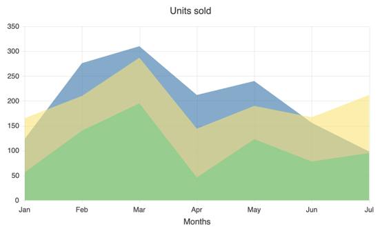
Area Chart
The Blazor Area Charts help you show comparisons between sets of data exactly how you want. Customize everything from basic opacity, color, and line style to more advanced axis, plat area, and legend settings. The Area Chart will even let you determine how to handle scenarios where a null value appears in the series.
See the Blazor Area Chart demo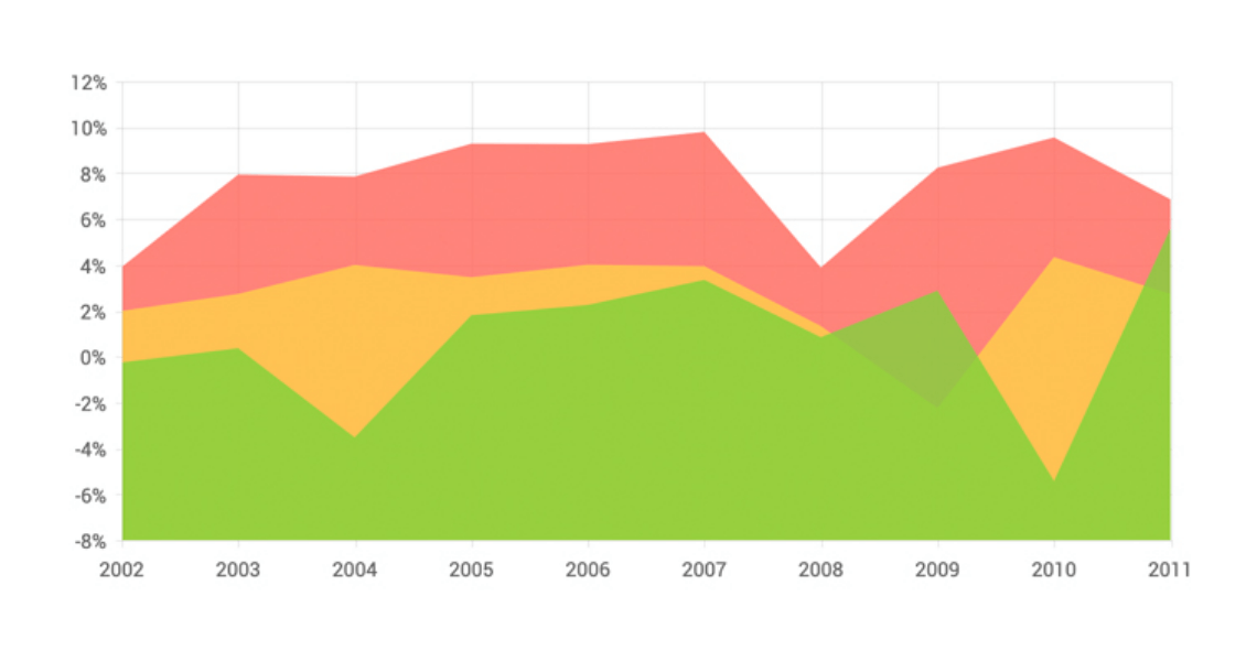
-
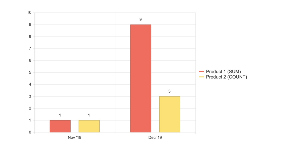
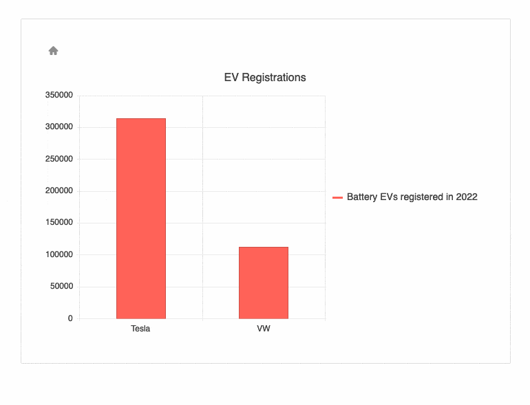
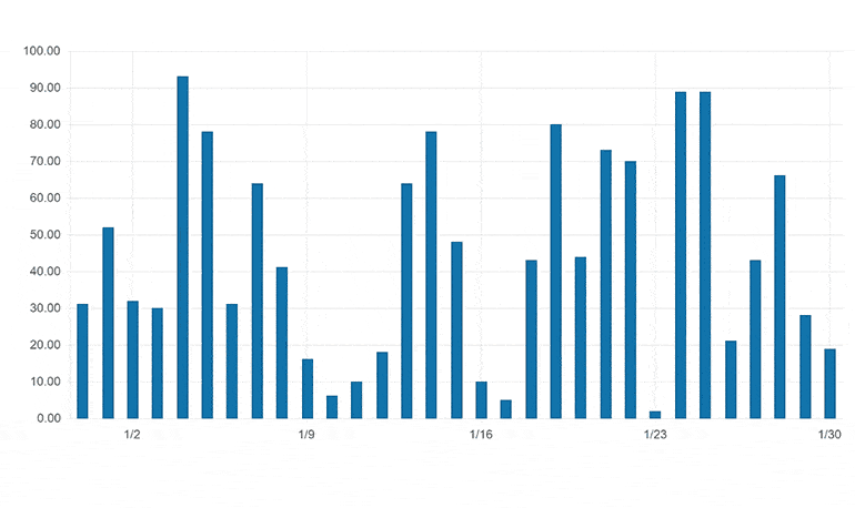
Bar Chart
The Blazor Bar Charts provide a highly customizable version of one of the most typical chart types. Customize bar colors, gap and spacing, axes, chart area, legend, and more.
See the Blazor Bar Chart demo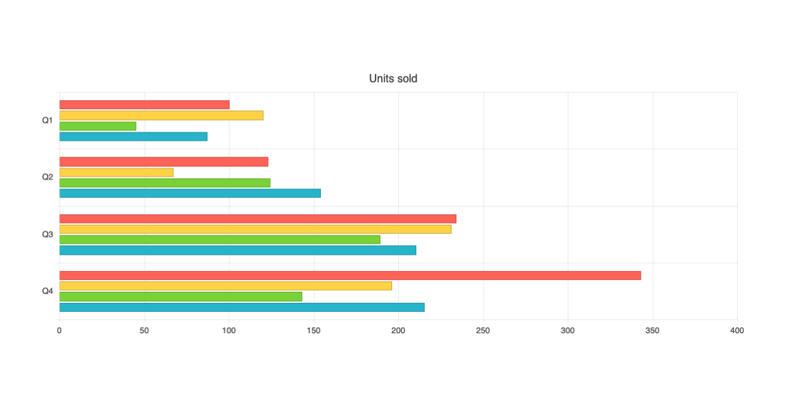
-
Bubble Chart
The Blazor Bubble Chart is an easily implemented version of the chart type popular for visualizing scientific, social, and economic relations. Customize opacity, color, axes, chart area, legend, and more. Additionally, negative bubble values are supported.
See the Blazor Bubble Chart demo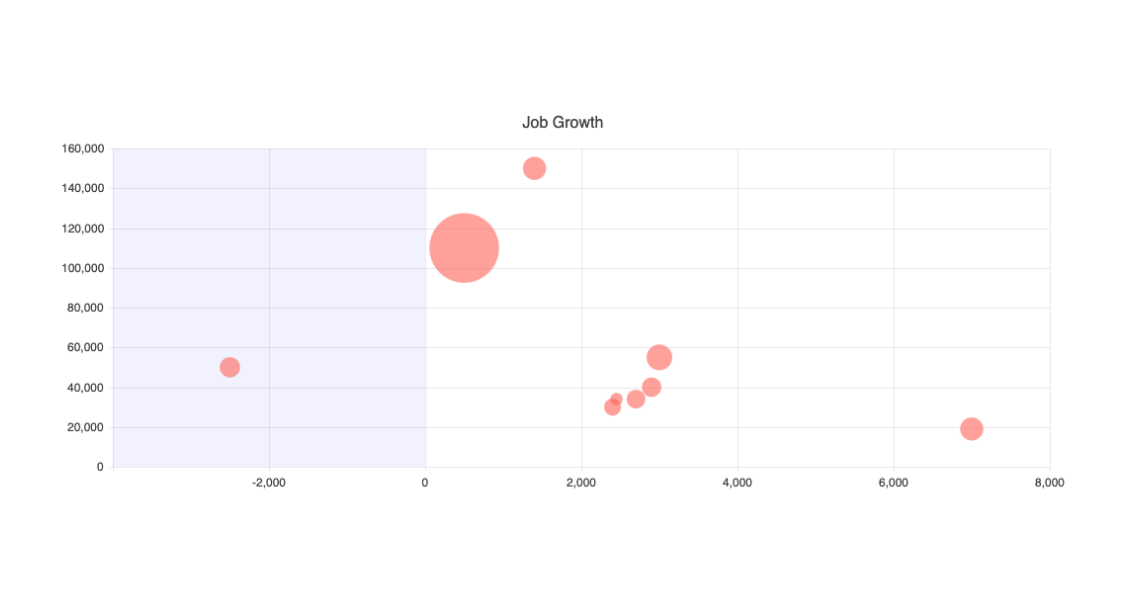
-
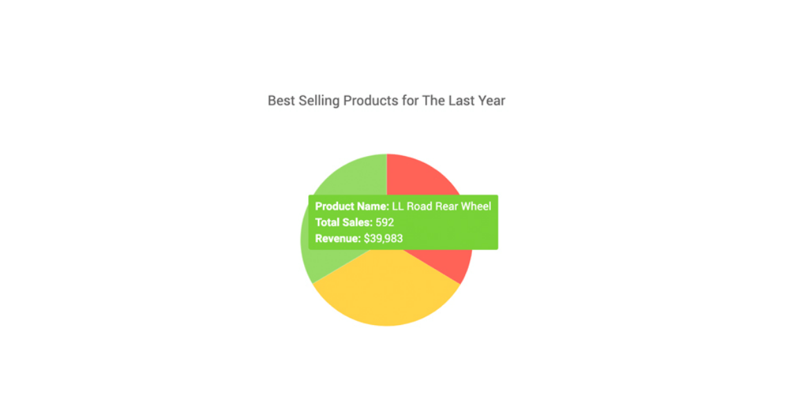
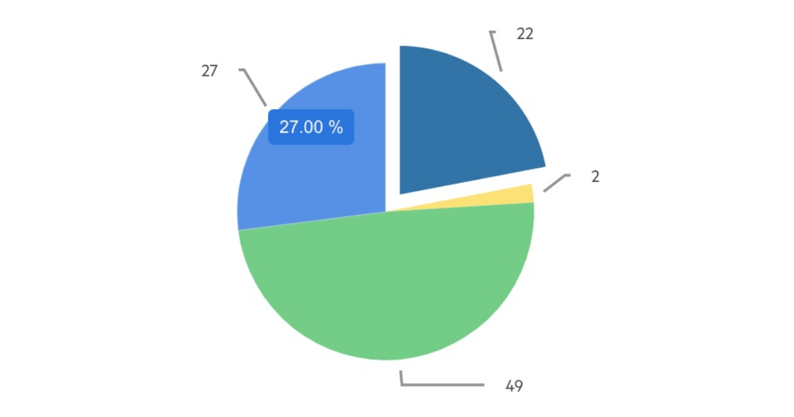
Donut Chart
The Blazor Donut Cchart is a variant of the pie chart and is suitable for displaying data as parts of a whole. It has a hole in its center and displays categories as arcs rather than slices. While a Pie chart is suitable for displaying single series of data, the Donut chart is perfect for displaying multiple data series in both Blazor WebAssembly (WASM) and Server-side dashboard applications.
See the Blazor Donut chart demo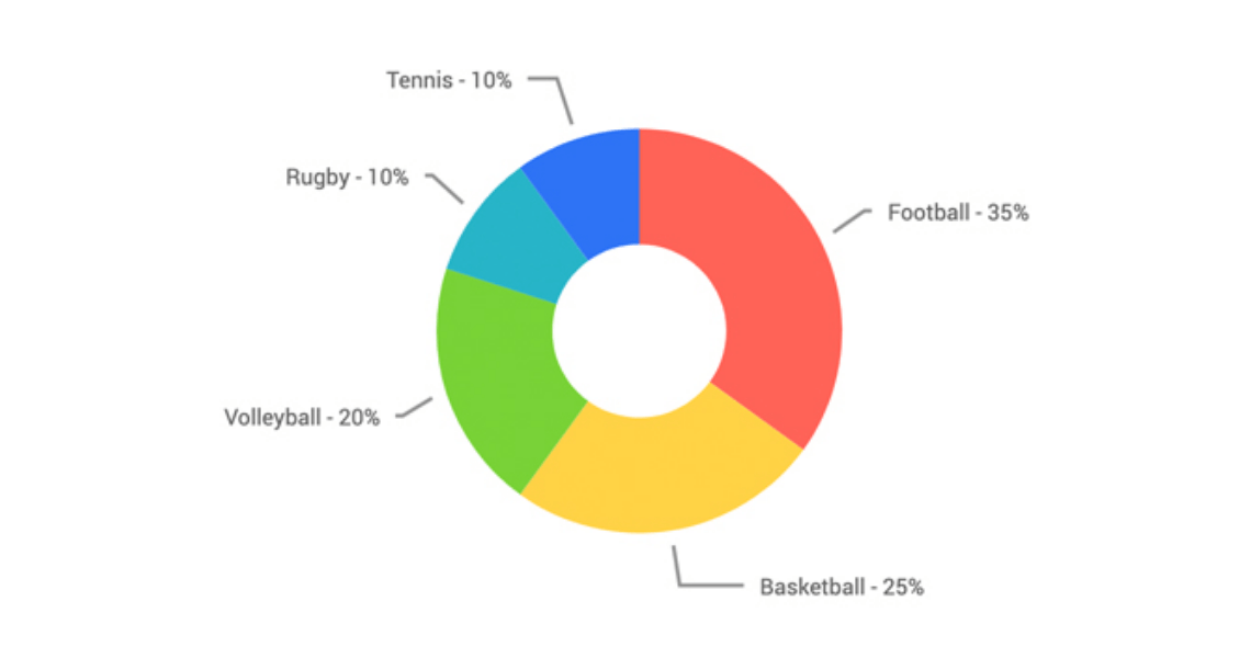
-
Heat Map
The Blazor Heatmap Chart is used to display values as color in two dimensions. It allows visualization of multiple values, often recorded on a daily basis, such as temperatures, sales, orders, etc. The component features color scales, category binding, tooltips, shape customization and more.
See the Blazor HeatMap Chart demo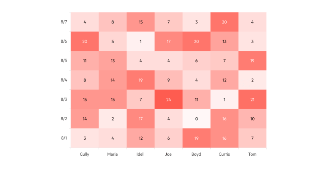
-
Line Chart
The Blazor Line Chart component displays data as continuous lines that connect points defined by the values of their items. It is useful for displaying a trend over time or comparing several sets of similar data in both Blazor WebAssembly (WASM) and Server-side dashboard applications.
See the Blazor Line Chart demo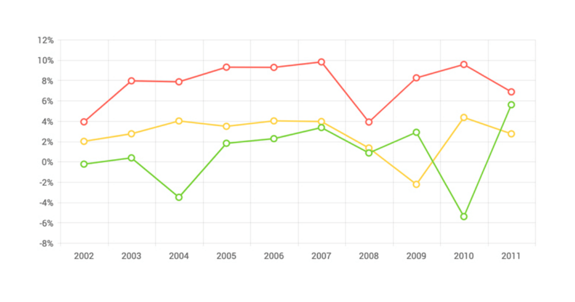
-
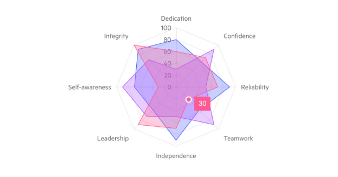
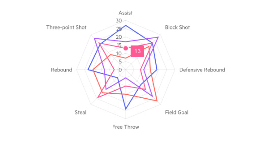
Radar Area Chart
The Blazor Radar Area Chart displays multivariate data. The series are marked with data points connected with lines and filled in to represent the area of each variable depending on its metrics. Each variable has its own axis and all of them are joined in the center of the Radar. It is useful for comparing combinations of several entities in one visual.
-
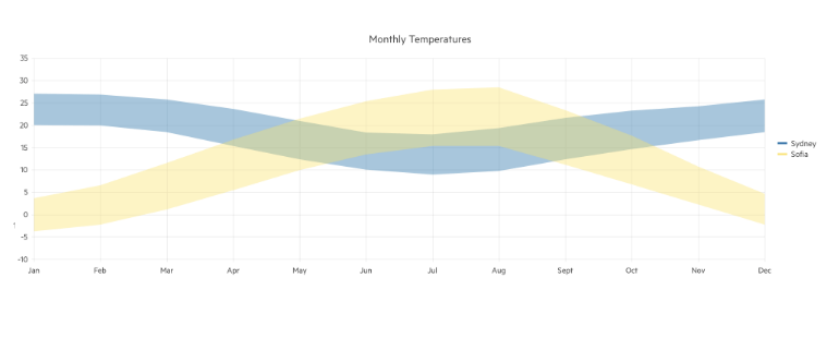
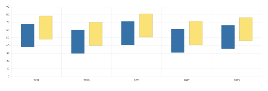
Range Area Chart
Leverage the Range Area Chart to showcase the difference between pairs of continuous value sequences, e.g., visualizing the lowest and highest temperature values through the year in two different cities. Thanks to the multiple appearance options you can customize the Range Area Chart to fit your brand, user or personal requirements. By default, the series backgrounds are semi-transparent, which lets the user clearly see where different sets of data overlap.
-
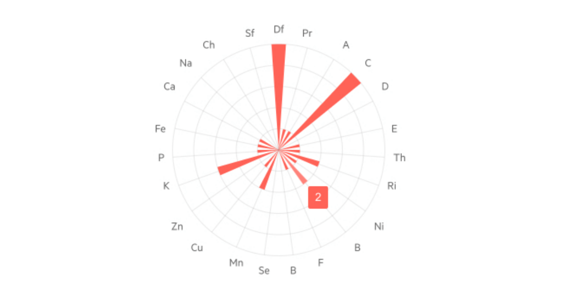
Radar Column Chart
The Blazor Radar Column Chart is used to visualize multivariable data in a single view. Each variable is in the form of a column whose height depends on the data value. The multiple data columns have a common starting point which is the center of the Radar. This Radar Chart type is useful for breaking down a group performance into its different entities and their quantity.
-
Radar Line Chart
The Blazor Radar Line Chart serves to display data from multiple variables. Each variable has its own axis and all of them are joined in the center of the Radar. The series are represented as lines which are connected by data points on the different axes. It is useful for analyzing different metrics of multiple entities in one visual.
-
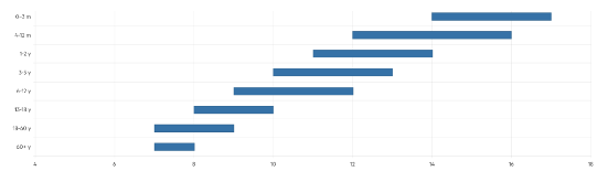
Range Bar Chart
Leverage the Range Bar Chart to showcase data as horizontal bars whose length and position vary according to their from and to values. Cover use cases where comparison between several sets of data need to be displayed – e.g., summaries of quantitative or time data. The Range Bar Chart supports multiple appearance options, so you can easily customize it to fit your brand, user or personal requirements.
-
Range Column Chart
Leverage the Range Column Chart to showcase data as vertical bars whose heights and position vary according to their from and to values. Cover use cases where comparison between several sets of data need to be displayed – e.g., summaries of quantities or measurements for different time periods. The Range Column Chart supports multiple appearance options, so you can easily customize it to fit your brand, user or personal requirements.
-
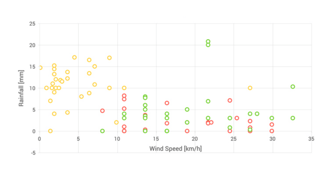
Scatter Chart
The Blazor Scatter Chart (also known as scatter plots or graphs) uses dots to represent values for two numeric variables. Scatter plots can be used in both Blazor WebAssembly (WASM) and Server-side dashboard applications to observe relationships between numerical values such as scientific experiment data or parametrized test results.
-
Scatter Line Chart
The Scatter Line Chart component is very similar to the Scatter chart which uses points to represent the relationship between two numeric values, but the dots are connected by lines and thus it can account for missing values in a series or show a trend (for example, in a scientific experiment data). Scatter line plots can be used in both Blazor WebAssembly (WASM) and Server-side dashboard applications to observe relationships between values.
-
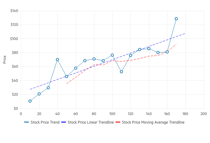
Trendline Chart
Telerik UI for Blazor Trendline Chart visualizes data points in a time series or sequential order. It’s often used to represent and analyze trends, patterns and relationships in the data over time. Trendline charts are commonly used in fields like finance, economics, statistics and data analysis to identify and understand trends and facilitate the process of making informed decisions.
-
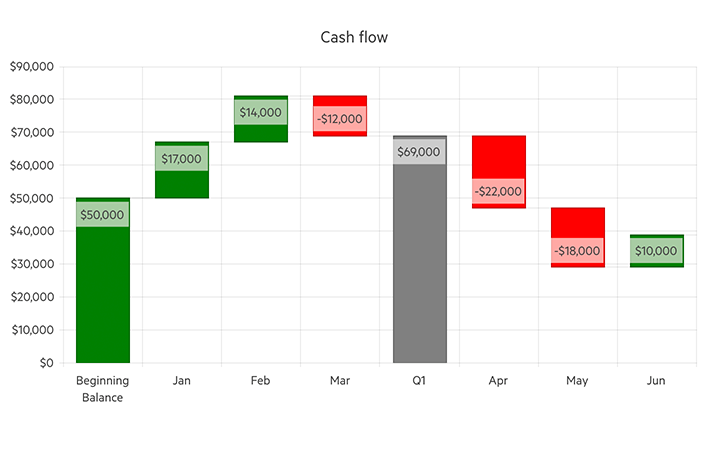
Waterfall Chart
Telerik UI for Blazor Waterfall Chart enables you to depict factors influencing a result over time. It illustrates how an initial value can be affected by the cumulative effect of sequential positive and negative values using series of bars that indicate gains and losses. Leverage the Waterfall chart for different types of quantitative analysis related to inventory, cash flows, performance, etc.
-
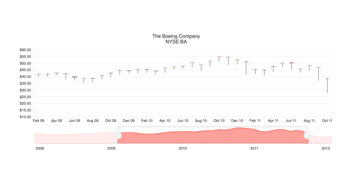
OHLC Chart
The Blazor OHLC Chart, also called the Open High Low Close Chart) shows price movements over time through the four data points in its name. All you need to do is bind data and the component does the rest!
See the Blazor PHLC Chart demo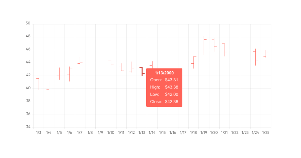
-
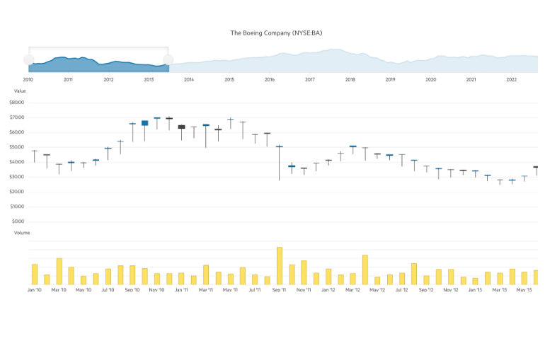
Stock Chart
The Blazor Stock Chart component was added for those of you developing financial applications. The Stock Chart displays changes in the price of a financial unit over time, such as the daily values of a stock price for the past month. You can fully customize the control and change anything from fonts, area background color, opacity, line width and dash types to its dimensions, paddings & margins and tooltips. You can even provide your own templates.
-
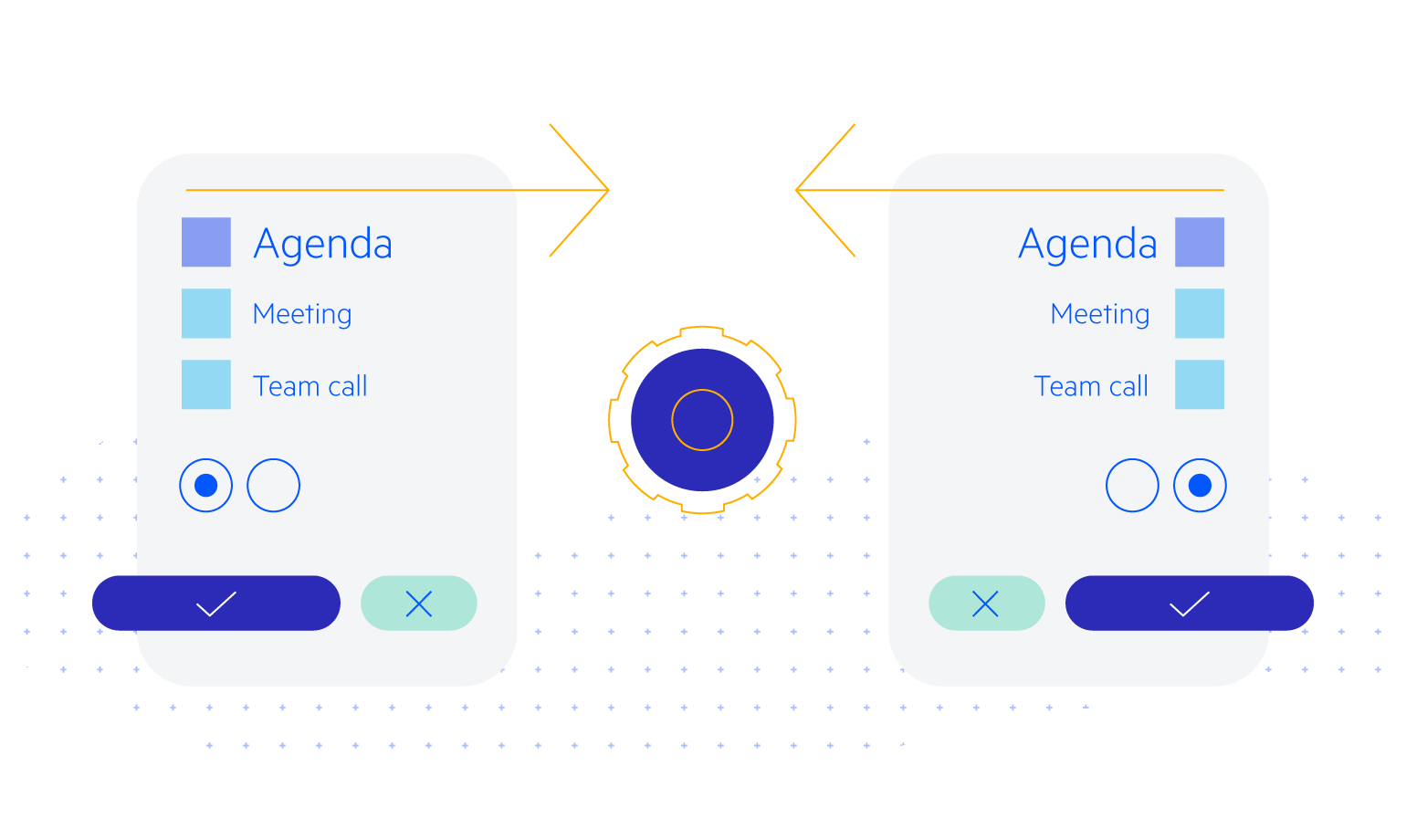
Flexible Data Binding
The Blazor Chart gives you full flexibility in data binding. You can use various data sources to bind the axes and the series separately or together.
- Separate Series Data – each series can have its own data collection, and the items on the x-axis come from another, and are matched by their indexes.
- Bind the entire chart to a single model – when your data is tightly coupled, you’d often have all the information for a data point or even category in a single class and the chart can use that as well.
- Mix and match – you can have some series use one approach, and the rest another, and the chart will match the categories for you.

-
Tooltips
Users can hover over the Telerik UI for Blazor Chart to get more detailed information about a particular data point on it. The most obvious case would be a line chart for which the user can hover to read the exact value of the data point, but you can customize the tooltip to do a lot more than that. The Chart Tooltip has 2 levels of configuration:
- Through Parameter Settings you can modify some basic styling like borders and colors.
- Through templates you can completely replace the built-in tooltip with one that serves your application and displays any information important to your users.
-
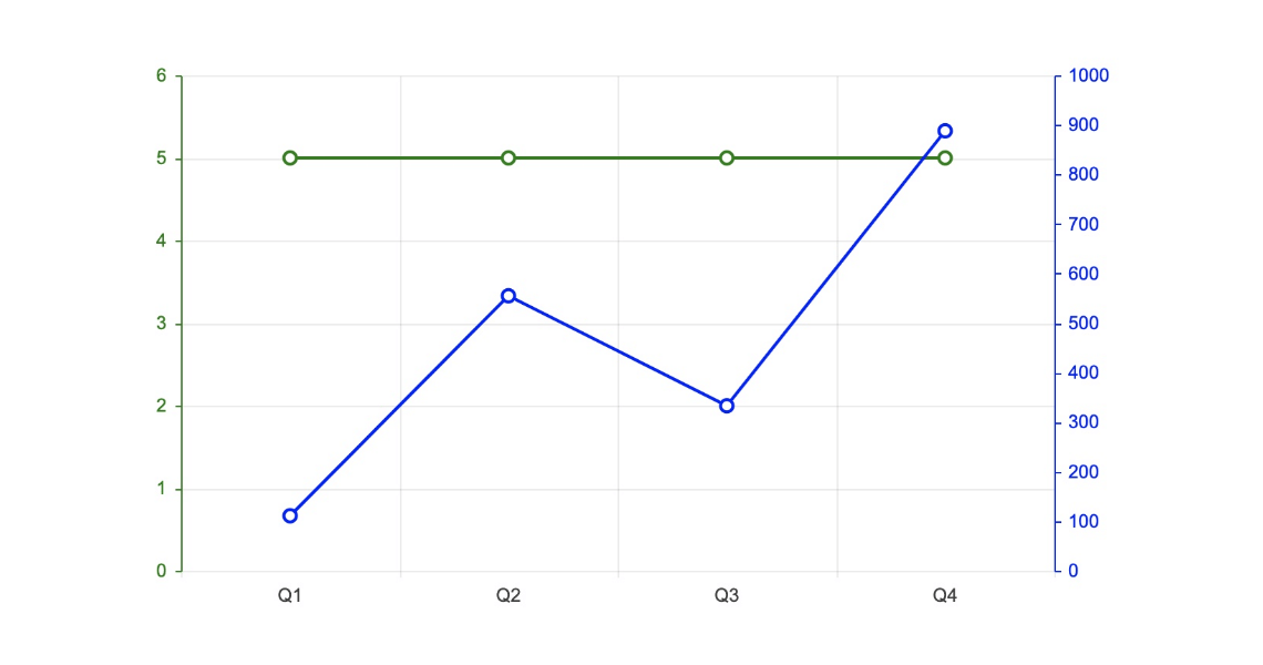
Multiple Axes
The Chart can render more than one axis in each dimension and you can associate each series with its own axes. This lets you show data that varies on orders of magnitude in the same chart without loss of detail.
-
Date Axis
If you want to show the development of a trend over time, the chart can let you provide DateTime values for its x-axis and it will aggregate the data points falling in the intervals you choose for you.
-
DrillDown Charts
Elevate users’ charting experience by providing access to more granular data – e.g., breakdown by product of the selected category. Leverage the DrillDown feature in Telerik UI for Blazor Charts to enable users to click on a point (bar, pie segment, etc.) and navigate to a different, more informative view. Presenting one layer at a time lightens the load, thus improving performance.
-
Pan and Zoom
Empower users to focus on the data they want with the built-in panning and zooming capabilities of the Telerik UI for Blazor Chart. Zooming into specific areas and focusing on different parts within the plot area allows better navigation and data analysis. This is especially useful on small screens where the chart may be too large for the available screen space.
-
Easy Customization
You can customize all aspects of each individual chart – from the series color, to its labels content, font, size, position, and the axes lines, labels and formatting. Just look for the nested tags under each element declaration and the Intellisense will show you a ton of options.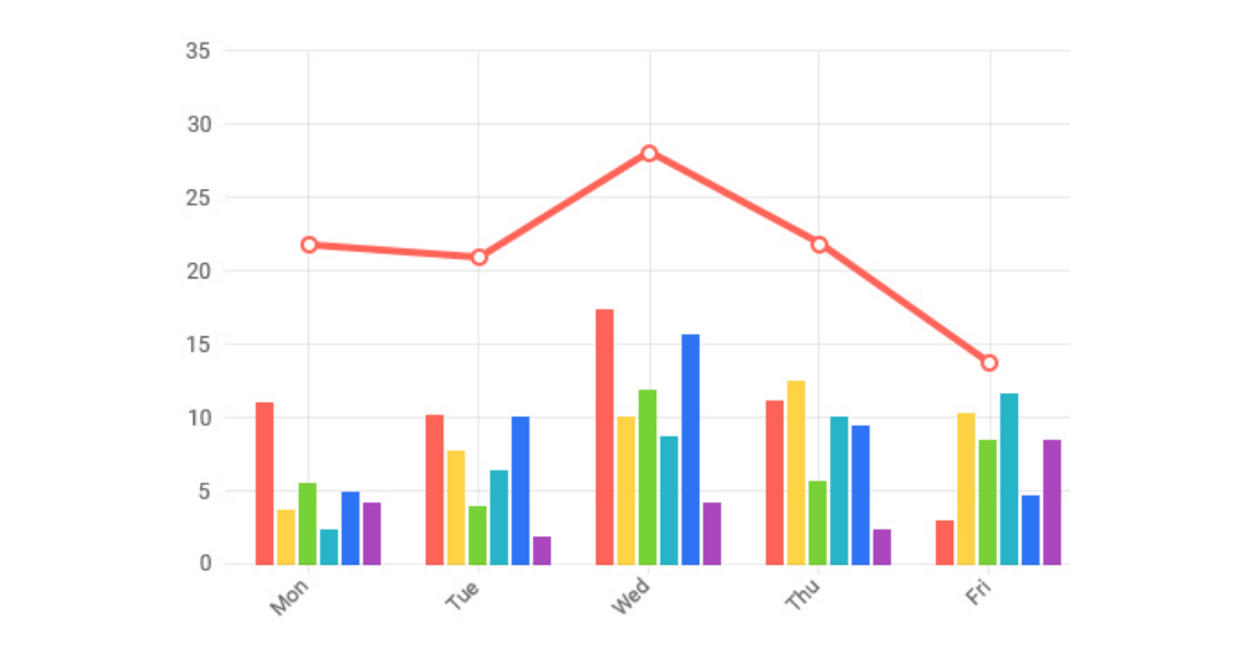
-
Chart Events
Quickly react to user interactions with Telerik UI for Blazor Chart, leveraging the available events, triggered upon clicking on various Chart elements. Handling these events opens the door for showing more specialized data to the user.
- OnAxisLabelClick fires when the user clicks a label item on any of the Chart axes.
- OnLegendItemClick is triggered upon clicking on any item in the Chart legend.
- OnDrilldown fires when the drill-down functionality is executed.
- OnSeriesClick triggers when the user clicks on the chart.
-
Plot Area Customization
The Blazor Chart component exposes multiple parameters that allow customization of the plot area borders, margin and padding. You can set the border color by passing a valid CSS color string, including HEX and RGB, set the position to top, right, or left and more.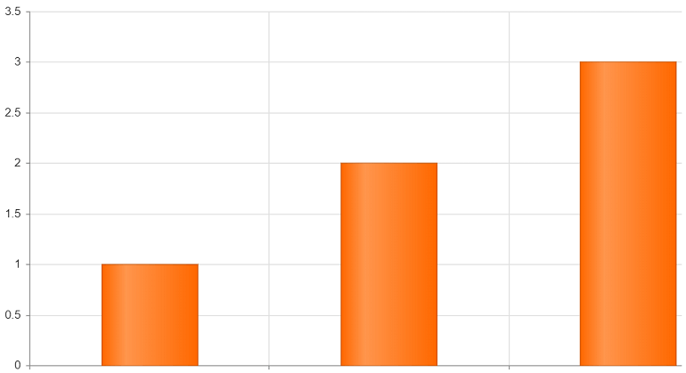
-
Legend Customization
Align the look and feel of Telerik UI for Blazor Charts with the expected outcome. Multiple customization options empower you to control the Charts legend style as you wish. You can add text as Legend title, thus providing additional information to users, and modify the Legend and Legend Series type. Adding different colors is also possible.
-
Chart Legend Custom Title
The Telerik Blazor Chart legend title is now fully customizable, and you can modify all aspects of the chart legend title including its position, border, alignment, padding and background color.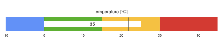
-
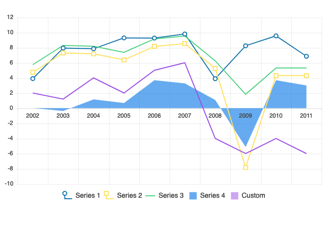
Multiple Series Types, One Chart
You can also mix different types of series in a single chart to create more compelling visuals – such as scatter charts and chatter-line charts; or bar charts and line charts.
See the Blazor Multiple Series Chart demo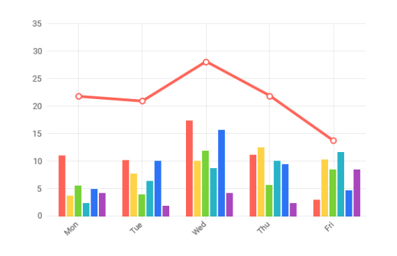
-
Globalization
The Label Format Strings in Telerik UI for Blazor Charts, are culture aware so your users see, for example, the expected number formats with the decimal and thousands of separators they are used to.
See the Blazor Chart Globalization documentation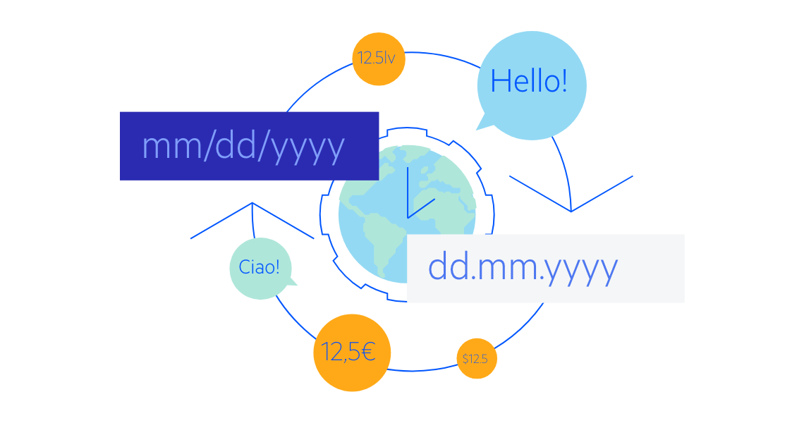
-
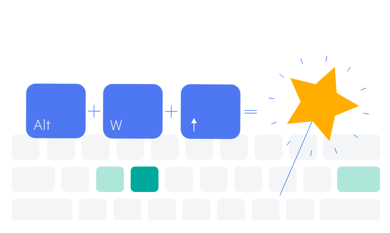
Keyboard Navigation and Accessibility
Telerik UI for Blazor Charts support out of the box Keyboard Navigation that allows easy navigation and interaction with the list values of the component using keyboard only. Semantic HTML and support for the accessibility standards (WCAG, Section 508 and WAI-ARIA attributes for screen readers) let users with disabilities use the Telerik Charts with ease.
-
Theming
The Telerik Blazor Chart component has several built-in themes such as Default (our own styling), Material (based on the Material Design guidelines), Bootstrap (which looks like the Bootstrap styling to integrate better) and Fluent (based on Microsoft Fluent UI). Each theme predefines several series colors, so your charts look harmonious and fit design guidelines.
-
Right-to-Left (RTL) Support
The Telerik UI for Blazor Chart component supports right-to-left configuration. The RTL functionality is supported by most of our components to accommodate users who communicate in a right-to-left language script, such as Arabic and Hebrew.
Learn more in our Blazor Right-to-Left Support documentation
-
Candlestick Chart
The Blazor Candlestick Chart visualizes the movement of the price of a financial unit and consists of a bar (the candle), representing the open and close values, and vertical lines, the candlesticks, which illustrate the highest and lowest values.
See the Blazor Candlestick Chart demo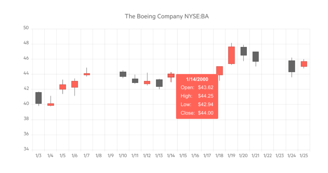
-
Column Chart
The Blazor Column Chart is one of the primary charting types that you may need to add to your Blazor WebAssembly (WASM) and Server-side dashboard application. It displays values as vertical bars whose heights are proportional to the values being plotted. You can use a Column chart to show a comparison between several sets of data (for example, summaries of sales data over different time periods). Each series is automatically colored differently for easier reading.
See the Blazor Column Chart Demo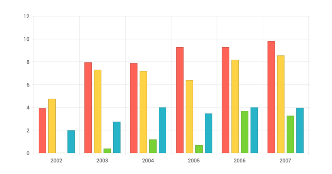
-
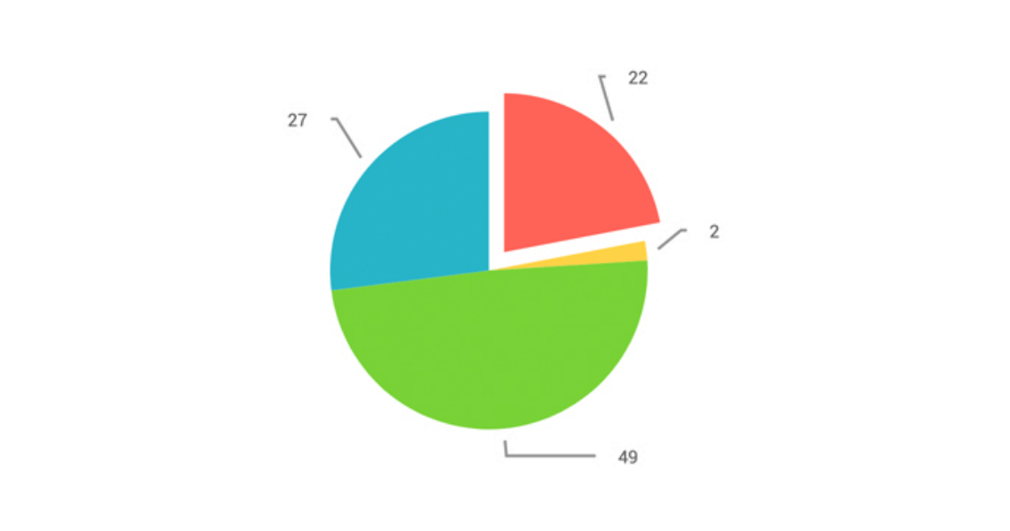
Pie Chart
The Blazor Pie Chart component shows how a certain total amount is split between categories as a circle divided into radial slices. Each categorical value corresponds with a single “pie slice” of the circle, and the size of each slice is proportional to the value of the whole. The UI for Blazor Pie chart component works in both Blazor WebAssembly (WASM) and Server-side applications and is suitable for displaying single series of data.
-
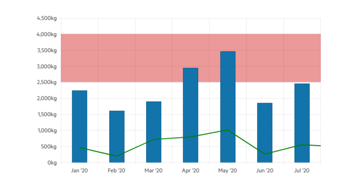
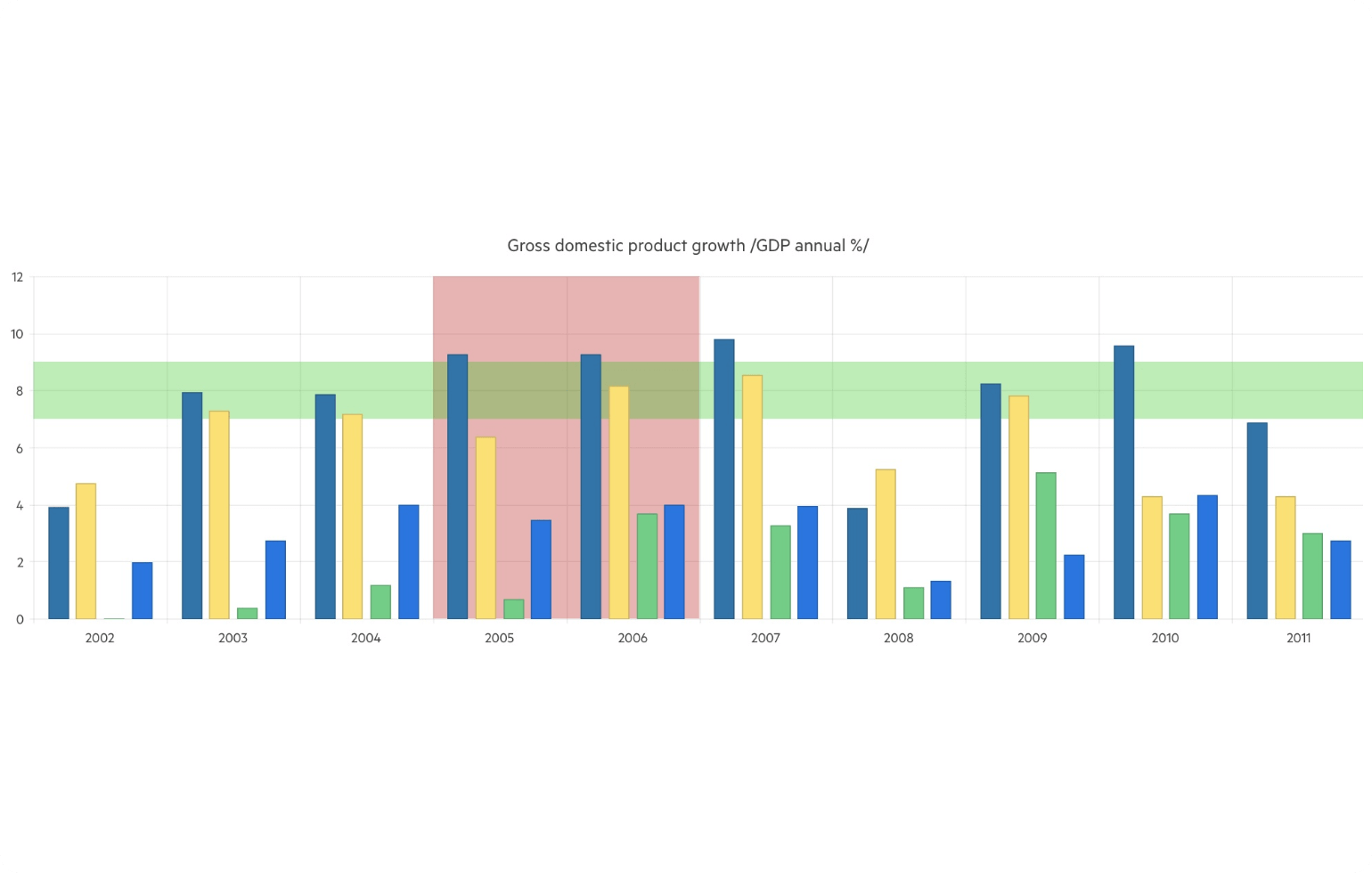
Plot Bands
The Telerik UI for Blazor Chart plot bands feature allows you to highlight a specific range of an axis. Each plot band can be configured to display an optional label.