
UI for Blazor
Blazor Button Group
- The Blazor Button Group component comes with a variety of built-in features, accessibility and keyboard navigation.
- Part of the Telerik UI for Blazor library along with 120+ professionally-designed UI components.
- Includes support, documentation, demos, virtual classrooms, Visual Studio Code Extensions and more!

-
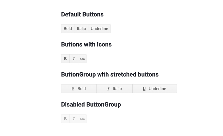
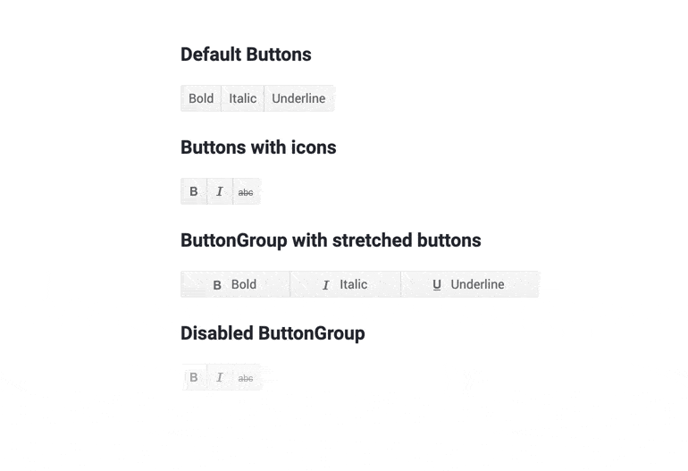
Organize Buttons with Shared Purpose with Blazor ButtonGroup
The Telerik UI for Blazor ButtonGroup component serves as a container managing several buttons with shared purpose. The main use case for it is linking buttons with a shared purpose – for example you can have a button group for text alignment and 3 buttons to align the text to the left, right or center. The group can be configured to support single or multi-element selection which makes the button in it act as if they were radio buttons or checkboxes respectively.
-
Blazor ButtonGroup Selection
As mentioned, the ButtonGroup component can be setup in 2 different modes:
- In single element selection, clicking a button makes it selected. Clicking any other button will deselect the first one and select the clicked button.
- In multi element selection, clicking a button selects it. Clicking any other button will select it without altering the first one. The user can deselect the initial button by clicking on it a second time.
-
Blazor ButtonGroup Events
Two events are fired on buttons in a ButtonGroup – SelectedChanged and OnClick. One is triggered when the corresponding toggle button changes its state, the latter is called on any button when it’s clicked. Note that changing the state of the button may happen because of several different reasons – it was clicked, through a keyboard shortcut or another button in the same single-selection group was selected.
Learn more about ButtonGroup Events in our documentation
-
Blazor ButtonGroup Accessibility and Keyboard Navigation
Like all other Telerik UI for Blazor components, the ToggleButton component supports out of the box Keyboard Navigation and web accessibility standards implementation. This enables easy navigation through pages using just keyboard, as well as access to component content through assistive technologies.
-
Blazor ButtonGroup Theming
The Telerik Blazor ButtonGroup component has several built-in themes such as Default (our own styling), Material (based on the Material Design guidelines), Bootstrap (which looks like the Bootstrap styling to integrate better) and Fluent (based on Microsoft Fluent UI). You can easily customize any of out-of-the-box themes, style specific component or create new theme using the Telerik Saas ThemeBuilder application.
-
Right-to-Left (RTL) Support
The Telerik UI for Blazor Button Group component supports right-to-left configuration. The RTL functionality is supported by most of our components to accommodate users who communicate in a right-to-left language script, such as Arabic and Hebrew.
Learn more in our Blazor Right-to-Left Support documentation

