
UI for Blazor
Blazor ChipList
- Showcase and manage a collection of Blazor chips with the Telerik UI for Blazor ChipList component.
- Part of the Telerik UI for Blazor library along with 120+ professionally-designed UI components.
- Includes support, documentation, demos, virtual classrooms, Visual Studio Code Extensions and more!
-
Showcase and Manage a Collection of Chips with Blazor ChipList
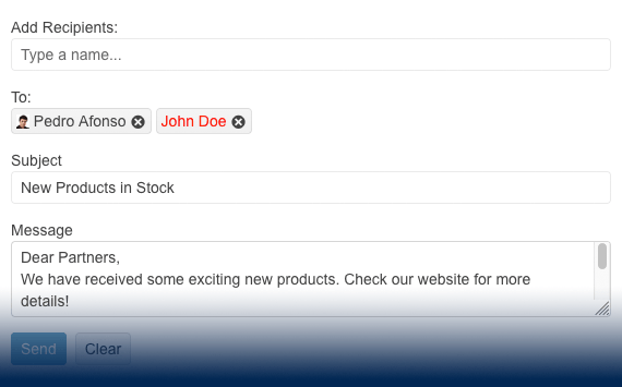
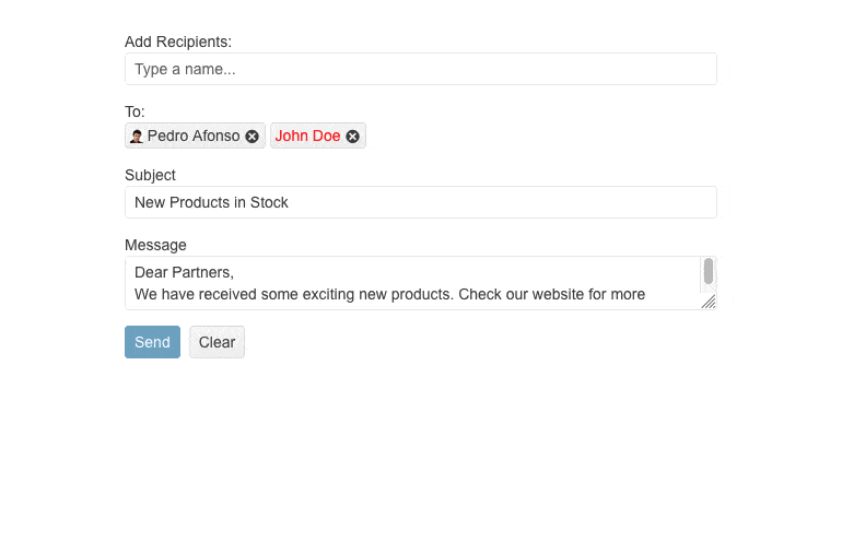
Organize a collection of individual Blazor Chip components in a list and manage it by adding and removing selected items. The Telerik UI for Blazor ChipList component is mostly used for single or multiple selection, e.g., to include additions to an ordered meal.
.png?sfvrsn=fd2d4704_1)
-
Selection Mode
Enable single or multiple selections, leveraging the selection mode feature in Telerik UI for Blazor ChipList component. In cases you need a read-only list, the ChipList can disable selection completely.
-
Appearance
Leverage the predefined set of appearance options to modify the look and feel of the ChipList component, i.e., configure the size of the chips within the ChipList.

-
Customization
Built on top of the existing Blazor Chip component, the Telerik UI for Blazor ChipList delivers the same customization options to meet any design requirements. These include the color and style of the ChipList, whether to display a close or delete icon and whether to add avatars or images as part of the ChipList content.
-
Disabled ChipList
Control if a user should interact with the Blazor ChipList items, leveraging a single configuration option that disables the entire component.
-
Events
To ensure smooth interaction, the Telerik UI for Blazor ChipList component exposes different events related to user interaction - chip selection and removal.
-
Accessibility and Keyboard Navigation
Leverage the Ocean Blue A11Y color swatch within the Telerik UI for Blazor ChipList component to ensure AY11 compliance—it addresses corner cases for color contrast. Moreover, with this component you can navigate around and invoke all actions using the keyboard alone.

-
ChipList Theming
The Telerik UI for Blazor ChipList component has several built-in themes, including Default (our own styling), Material (based on the Material Design guidelines), Bootstrap (which resembles the Bootstrap styling) and Fluent (based on Microsoft Fluent UI).
You can easily customize any of the out-of-the-box themes with a few lines of CSS, or create new theme to match your colors and branding by using the Telerik SASS ThemeBuilder application.
-
Right-to-Left (RTL) Support
The Telerik UI for Blazor Chip List component supports right-to-left configuration. The RTL functionality is supported by most of our components to accommodate users who communicate in a right-to-left language script, such as Arabic and Hebrew.
Learn more in our Blazor Right-to-Left Support documentation

