UI for Blazor
Blazor Scheduler
- The Blazor Scheduler component lets you show a collection of events in a calendar making it easy to management them.
- Part of the Telerik UI for Blazor library along with 120+ professionally-designed UI components.
- Includes support, documentation, demos, virtual classrooms, Visual Studio Code Extensions and more!
-
Full-Featured Calendar to Add Scheduling to Your Blazor Apps
The Telerik Blazor Scheduler component displays a set of events and resources over time so you can manage (edit) bookings, agendas, your workday and shared resources such as meeting rooms in both WebAssembly (WASM) and Server-side Blazor apps.
Check out the Blazor Scheduler demo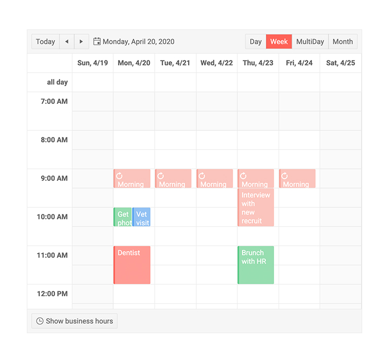
-
Blazor Scheduler Data Binding
To set up a scheduler, just provide it with a collection of your appointments as a data source and it will render them.

-
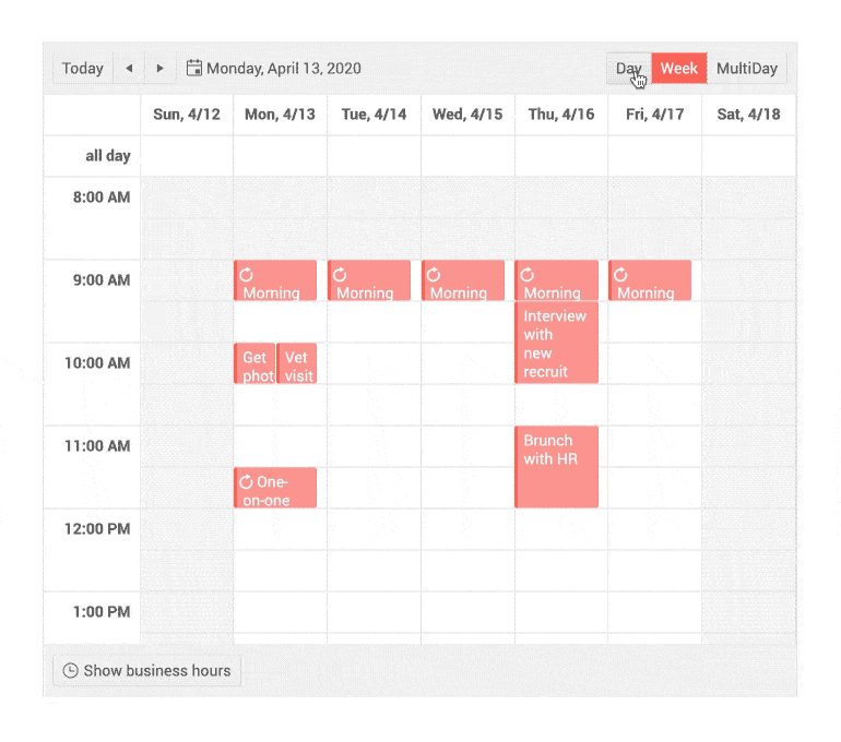
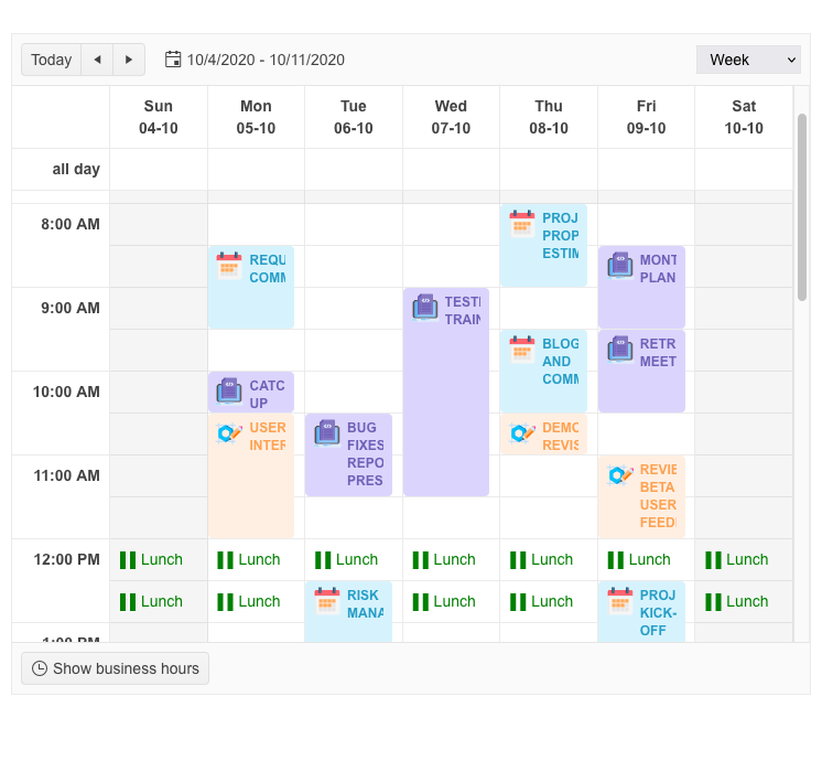
Blazor Multiple Scheduler Views
The Scheduler provides several modes of presenting the current time and events to match the particular needs. The more granular a view is, the finer precision you can see, but you will see fewer events and a shorter time period:
You can customize the views with a variety of settings.
-
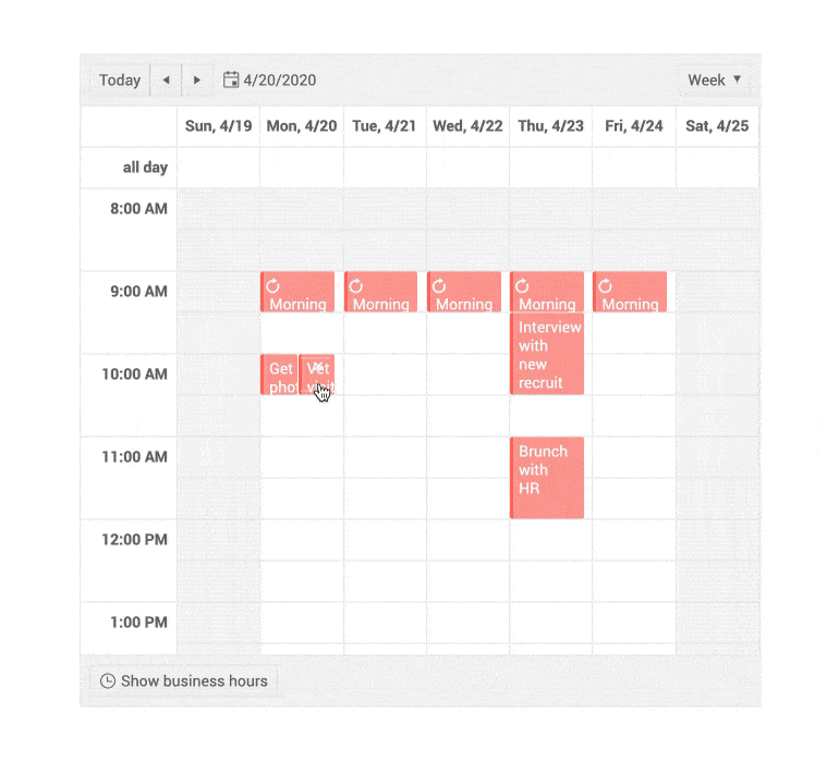
Scheduler Resize Appointments
Hovering over an appointment will show you resize handles that you can use to change its duration without having to open the full edit form and fiddle with the date-time pickers. Easier user experience, but the same events and API for the developer.
See it in action in the Appointment Editing demo.
-
Scheduler Drag and Drop Appointments
A single drag-and-drop with a swipe lets you move events around as an alternative for editing them through the default edit form. Check it out in the Appointment Editing demo. Fires the same Update events so you do not need to handle it in any special way.
-
Conditional Formatting of Appointments
The Scheduler will fire the OnItemRender event once when each appointment is about to be rendered. The event’s handler is best used to modify the CSS classes of that specific item depending on some value in the appointment. For example, coloring all appointments based on the day on which they occur.
-
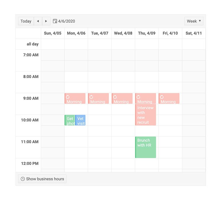
Scheduler Event Resources
Events can be associated with a resource (such as a tool, a meeting room or a person) and the Telerik Scheduler lets you color the appointments accordingly so that you can see at a glance who they are assigned to, or where they will take place.
-
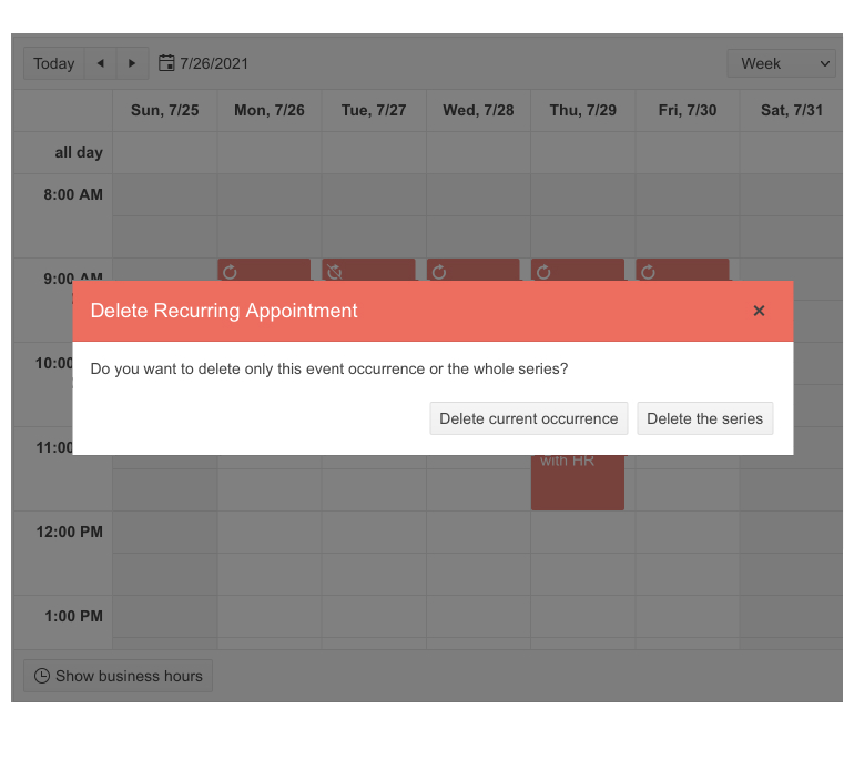
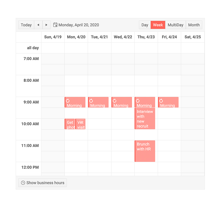
Scheduler Recurring Appointments
The daily team meeting or the monthly check-in with your manager can be created once and the Telerik Scheduler will expand them as a repeating series, just like Outlook. You can then edit the entire series at once, or a specific instance, called an exception.
See them in action in the Recurring Events demo.
-
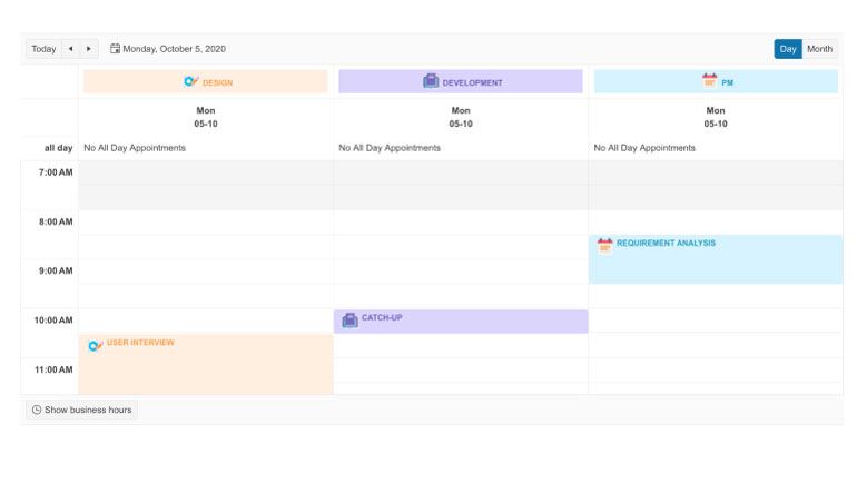
Scheduler Resource Grouping
The Scheduler component provides built-in grouping functionality of one or more resources. With the new feature, you can easily visualize appointments grouped by resources and let users perform any follow-up actions like scheduling or booking. The Scheduler resource grouping functionality works smoothly in both horizontal and vertical modes.
Check out the Blazor Scheduler Grouping functionality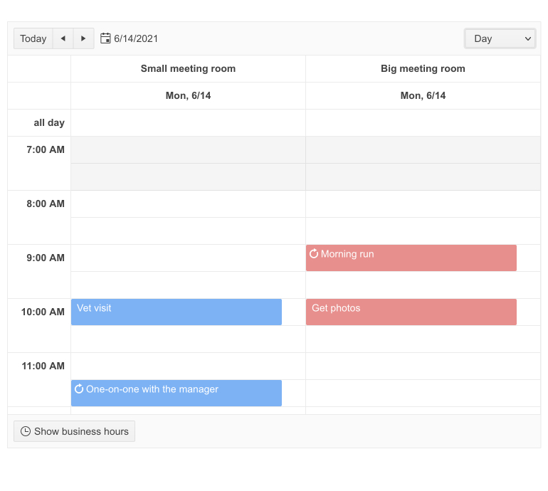
-
Custom Popup Editing Window
The Blazor Scheduler component exposes multiple settings for its popup editor in the dedicated SchedulerPopupEditSettings tag. You can set the (max) width, (max) height, CSS class. In addition, we provided SchedulerPopupEditFormSettings tag that allows you to configure the orientation of the form (either horizontal, or vertical), the columns, and column spacing layout parameters of the form, and the horizontal alignment of the Buttons in the form through ButtonsLayout.
-
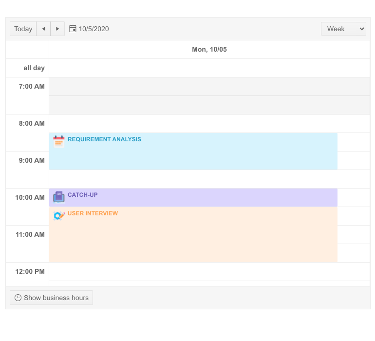
Appointment Templates
Control how appointments are rendered in the Scheduler component by specifying a template. Templates allow you to override the default appearance of each appointment, while you still get to keep all standard interactions like dragging and resizing, the delete icon, etc. The Scheduler supports three types of templates:
- ItemTemplate is used for regular appointments within the limits of a single day.
- AllDayItemTemplate is used for events that take the entire day.
- SlotTemplate allows adding arbitrary content (i.e., formatted text or icons) to the slot cells.
See the detailed documentation on implementing a custom template.
-
ТoolbarTemplate
The ToolbarTemplate in Telerik UI for Blazor Scheduler allows developers to customize the scheduler's toolbar by adding custom buttons, icons or controls tailored to specific needs. This flexibility enhances user interactions, providing a more personalized scheduling experience with functionality beyond the default toolbar options.
See ToolbarTemplate in Telerik UI for Blazor Scheduler demo.
-
Resource Grouping Template
The Resource Grouping Template in Telerik UI for Blazor Scheduler allows for the customization of resource headers when grouping events by resources such as rooms, employees or equipment. This feature enables a more tailored presentation, helping users design unique layouts and improve the clarity of grouped event displays.
See Resource Grouping Template in Telerik UI for Blazor Scheduler demo.
-
Hide “All Day”
In Telerik UI for Blazor Scheduler, the "All Day" panel can be hidden by adjusting the component's configuration, removing the display of all-day events from the interface. This helps streamline the scheduler’s view, focusing only on timed events for a cleaner, more focused layout. -
DateHeader Template
By default, the Scheduler component renders the date in a custom format - “ddd M/dd”. To change the date and month order, you need to use a Date Header Template, which allows you to customize the rendering of the date header slots for the Day, Week and Timeline views. In addition, there are more templates you can override – the ‘No data’ schedule is used if there’s no suitable data to be displayed, while the Delete confirmation – when you want to override tha uncustomizable default prompt.
-
Events
The Scheduler component fires various events that help you easily control the logic when appointments are clicked or need to be managed by end users. The events include:
- CUD Events: target appointment editing, including creating, updating and deleting appointments.
- OnModelInit: fires before editing and adding new items in the component.
- OnItemClick: catches a user’s single click on an appointment.
- OnItemDoubleClick: listens to a user’s double click on an appointment.
- OnItemContextMenu: catches a right click on an appointment.
- ItemRender: fires when the appointments are rendered and allows customization of their appearance.
- OnCellRender: allows you to add styles to each of the underlying slot cells.
- DateChanged: reacts to a user changing a current date.
- ViewChanged: fires when a user switches to another view.

-
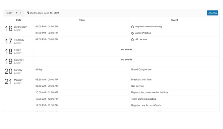
Agenda View
Тhe Agenda View in Telerik UI for Blazor Scheduler presents a chronological list of scheduled events, offering a clear, scrollable layout for easy navigation. It provides detailed information such as event title, time and location, helping users quickly review and manage their upcoming appointments.
-
Keyboard Navigation
Through the keyboard navigation support, Scheduler users can cycle through the available time slots and scheduled appointments, while also creating new appointments without touching the mouse.
-
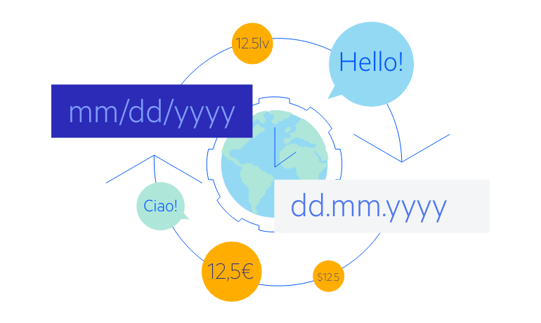
Scheduler Globalization and Localization
The Telerik Blazor Scheduler component reacts automatically to the current user culture. The date formats and the first day of the week will change automatically, and you can easily translate button texts and labels. Check it out in the Scheduler Globalization Demo.
-
Blazor Scheduler Theming
The Telerik Blazor Scheduler has several built-in themes such as Default (our own styling), Material (based on the Material Design guidelines), Bootstrap (which looks like the Bootstrap styling to integrate better) and Fluent (based on Microsoft Fluent UI). You can easily customize any of out-of-the-box themes with a few lines of CSS, or create new theme to match your colors and branding by using the Telerik SASS ThemeBuilder application.
-
Also Available...
The Scheduler component is also available for these popular Web frameworks:
-
Scheduler Edit Appointments
Not only can you see the current events, you can also let your users edit, delete and create new appointments. You can control these operations separately so certain users can, for example, only create events, but not edit or delete (for example, your intern taking bookings should not be able to delete existing ones by accident).
However, anyone can missclick and end up deleting important appointments. That is why we have added a Delete Confirmation Popup which is displayed when the user clicks the [x] button. It asks for confirmation of the action and provides a cancel button. If the appointment you are trying to delete is part of a series of occurrences, you can choose to either delete only this event or all events in the series.The CRUD operations in the Telerik Scheduler for Blazor are managed through a set of dedicated events and parameters so you can plug your business logic and services seamlessly.