UI for Blazor
Blazor ListBox
- Enable your users to easily select or move items between multiple lists with Telerik UI for Blazor ListBox.
- Part of the Telerik UI for Blazor library along with 120+ professionally-designed UI components.
- Includes support, documentation, demos, virtual classrooms, Visual Studio Code Extensions and more!
-
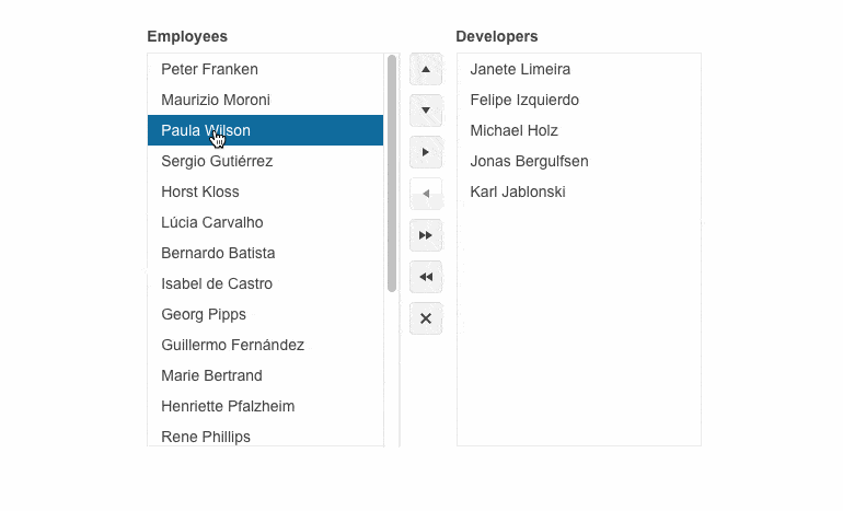
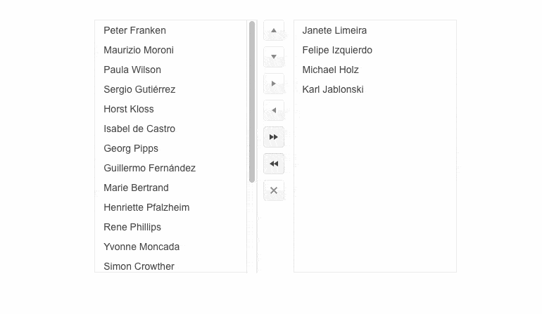
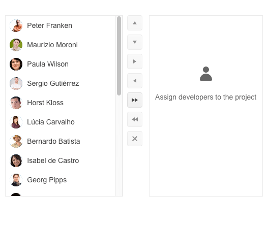
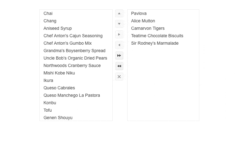
ListBox Toolbar
For elevated interactions with the component, Blazor ListBox includes a toolbar for effortless up and down moving of items within a list, switching items from one list to another, or deleting them. Adding or removing items from the toolbar or deleting them altogether is also possible. Moreover, you can change the toolbar position, leveraging a simple property.
-
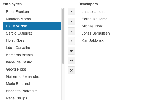
Selection
Play with the ListBox configurator to change the selection mode and choose the behavior that better fits your app requirements. Telerik UI for Blazor ListBox supports single and multiple selection.
-
Drag and Drop
Leverage the out-of-the-box drag and drop functionality in Blazor ListBox. It allows you to easily transfer items between lists with the only precondition to drag and drop one item at a time. The drag and drop capability can be used for list reordering as well.
-
ListBox Templates
Instead of showing items as plain text, you can leverage the ItemTemplate to add images, layout, colors, etc. In cases where the ListBox is empty, you can use the NoDataTemplate to alter the appearance of the empty component.
-
ListBox Appearance
Effortlessly modify the ListBox elements size thanks to the built-in Size parameter. Customize the appearance of the components by choosing one of the available sizing options – small, medium, or large.
-
ListBox Events
To ensure smooth interaction, the UI for Blazor ListBox component includes the following set of events:
- OnReorder: fires when the user initiates items reordering.
- OnTransfer: fires when the user initiates a transfer of items from one ListBox to another.
- OnRemove: fires when the user initiates deletion of items.
- OnDrop: fires when the user drops dragged items.
- SelectedItemsChanged: fires when the user selects or unselects ListBox items.
-
Right-to-Left (RTL) Support
The Telerik UI for Blazor ListBox supports right-to-left configuration. The RTL functionality is supported by most Telerik components to accommodate users who communicate in a right-to-left language script, such as Arabic and Hebrew.
-
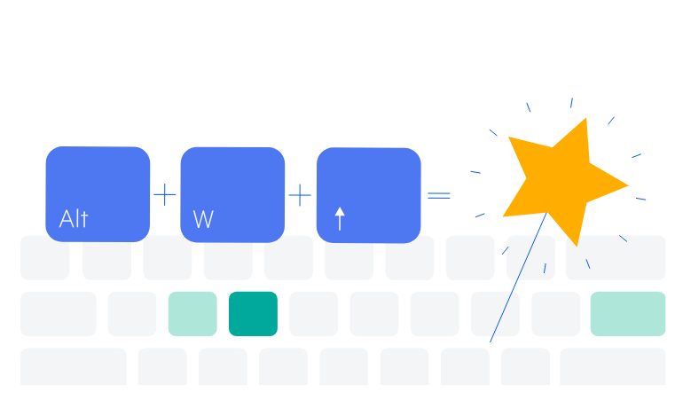
Keyboard Navigation
The ListBox component in Telerik UI for Blazor supports built-in keyboard shortcuts for focusing and interacting with the component using only a keyboard.
Try out the keyboard shortcuts for Telerik UI for Blazor ListBox
-
ListBox Theming
Telerik UI for Blazor ListBox comes with the Default, Bootstrap, Fluent, and Material built-in themes. Each theme provides a set of color swatches you can choose from to match your applications’ appearance and styling. Additionally, you can easily customize any of the out-of-the-box themes with a few lines of CSS or create a new one to match your branding by using the Progress ThemeBuilder application.
-
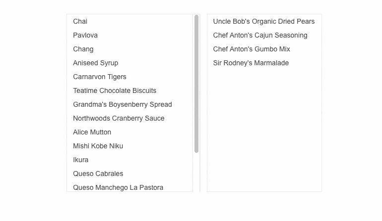
Displaying a List of Data Items Made Easy
Telerik UI for Blazor ListBox allows displaying a list of items in a specific area that can be scrolled through. Give your users the flexibility to select, reorder, delete and drag and drop items with ease.
Additionally, you can combine multiple Blazor ListBoxes to enable users to move items between two or more lists thanks to the built-in capabilities for moving single or multiple items back and forth between various ListBox instances.