UI for Blazor
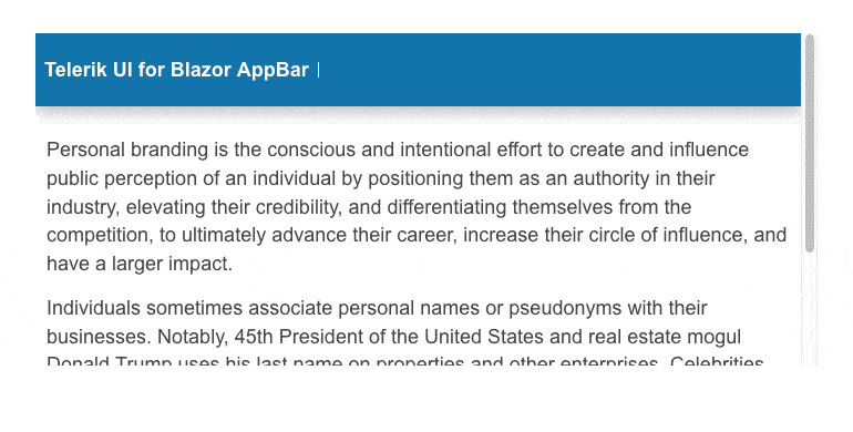
Blazor AppBar
- Create seamless and visually pleasing navigation experience with Telerik UI for Blazor AppBar.
- Part of the Telerik UI for Blazor library along with 120+ professionally-designed UI components.
- Includes support, documentation, demos, virtual classrooms, Visual Studio Code Extensions and more!
-
Sleek and Customizable App Navigation
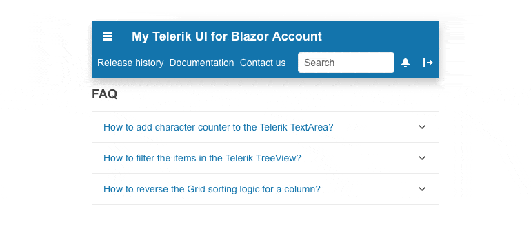
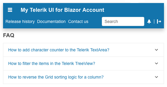
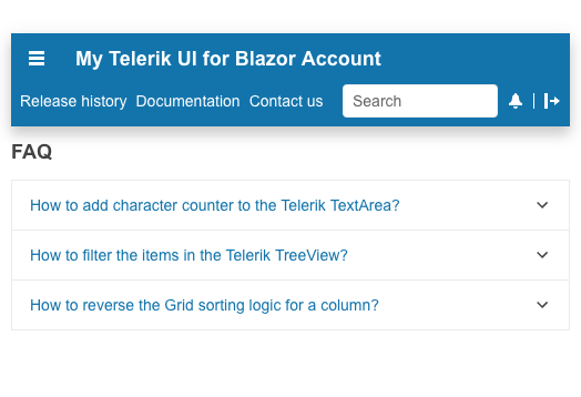
Empowers users to effortlessly navigate through an application while accessing key features with Telerik UI for Blazor AppBar, aka Navigation or NavBar. This UI component is designed with consistency in mind allowing users to intuitively access essential functions, switch between screens and keep the contextual awareness throughout their app journey.
-
AppBar Position
Effortlessly adjust the Telerik UI for Blazor AppBar position and content flow, leveraging the Position parameter and define if it is sticky, fixed, or static via the PositionMode.
-
Content Arrangement
The AppBar component does not come with a predefined layout. Instead, it offers Blazor developers full flexibility to define the items and the order in which they should appear. Section and Separator layout options are there to assist you to visually distinguish the AppBar items and achieve the desired look and feel.
Check Telerik UI for Blazor AppBar sections and separators documentations
-
AppBar Theme Color
Effortlessly customize the appearance of the AppBar’s theme color, leveraging the multiple built-in options. The ThemeColor parameter can be set to a handful of different colors to align with the outlook of the page.