UI for Blazor
Blazor Card
- Use the Blazor Card component to beautifully display the articles in your blog, the menu in a restaurant app, etc.
- Part of the Telerik UI for Blazor library along with 120+ professionally-designed UI components.
- Includes support, documentation, demos, virtual classrooms, Visual Studio Code Extensions and more!

-
Layout
The layout of a Card component consists of multiple building blocks, including placeholders for header, image, body, footer, and a list of actions. You can choose the blocks you need to create the perfect layout for your use case. The cards can be organized in different containers—like a list or deck—to change the direction in which cards are laid out.
Check out the different Blazor Card Layouts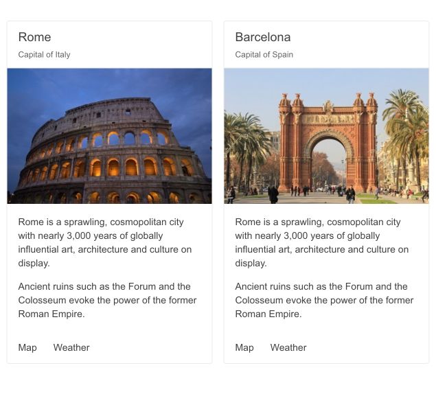
-
Orientation
The Card’s orientation can be easily switched by changing the Orientation attribute. Cards default to Vertical and display the image beneath the body. When in horizontal, the image is displayed to the left of the body.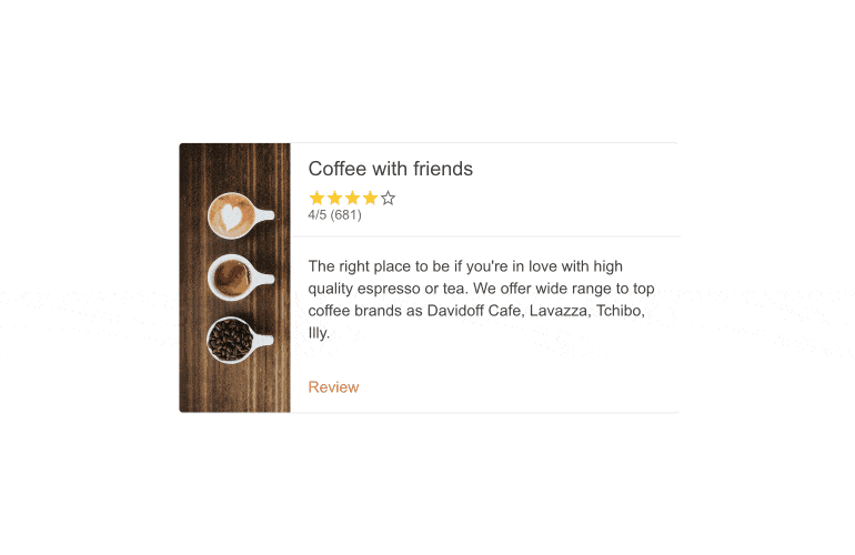
-
Dynamic Card Rendering
If you store your cards’ data in an enumerable container, you can render all cards corresponding to that data by doing a @foreach in your Razor code.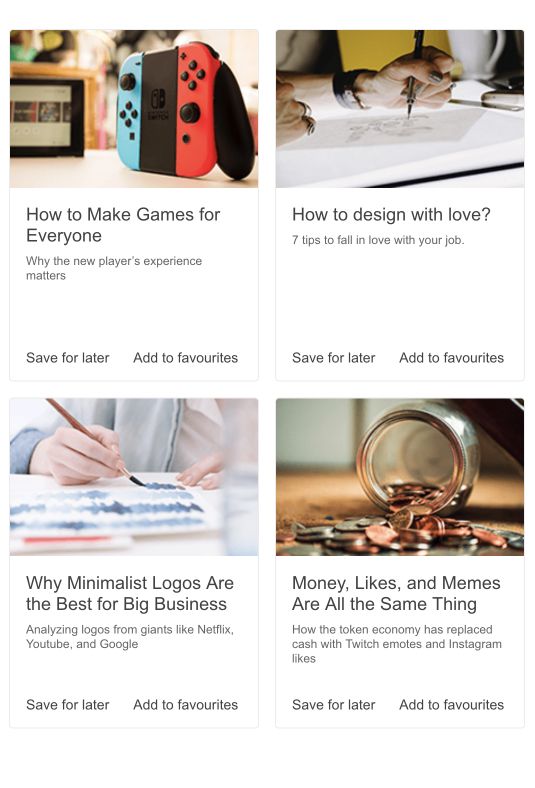
-
Configuration
The Card component can also contain an expandable header. This flexibility allows you to display multiple cards at the same time. Another element you can control are the actions on the bottom of the component, which can be configured in relation to the cards.
Example of Telerik UI for Blazor Card with expandable header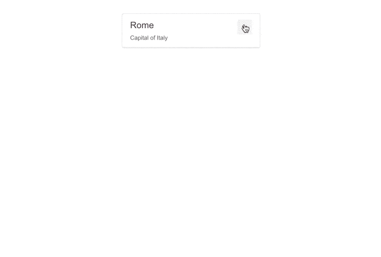
-
Card Theming
Themes can be used with the Card component to quickly produce frequently used effects like error or info messages, or when you want to color-code your cards for a specific purpose.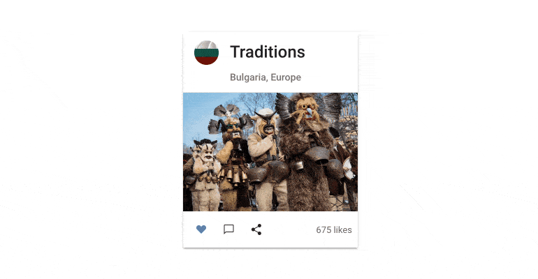
-
Right-to-Left (RTL) Support
The Telerik UI for Blazor Card component supports right-to-left configuration. The RTL functionality is supported by most of our components to accommodate users who communicate in a right-to-left language script, such as Arabic and Hebrew.
Learn more in our Blazor Right-to-Left Support documentation

-
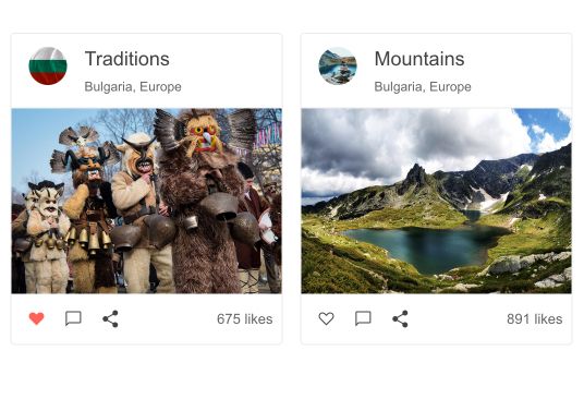
Use the Blazor Card to Beautifully display blog articles or menu
Cards are an extremely popular element of modern UI systems. Their flexibility as content containers is what makes them so attractive in web apps. Beautifully display the articles in your blog, the menu in a restaurant app or the destinations in a travel agency’s site with the Telerik UI for Blazor Card component.