background

UI for Blazor

Blazor Notification

  • The Blazor Notification component notifies users about the status of action in application.
  • Part of the Telerik UI for Blazor library along with 110+ professionally-designed UI components.
  • Includes support, documentation, demos, virtual classrooms, Visual Studio Code Extensions and more!
Telerik UI for Blazor Notification - Header
  • Display Notifications Easily in Your Blazor Apps

    The Telerik UI for Blazor Notification Component offers sleek animated ways to display notifications which can then be dismissed manually by the users or automatically after some time. The Notification component is useful when building applications that require messages such as events reminders, alarm snoozing or any status updates coming from an application process.

    Telerik UI for Blazor Notification Overview
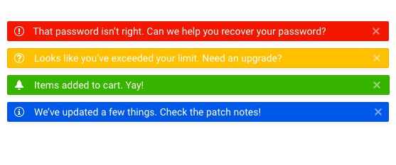
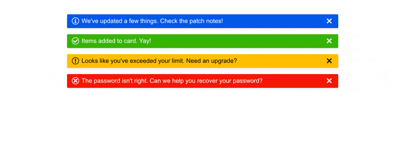
  • Built-in Theme Colors

    The component comes with the option to set one of the predefined colors (ThemeColor parameter) for the notification such as Primary, Secondary, Tertiary, Success, Info, Warning, Error, Dark, Light, Inverse or build your own. It lets you match the use case logic and the color associated with it.

    See more about Blazor Notification component themes

  • Notification Customization

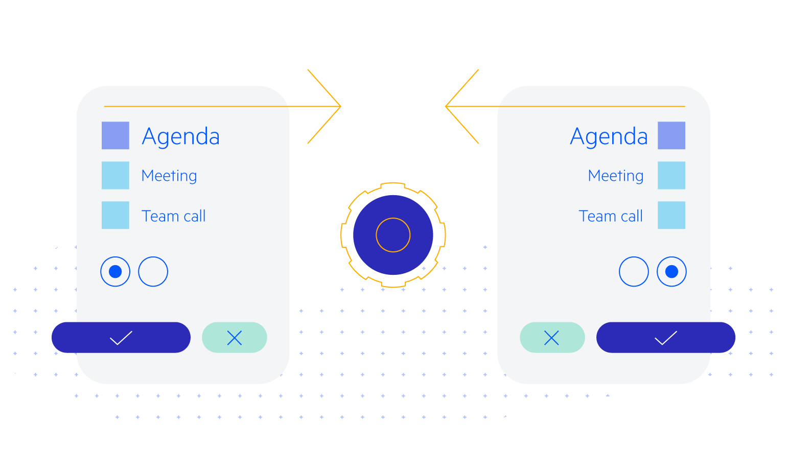
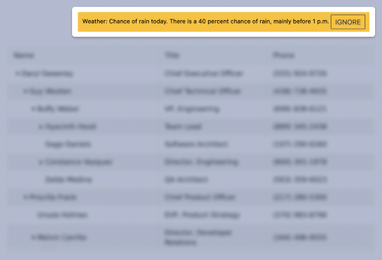
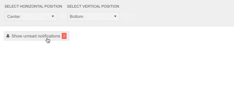
    The Notification Component is fully customizable, and you can choose the preferred position to display your messages on the page – top, bottom, right, left, or to set a specific custom position as well. The UI component offers the feature to personalize the notification content by including images or other elements.

    Telerik UI for Blazor Notification Customization
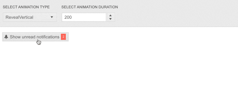
  • Notification Animation Options

    A crucial part of Notifications is how they appear on the page. You can control the animation of your message by choosing from the predefined options and setting an animation type.

    Telerik UI for Blazor Notification Animation
  • Showing and Hiding

    The Notification component uses a Show method which has an overload for common parameters like Text and Color and overloads which accept the whole Notification model. You can also choose how your notification will disappear. If you want this to happen automatically, you can set a specified time for the notification duration. The message can also be dismissed manually by pressing a close button that will be visible near the message. The component also has a hiding feature which means that even if the user does not click the closing button within a specified time, the notification will still hide automatically.

    Learn more about the Notification component animation types

  • Notification Component Theming

    The component has several built-in themes such as Default, Material, Bootstrap and Fluent. You can easily customize any of out-of-the-box themes with a few lines of CSS or create new theme to match your colors and branding by using the Telerik SASS ThemeBuilder application.

    Telerik UI for Blazor Notification Theming
  • Also Available...

    The Notification component is also available for these popular Web frameworks:

  • Right-to-Left (RTL) Support

    The Telerik UI for Blazor Notification component supports right-to-left configuration. The RTL functionality is supported my most of our components to accommodate users who communicate in a right-to-left language script, such as Arabic and Hebrew.

    Learn more in our Blazor Right-to-Left Support documentation 

    Blazor RTL Support

Frequently Asked Questions

  • What are the built-in notification types within the Telerik UI for Blazor Notification component?

    Telerik UI for Blazor Notification component includes 4 built-in notification types. They reflect what users are accustomed to seeing.

    • Error notification with red background and an “X” icon.
    • Warning notification with yellow background and an “!” icon.
    • Info notification with blue background and an “I” icon.
    • Success notification with green background and an “✓” icon.

    You can, of course, define your own type of notification by customizing the component template, set different size, color, and position options, or leverage the different built-in animations such as Fade, Slide, Push, Zoom and Reveal.

  • How can I buy Telerik UI for Blazor Notification component?

    Telerik UI for Blazor is a professional grade UI library with 110+ native components for building engaging and feature-rich applications. You can purchase the suite online or contact our sales team.

    You can, of course, decide to purchase a DevCraft license. It bundles all Progress Telerik .NET and JavaScript components.

  • Is there a free Telerik UI for Blazor license that I can use to try out the Notification component?

    You can try all Telerik UI for Blazor components without paying anything or having to provide any payment details by simply signing for the free 30-day trial. During your evaluation, you will have access to all Blazor components, technical support, documentation, and on-demand technical training.

  • What makes the Telerik UI Notification component better?
    • Each Telerik UI for Blazor component is truly native, built from the ground up for Blazor. Most of the Blazor UI libraries on the market are just JavaScript wrappers.
    • Just like any other Blazor component, the Notification component is highly accessible and offers numerous customization options to fit any design requirements or personal needs.
    • The component is part of the Telerik UI for Blazor suite with over 110 components that share common themes and API, so you can create not only engaging, but also consistent UI.
    • The Blazor Notification is frequently updated for compatibility and user demand by the experts behind the product. If you see something missing, simply request it in Blazor’s Feedback portal.
    • With Telerik UI for Blazor you get access to a fast-responding support team on standby with 97% satisfaction rates.
    • Each Blazor Notification feature is meticulously documented and represented by a demo.
  • Is there a chance to purchase the Notification component only? I don’t need the rest.

    No, Telerik doesn’t offer standalone component licenses. To simplify the purchasing process and provide as much value as we can, we offer a license for the whole Telerik UI for Blazor suite, which consists of 110+ UI components. The Blazor Notification component is part of that library.

  • How easy is it to get started with the Telerik UI for Blazor Notification component?

    It’s quite easy to get started with any of the Telerik UI for Blazor components. To learn more on how to get started with the Blazor Notification component visit the documentation or play with the Notification demo. Each demo contains the source code behind the example to facilitate you even further.

    Don’t forget to sign up for a free 30-day Telerik UI for Blazor trial. It will give you access to support resources to help you during your learning and evaluation process.

All Blazor Components

Next Steps