
UI for ASP.NET Core
ASP.NET Core Notification
- Use the ASP.NET Core Notification component to render important information for end users.
- Part of the Telerik UI for ASP.NET Core library along with 120+ professionally designed UI components.
- Includes support, documentation, demos, virtual classrooms, Visual Studio Code Extensions and more!
-
Overview
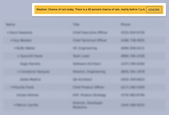
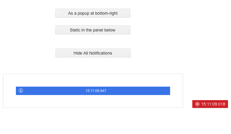
The Telerik UI for ASP.NET Core Notification lets you display various brief messages to application users. It can be useful to show alerts, confirmations, status updates, warnings etc. The component supports Razor Page scenarios, RTL, templates and more.
See the ASP.NET Core Notification in action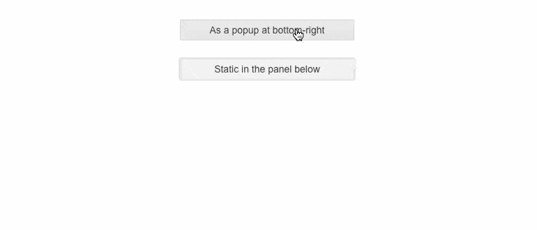
-
Types
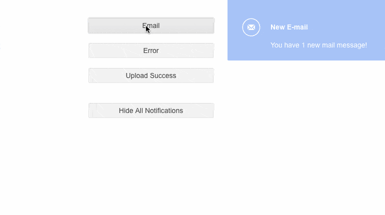
The Notification component comes with four built-in notification types:
- Info
- Success
- Error
- Warning
-
Hiding
By default, the notification stays visible for five seconds before it disappears, however, you can disable automatic hiding and shorten or longer the visibility duration. As for manually closing the notification, users can click on it and make it disappear or you can implement a Close button to make it easier for them to know how to hide it. -
Positioning and Stacking
The Core Notification displays popup boxes which overlay the rest of the page. You can control their positioning, but if no position is defined the notifications will show up in the bottom-right corner and stack upwards. If you do not want them to be displayed this way, you can easily change the positioning and stacking of the component with a few settings. -
Templates
The component can be easily customized through templates. Each template can be used together only with its corresponding notification type.
-
HTML and Tag Helpers
The Telerik UI for ASP.NET Core suite offers two approaches to declare the Notification or any other component – choose HTML or Tag helpers based on your preference, practice, and technology background, and add this advanced input element to any new or existing form.
-
RTL Support
Right-to-left support is available for cultures where people read from right to left. You can satisfy any cultural preference with the ASP.NET Core Notification component by changing the alignment between left-to-right and right-to-left with only a few settings.
-
Theming
The Telerik UI for ASP.NET Core Notification has four built-in themes and various swatches, including Default (Main Dark, Nordic, Purple), Material (Arctic, Lime Dark, Nova), Bootstrap (Urban, Vintage etc.) and Fluent. You can easily customize any out-of-the-box themes with a few lines of CSS or create new themes to match your colors and branding by using the Progress SASS ThemeBuilder application.
-
Razor Pages
The Notification is one of the many Telerik UI for ASP.NET Core controls that are supported in both MVC and Razor Pages applications. To learn more about plugging ASP.NET Core components in Razor Pages, check out the documentation article or visit the Razor Pages examples in our GitHub project repository.
