UI for ASP.NET Core
ASP.NET Core StackLayout
- Aligning any type of content in a vertical or horizontal row is a breeze with the Telerik UI for ASP.NET Core StackLayout.
- Part of the Telerik UI for ASP.NET Core library along with 120+ professionally designed UI components.
- Includes support, documentation, demos, virtual classrooms, Visual Studio Code Extensions and more!

-
Customization
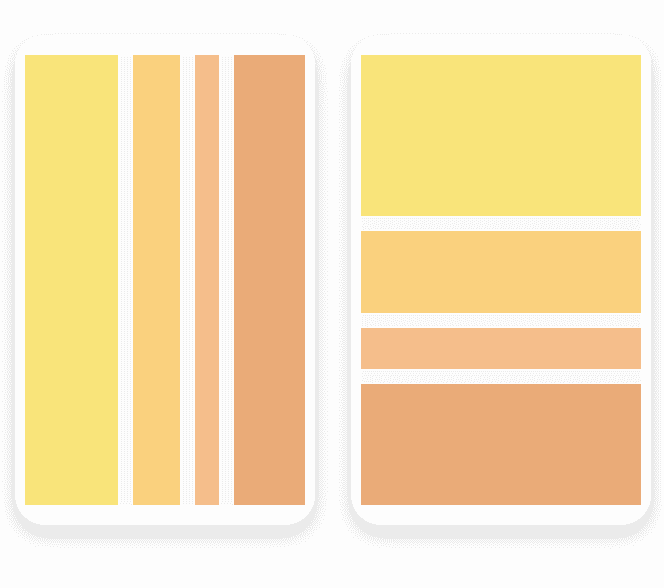
Play with the ASP.NET Core StackLayout component to match it with the expected outcome. You can easily customize its width and height, change the styling, add spacing between inner elements, or change the layout from vertical to horizontal and vice versa. The vertical or horizontal options provide the opportunity to align inner items to the left, right, center or to stretch them.
-
Layout
The StackLayout component is typically used for aligning several elements in the same pattern (in a row or column), but you can also use it to define more complex layouts by nesting more than one component instance with the appropriate settings.
-
Theming
With the ASP.NET Core StackLayout component you can apply multiple built-in themes such as Default (our own styling), Material (based on the Material Design guidelines), Bootstrap (which looks like the Bootstrap styling to integrate better) and Fluent (based on Microsoft Fluent UI) on the components stacked within the layout.
You can further customize any of the out-of-the box themes, style a specific chart component or create new theme to match your colors and branding by using the Telerik SASS ThemeBuilder application.
-
Overview
The Telerik UI for ASP.NET Core StackLayout component enables you to arrange UI elements horizontally or vertically in a stack. This can include simple text, images, or even other ASP.NET Core components such as the Chart. The StackLayout component comes with multiple customization options to satisfy any design request while keeping the project visually appealing and functional.
The StackLayout component simplifies the creation of layouts in web applications and helps developers migrate from desktop to the web since it mimics the StackPanel component used in Windows development.