UI for ASP.NET Core
ASP.NET Core CheckBoxGroup
- Flexible ASP.NET Core CheckBoxGroup form component to group multiple CheckBox controls in a single component.
- Part of the Telerik UI for ASP.NET Core library along with 120+ professionally designed UI components.
- Includes support, documentation, demos, virtual classrooms, Visual Studio Code Extensions and more!
-
Overview
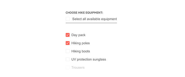
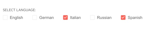
The Telerik UI for ASP.NET Core CheckBoxGroup component serves as a collection of multiple CheckBox controls, while providing more than the sum of its parts—it automatically positions the internal checkboxes, exposes utilities to set all values at once and more.
Check out the ASP.NET Core CheckBoxGroup demo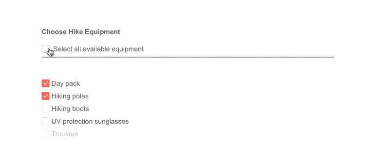
-
Data Binding
The control simplifies the creation of child checkboxes by creating it on its own—you only need to specify the values for each checkbox.
Visit the documentation to learn more about CheckBoxGroup binding
-
Customizations
The control brings multiple customization options to developers, including:
-
Having different values for the label text and the value accessible in code
-
Rendering the checkboxes before or after the labels
-
Laying out the checkboxes horizontally or vertically
-
-
ASP.NET Core CheckBox
If you do not necessarily need grouped checkbox controls, the Telerik UI for ASP.NET Core CheckBox component allows you to add single easily customizable checkboxes to your application.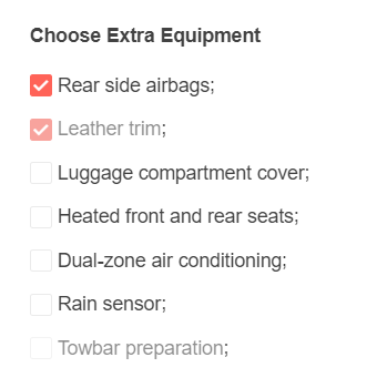
-
Accessibility
The CheckBoxGroup component is Section 508 and WCAG 2.1 guidelines compliant, thus you can rest assured that your application will meet the needs of all users.
-
Keyboard Navigation
The ASP.NET Core CheckBoxGroup comes with built-in support for keyboard navigation. Users can easily navigate the component with the Shift, Tab and Enter buttons.
-
CheckBoxGroup Theming
The Telerik ASP.NET Core CheckBoxGroup component has 20+ built-in themes such as Default (our own styling), Material (based on the Material Design guidelines), Bootstrap (which looks like the Bootstrap styling to integrate better) and Fluent (based on Microsoft Fluent UI). You can easily customize any of out-of-the-box themes with a few lines of CSS, or create new theme to match your colors and branding by using the Telerik SASS ThemeBuilder application.