UI for ASP.NET Core
ASP.NET Core TextArea
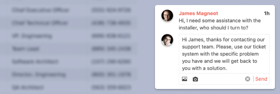
- Let users type multiline text like notes, comments and descriptions with the ASP.NET Core TextArea component.
- Part of the Telerik UI for ASP.NET Core library along with 120+ professionally designed UI components.
- Includes support, documentation, demos, virtual classrooms, Visual Studio Code Extensions and more!
-
Overview
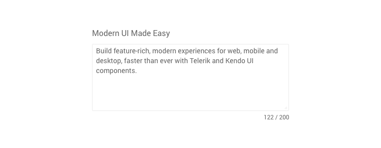
The Telerik UI for ASP.NET Core Text Area component is a popular text input element. It works best for text of average length – too long for a TextBox and too short/simple for a smarter editor – e.g. item descriptions, user comments, etc. Developers can customize everything on the control like its look and behavior, data binding, maximum length and the number of rows.
-
Floating Label
As an input component, the TextArea can have labels attached to it. It is possible to position the label before the input or as a floating label.
See how Floating Labels work in ASP.NET Core TextArea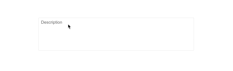
-
Declarative Initialization
Declarative initialization—a feature that serializes the component declaration as an MVVM declarative configuration instead of an inline initialization script—is supported in Telerik UI for ASP.NET Core TextArea. It is beneficial in cases when the Content Security Policy (CSP) is enabled as it eliminates the requirement to call the methods that defer the initialization script generated after the component's HTML markup.
See Telerik UI for ASP.NET Core TextArea declarative initialization demo
-
HTML and Tag Helpers
Telerik UI for ASP.NET Core provides two ways for you to declare UI components – by using HTML or Tag helpers. You can choose between the two approaches based on technology background, developer preference and practice, and implement the TextArea component in your applications as well as configure its placeholder, value and other options.

-
Text Area Component Theming
The Telerik ASP.NET Core Text Area component has 20+ built-in themes such as Default (our own styling), Material (based on the Material Design guidelines), Bootstrap (which looks like the Bootstrap styling to integrate better) and Fluent (based on Microsoft Fluent UI). You can easily customize any of out-of-the-box themes with a few lines of CSS, or create new theme to match your colors and branding by using the Telerik SASS ThemeBuilder application.

-
Right-To-Left Support
The TextArea is one of the many components in the Telerik UI for ASP.NET Core suite with out-of-the-box support for RTL text.
See how RTL Support works in ASP.NET Core TextArea Demo