UI for ASP.NET Core
ASP.NET Core Avatar
- Add a familiar avatar to represent profiles or other types of accounts with the Telerik UI for ASP.NET Core Avatar.
- Part of the Telerik UI for ASP.NET Core library along with 120+ professionally designed UI components.
- Includes support, documentation, demos, virtual classrooms, Visual Studio Code Extensions and more!
-
Overview
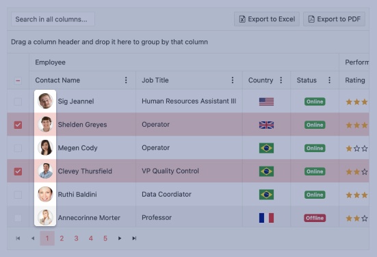
The ASP.NET Core Avatar Component is perfect for displaying entities with small photos, custom icons, avatars or initials in your apps.
See the ASP.NET Core Avatar component demo.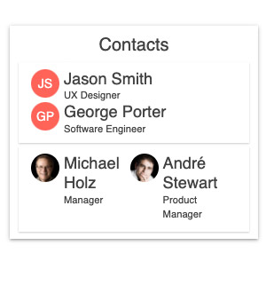
-
Avatar Types
The Avatar exposes a Type parameter with three predefined options: text (default), icon and image and allows further customization of each option via additional parameters related to setting its content (imageURL, icon name, actual text and more).
-
Configuration and Appearance
Configure the Avatar UI component shape as a circle, square or rectangle, as well as with rounded corners. You can further customize the look by setting its size to small, medium (default) or large, appearance fill style, border, alt text and more.
See how to customize the Avatar component appearance.
-
Avatar Theming
You can choose one of the several built-in themes and swatches, including Default (our own styling), Material (based on the Material Design guidelines), Bootstrap and Fluent (based on Microsoft Fluent UI) to style the appearance of the Avatar UI component. You can easily customize any of the available themes with a few lines of CSS or create a new theme to match your colors and branding with the Progress SASS ThemeBuilder application.

-
HTML and Tag Helpers
As with all Telerik UI for ASP.NET Core components, you have the flexibility to declare the Avatar via HTML and Tag helpers.