UI for ASP.NET Core
ASP.NET Core Wizard
- Use the ASP.NET Core Wizard component to break down lengthy processes into simple steps.
- Part of the Telerik UI for ASP.NET Core library along with 120+ professionally designed UI components.
- Includes support, documentation, demos, virtual classrooms, Visual Studio Code Extensions and more!

-
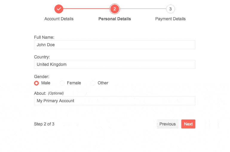
Wizard Component Overview
The Telerik UI for ASP.NET Core Wizard breaks long processes into multiple steps and simplifies user experience by only asking them to fill just one form at a time. Each Wizard step has its own content (form or other HTML), comes with built-in form validation (via Form component integration) for the input data and a progress indicator displaying the number of steps left towards completing the process.
Visit the ASP.NET Core Wizard demo page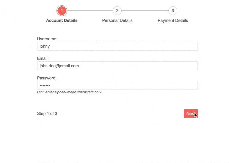
-
Wizard Component Form Integration
The Wizard component can use the existing Form component for configuration - each step of the Wizard has the same functionality as a stand-alone Form component and can thus benefit from all the Form’s features. An example on how to configure Form component can be found in the Wizard Form demo.
-
Wizard Component Loading Content
Built-in support is provided for loading content via AJAX. You only need to set the wizard’s contentURL and it will take of the rest. Alternatively, content by loaded locally from a piece of HTML (HTML string or DOM element) either by specifying the piece directly or by using the form element in the step.
-
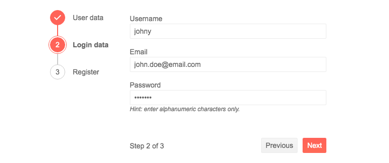
Wizard Component Layout
The Wizard’s stepper can be oriented & positioned in 3 distinct places relative to the Wizard’s content:
- horizontally and above the content
- vertically and on the left of the content
- vertically and on the right of the content
-
Wizard Component Theming
The Telerik ASP.NET Core Wizard has several built-in themes such as Default (our own styling), Material (based on the Material Design guidelines), Bootstrap (which looks like the Bootstrap styling to integrate better) and Fluent (based on Microsoft Fluent UI). You can easily customize any of out-of-the-box themes with a few lines of CSS, or create new theme to match your colors and branding by using the Telerik SASS ThemeBuilder application.
-
Wizard Component Accessibility and Keyboard Navigation
The Telerik UI for ASP.NET Core Wizard implements keyboard navigation and accessibility features to allow as many people to use it. Navigation and interaction with the steps and inputs of the component can be done entirely through keyboard. Major accessibility standards such as WCAG, Section 508 and WAI-ARIA attributes are all supported for the best user experience.