UI for ASP.NET Core
ASP.NET Core FloatingAction Button
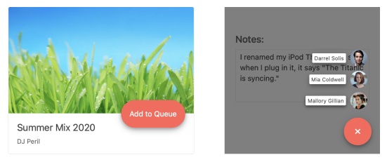
- The ASP.NET Core FloatingActionButton gives users quick access to their favorite activity.
- Part of the Telerik UI for ASP.NET Core library along with 120+ professionally designed UI components.
- Includes support, documentation, demos, virtual classrooms, Visual Studio Code Extensions and more!
-
Overview
The Floating Action Button component of Telerik UI for ASP.NET Core appears over the main UI and represents the most frequently executed command of your app. For example, a chat app may have its “New message” button as a floating one. It can be used everywhere, but its real power lies in enhancing mobile apps UI, where screen space is limited and minimizing the number of interactions available to users is critical.
See the ASP.NET Core FloatingActionButton in action
-
Appearance
The appearance of the control can be modified in several ways—you can select its shape (Pill, Rounded, Rectangle), colors by changing your theme, text and icon.
-
Alignment
The button component can be positioned anywhere within the viewport, be it in a fixed or absolute position. You can specify a custom offset on the sides or just use one of the predefined positions like “top left” or “middle right.” -
Items
As useful as it is to have a quick shortcut for users to jump immediately to their favorite action, sometimes you might want to provide more context around the action or a choice between several equally used actions. You can link additional items to the button so whenever the button is clicked, it will expand a list of the associated items, giving users the ability to pick an option. In this case, it’s the item’s responsibility to execute the action, not the button itself. -
Events
The Floating Action Button component can fire four events—OnExpand, OnCollapse, OnItemClick and OnClick. They are triggered as you would expect—when the button is expanded/collapsed, one of its items clicked or the button itself is clicked.
Explore the ASP.NET Core FloatingActionButton events -
RTL Support
The Floating Action Button fully supports RTL languages and using it together with RTL scripts will cause it to reverse the order of the labels and the icons.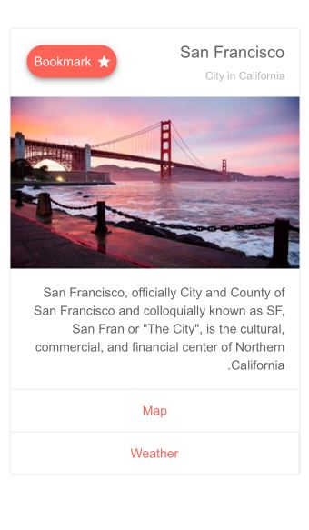
-
Templates
The FloatingActionButton component provides full control of the rendering of the speed dial action items. You can use templates to customize the button to match your application's style. -
Keyboard Navigation and Accessibility
The Telerik UI for ASP.NET Core Floating Action Button component is accessible to screen readers and provides support for all accessibility standards—WAI-ARIA, Section 508 and WCAG 2.1. The built-in keyboard navigation support enables developers can use a key binding to focus the element while the user can use standard buttons to navigate through the items and pick which one to execute.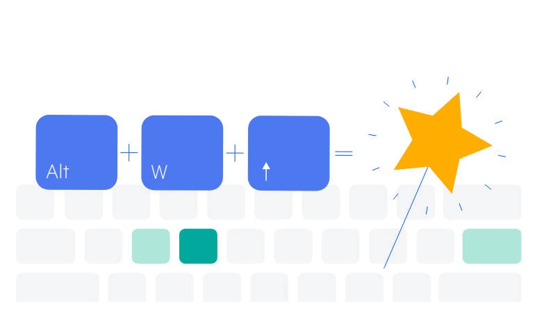
-
Theming
The FloatingActionButton component has several built-in themes such as Default (our own styling), Material (based on the Material Design guidelines), Bootstrap (which looks like the Bootstrap styling to integrate better) and Fluent (based on Microsoft Fluent UI). You can easily customize any of out-of-the-box themes with a few lines of CSS, or create new theme to match your colors and branding by using the Telerik SASS ThemeBuilder application.