UI for ASP.NET Core
ASP.NET Core ToggleButton
- Effortlessly group related options between various buttons with the Telerik UI for ASP.NET Core ToggleButton.
- Part of the Telerik UI for ASP.NET Core library along with 120+ professionally designed UI components.
- Includes support, documentation, demos, virtual classrooms, Visual Studio Code Extensions and more!
-
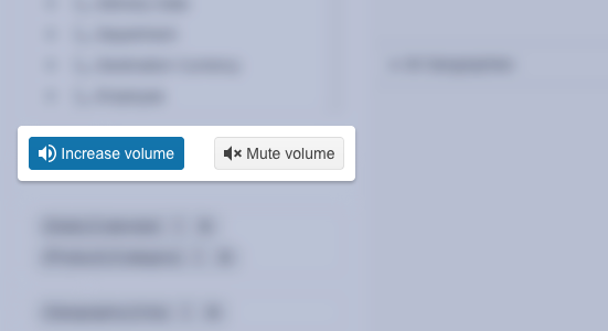
Provide a Straightforward and Intuitive Way to Control Features or Settings
Telerik UI for ASP.NET Core ToggleButton enables you to effortlessly group related options by displaying various buttons as well as to indicate whether the button is active or inactive. The ASP.NET Core ToggleButton offers a simple and efficient way for users to control features, settings, and options, thus enhancing the overall user experience. Being compact by design, the Toggle Button fits into small spaces, making it ideal for applications with limited screen real estate.
-
Appearance
Customize the appearance of the Telerik UI for ASP.NET Core ToggleButton using the predefined styling options such as different sizes, border radiuses, fill modes, and theme colors.
- Size—configures the overall size of the component.
- ThemeColor—configures what color will be applied to the component.
- FillMode—defines how the color is applied to the ToggleButton.
- Rounded—determines the border radius of the component.
See the Telerik UI for ASP.NET Core ToggleButton appearance demo

-
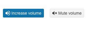
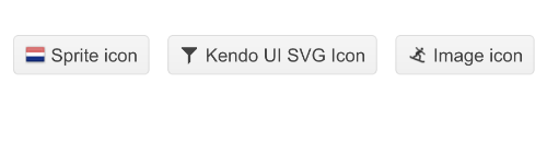
ToggleButton Images
Elevate user experience by complementing the text buttons of the Telerik UI for ASP.NET Core ToggleButton with images or icons.
See the Telerik UI for ASP.NET Core ToggleButton images demo
-
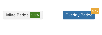
ToggleButton Badges
Use the built-in badges of the ASP.NET Core ToggleButton to convey additional information or to simply decorate the text button/s. The component enables you to choose between a set of predefined badge types such as the overlay, dot, pill, and rectangle. You can also specify the badge shape, text, and theme color that would better fit your app requirements.
See the Telerik UI for ASP.NET Core ToggleButton badges demo
-
Group
Grouping several instances into one distinguished group is a piece of cake with the Telerik UI for ASP.NET Core ToggleButton. This gives you the advantage of molding several ToggleButton instances and accessing them altogether via the data group attribute.
See the Telerik UI for ASP.NET Core ToggleButton group documentation
-
Events
The Telerik UI for ASP.NET Core ToggleButton supports a toggle event to ensure smooth experience with the component. The event fires when you start interacting with the button/s.
See the Telerik UI for ASP.NET Core ToggleButton events demo