UI for ASP.NET Core
ASP.NET Core TimeDurationPicker
- Enabling users to type or select a specific time duration is a breeze with the ASP.NET Core TimeDurationPicker.
- Part of the Telerik UI for ASP.NET Core library along with 120+ professionally designed UI components.
- Includes support, documentation, demos, virtual classrooms, Visual Studio Code Extensions and more!
-
Overview
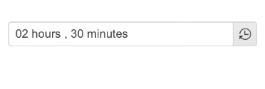
Allow users to select a particular time duration while eliminating the requirement to provide specific date, range of dates or time slots with the Telerik UI for ASP.NET Core TimeDurationPicker component. Give them the freedom to determine how many days, hours, minutes, or seconds an activity (e.g., online session, event, work project, etc.) is expected to take. Users can either pick a value from the component popup with built-in shortcut values or type the desired time duration themselves.
-
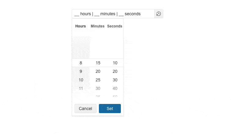
Columns
Customize the columns look and feel by configuring the number of columns, specifying the format for each of them and constraining the allowed selectable values.
-
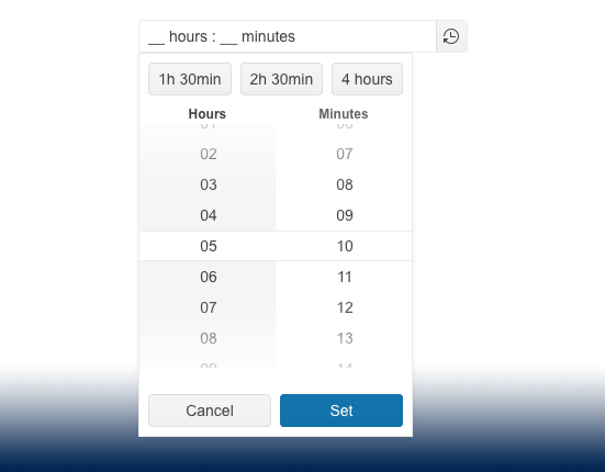
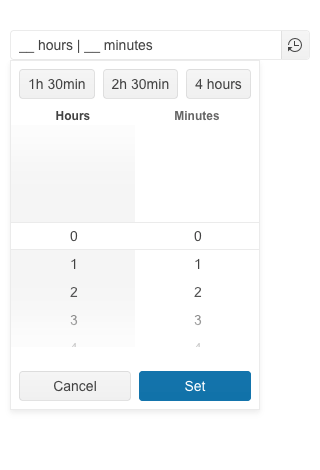
Shortcuts
Activities or events with repetitive duration time require smarter approach. Therefore, the TimeDurationPicker component allows you to add shortcuts in the form of button elements to its popup. These button elements can have predefined values and upon clicking on one of them, the value of the TimeDurationPicker gets updated.
-
Adaptive Mode
The TimeDurationPicker adaptive mode enables a mobile-friendly rendering of its time duration popup. Simply set the AdaptiveMode parameter to AdaptiveMode.Auto – this will trigger the picker component to automatically adapt to the current screen size and will change its rendering accordingly.
Check out the Telerik UI for ASP.NET Core TimeDurationPicker Adaptive Rendering Demo
-
Appearance
Get ready to play with the Telerik UI for ASP.NET Core TimeDurationPicker appearance. The component comes with multiple customization options, enabling you to control its size, fill mode and border radius.

-
Events
The ASP.NET Core TimeDurationPicker’s set of events enables smooth and transparent interaction with the component:
- Change event is triggered when the selected time duration is changed
- Open event fires when the TimeDurationPicker component is opened
- Close event is triggered when the TimeDurationPicker component is closed
-
Declarative Initialization
Declarative initialization—a feature that serializes the component declaration as an MVVM declarative configuration instead of an inline initialization script—is supported in Telerik UI for ASP.NET Core TimeDurationPicker. It is beneficial in cases when the Content Security Policy (CSP) is enabled as it eliminates the requirement to call the methods that defer the initialization script generated after the component's HTML markup.
See Telerik UI for ASP.NET Core TimeDurationPicker declarative initialization demo
-
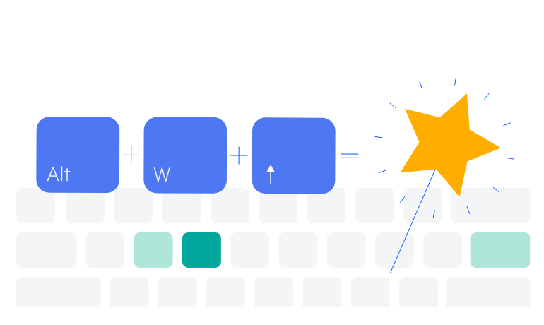
Keyboard Navigation
Improve accessibility and productivity with keyboard-only navigation. The Telerik UI for ASP.NET Core TimeDurationPicker comes with a built-in keyboard navigation support that allows users to easily interact with the component in the application through their keyboard.
See the ASP.Net Core TimeDurationPicker Keyboard Navigation demo
-
Theming
The Telerik UI for ASP.NET Core TimeDurationPicker component supports four built-in themes, including Default (our own Telerik-infused styling), Material (based on the Material Design guidelines), Bootstrap (which looks like the Bootstrap styling to integrate better) and Fluent (based on Microsoft Fluent UI).
Additionally, you can customize any of the ready-to-use themes with a few lines of CSS or create a new one to match your branding needs by using the Progress ThemeBuilder application.