
UI for ASP.NET Core
ASP.NET Core ToolBar
- A robust ASP.NET Core container for buttons, toggle & split buttons, or other elements.
- Part of the Telerik UI for ASP.NET Core library along with 120+ professionally designed UI components.
- Includes support, documentation, demos, virtual classrooms, Visual Studio Code Extensions and more!

-
Overview
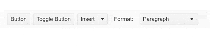
The Telerik UI for ASP.NET Core Toolbar component is designed to hold different types of controls, such as buttons, button groups, toggle buttons, split buttons, spacer and other customized elements. It can be used to fit various scenarios, which allows users to easily access and execute relevant commands. You can tailor the Toolbar to your project’s needs by adding, removing or reorganizing UI elements or customizing the toolbar content with templates. The component can be integrated with other controls, such as the Editor, and supports keyboard navigation.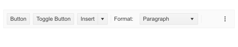
-
Resizing
The Toolbar component supports resizing, which shows or hides items in the component according to the available space.
-
Built-In Command Types
The Toolbar component comes with various built-in command types to fit into any use case scenario you might encounter. The available command types are as follows:
- Button: Its behavior, state and appearance can be configured to fit your needs.
- Button Group: Can be used to create a separate group of multiple buttons.
- Group: Creates a group which allows users to toggle only one button from it (helpful in cases of mutually exclusive options).
- Separator: Can be used to clearly separate different buttons and button groups from each other.
- Spacer: Moves the tools declared after it to the right, creating a more sophisticated look.
- Split Button: Acts as a primary button with a drop-down menu with different alternatives.
- Toggle Button: Is a button which allows users to toggle between two states.
-
Templates
The Core ToolBar control can be implemented in any project as it allows the developer to define custom items using the built-in templates engine. -
Icons and Sprites
The ToolBar component enables you to use FontAwesome icons as its sprite icons.
Learn how to easily customize the component -
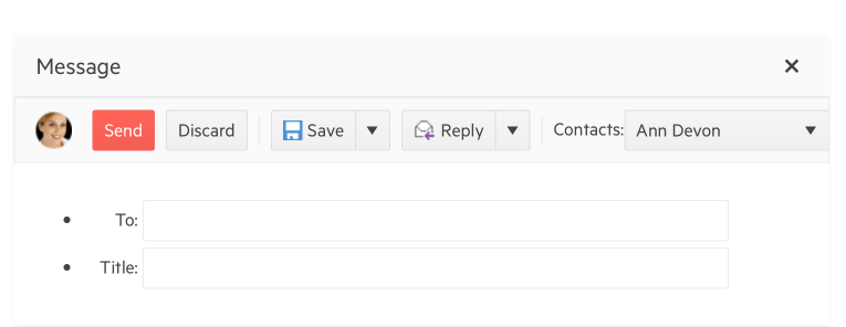
Use Cases
A Toolbar can be implemented in many use case scenarios, including:
- A table, for which you would need buttons to insert or delete rows, formatting options and text styling.
- An email application, which would require Send button, Save, Discard, Reply, etc.
- A calendar application, which would feature toggle buttons, such as To do, Done, Pending, dropdown menus and many other functionalities.
-
Integration with Editors
The Toolbar can be integrated in other components, such as the Editor, which will simplify the structure and make your work with the components way more convenient.
Check out the ASP.NET Core Toolbar Integration with Editors demo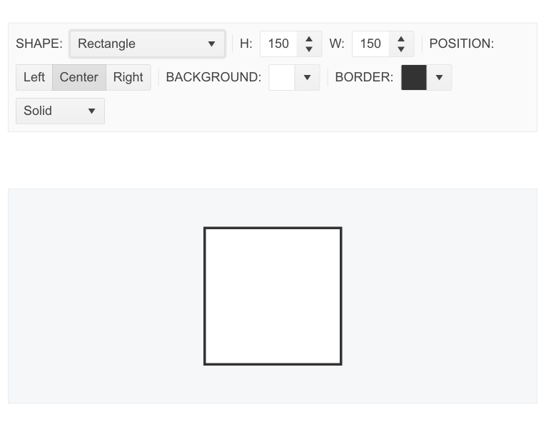
-
Events
The ToolBar control fires various events to notify programmers when an action is needed. These include OnClick and OnToggle events. For the full list of available events, visit the documentation.
-
HTML and Tag Helpers
Telerik UI for ASP.NET Core provides you with two ways to declare UI components—by using HTML or Tag helpers. You can choose between the two approaches based on the developer technology background, preference and practice and implement the Toolbar component in your applications.
-
Keyboard Navigation
The Toolbar is one of the many components in the Telerik UI for ASP.NET Core suite with out-of-the-box support for keyboard navigation. Whether your application’s audience consists of avid keyboard users or prefers the old-school mouse approach, they would all enjoy using the control.
-
Theming
The Toolbar component has several built-in themes, including Default (our own styling), Material (based on the Material Design guidelines), Bootstrap (which looks like the Bootstrap styling) and Fluent (based on Microsoft Fluent UI). You can easily customize any of the out-of-the-box themes with a few lines of CSS or create a new theme to match your colors and branding by using the Telerik SASS ThemeBuilder application.
-
Razor Pages
The ASP.NET Core Toolbar is one of the many Telerik UI for ASP.NET Core components that are supported in both MVC and Razor Pages applications. To view the complete list of Razor-Pages-supported Telerik components, read the documentation article or visit the Razor Pages examples in our GitHub project repository.
