UI for ASP.NET Core
ASP.NET Core Popover
- The Popover component for ASP.NET Core displays information when a user hovers or clicks on an anchor.
- Part of the Telerik UI for ASP.NET Core library along with 120+ professionally designed UI components.
- Includes support, documentation, demos, virtual classrooms, Visual Studio Code Extensions and more!

-
Overview
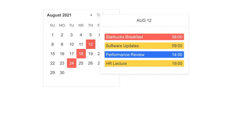
The Telerik UI for ASP.NET Core Popover component can be used to display content on top of an anchor. For example, if you hover over a certain date in a calendar, it can show scheduled events, or if you hover over an item in an online store, it can display additional details such as pricing, availability and sizes. The popover component features templates, a rich API and various theming options.
Check out the Telerik UI for ASP.NET Core Popover demo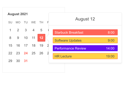
-
Templates
The content of the Popover can be customized through templates, which allows the configuration of text, images or HTML to style the component.
-
Events
The Popover control fires OnHover and OnClick events such as Show, Hide and more.
Check out the various Popover Events in this demo
-
API
Telerik UI for ASP.NET Core comes with a complete server-side API. With simple API calls, you can configure all features of the ASP.NET Core Popover component. Since the server wrappers output JavaScript, you also have full access to the client-side API for maximum control in the browser.
-
HTML and Tag Helpers
With Telerik UI for ASP.NET Core, you can choose from two component declaration options - HTML or Tag helpers. Take advantage of either one to help you easily implement the ASP.NET Popover in your application.
-
Popover Theming
To have the component and the whole application match your brand guidelines, you can choose one of the multiple built-in themes and swatches, including Default (our own styling), Material (based on the Material Design guidelines), Bootstrap (resembling the Bootstrap styling) and Fluent (based on Microsoft Fluent UI).
You can easily customize any of the available themes with a few lines of CSS or create a new theme to match your colors and branding with the Progress SASS ThemeBuilder application.