UI for ASP.NET Core
ASP.NET Core Date and Time Pickers
- Select date or time from a calendar or through a direct input with the ASP.NET Core Date & Time Picker components.
- Part of the Telerik UI for ASP.NET Core library along with 120+ professionally designed UI components.
- Includes support, documentation, demos, virtual classrooms, Visual Studio Code Extensions and more!
-
ASP.NET Core Date and Time Pickers
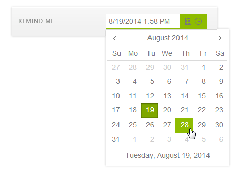
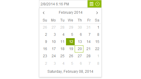
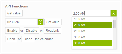
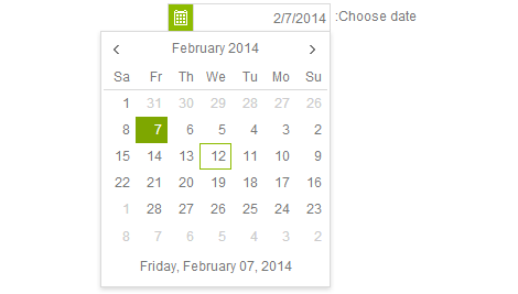
The ASP.NET Core DatePicker, TimePicker and DateTimePicker enable app users to select a date or time from a calendar, or to directly input a date on their own. The Date and Time Picker components support templates, configurable options for minimum and maximum date and time, start view and the depth of the navigation.
-
Floating Labels
Saving form space without losing the field context is a breeze with the floating label option in DatePicker and DateTimePicker components. Add a label that moves above the input upon clicking to create a smoother and more efficient end-user experience.

-
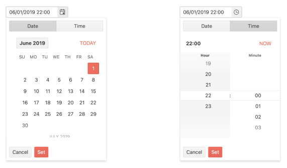
Adaptive Mode
Enable a mobile-friendly rendering of the DatePicker and DateTimePicker popups by setting the AdaptiveMode parameter to AdaptiveMode.Auto. The picker components automatically adapt to the current screen size and changes its rendering accordingly.
See the Telerik UI for ASP.NET Core DatePicker Adaptive Rendering Demo as an example
-
Start Time and End Time Configuration
The Telerik UI for ASP.NET Core DateTimePicker component enables effortless configuration of the start and end times of the TimeViewer. Easily set a time range and then apply it to all dates if the case requires so.
See the Telerik UI for ASP.NET Core DateTimePicker start and end times demo
-
Server- and Client-Side API for Max Flexibility
UI for ASP.NET Core comes with a complete server-side API. With simple API calls designed to feel natural in server-side languages, you can configure all features of the Telerik UI for ASP.NET Core Date and Time Pickers. Since the server wrappers output the JavaScript, you also have full access to the client-side API for maximum control in the browser.
As an example, you can validate user input both on the server and on the client and the control will display any provided validation messages.
-
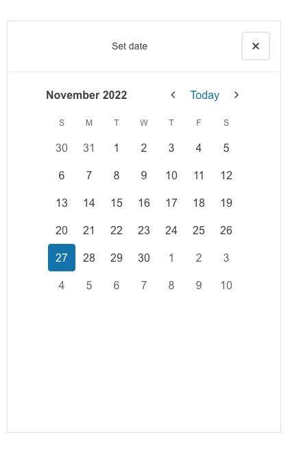
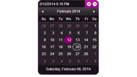
Modern Rendering
The visual quality of our controls is one of our highest priorities and we want to give you options to explore. That’s why we provide two separate rendering modes for the Telerik UI for ASP.NET Core Date and TimePickers. The secondary (modern) look can be activated by changing an attribute on the component.
-
Customization of DateInput Messages
Customizing the message placeholder for the date input in the DatePicker, TimePicker and DateTimePicker components has never been easier! You can now do it effortlessly using the Messages option in the DateInput UI component. Additionally, the component offers the .Format() option, allowing you to set the desired date format for parsing and formatting machine dates.
-
Declarative Initialization
Declarative initialization—a feature that serializes the component declaration as an MVVM declarative configuration instead of an inline initialization script—is supported in Telerik UI for ASP.NET Date and Time pickers. It is beneficial in cases when the Content Security Policy (CSP) is enabled as it eliminates the requirement to call the methods that defer the initialization script generated after the component's HTML markup.
See Telerik UI for ASP.NET Core DateTimePicker declarative initialization demo
-
Client and Server Validation
Implement the built-in server-side and client-side validation from ASP.NET Core. The Core date picker components will display any provided validation messages.
-
Right-to-Left (RTL) Support
Right out-of-the-box, the Telerik UI for ASP.NET Core DatePicker, TimePicker and DateTimePicker provide RTL support for languages such as Arabic and Hebrew. You can adjust for local preference by simply adjusting a few settings.
-
Works as you expect it to
By using Telerik UI for ASP.NET Core DatePicker, TimePicker or DateTimePicker, you gain the global benefits our library offers - Templates, Globalization and Keyboard Navigation.

-
Tag Helpers for ASP.NET Core DateTime Picker Component
the Telerik UI for ASP.NET Core Date Time Picker component can be completely declaratively configured with a HTML-like syntax using Tag Helpers - a system for enabling developers to lay out the components and their configuration in a simple and easy-to-read HTML-like declarative way.
-
Accessibility
Telerik UI for ASP.NET Core date and time pickers are compliant with Section 508 and WCAG guidelines, perfect for scenarios where accessibility is a concern.
To get more familiar with accessibility and its importance, check out our whitepaper focused on the topic to learn how accessibility affects your applications.
-
Edit Model Properties
The control offers edit templates for Model properties. It delivers an easy way to change fields relating to date and time by using the Telerik UI for ASP.NET Core components as the editors.