
UI for ASP.NET Core
ASP.NET Core Slider
- Use the ASP.NET Core Slider to allow users to easily select numerical values.
- Part of the Telerik UI for ASP.NET Core library along with 120+ professionally designed UI components.
- Includes support, documentation, demos, virtual classrooms, Visual Studio Code Extensions and more!
-
Overview
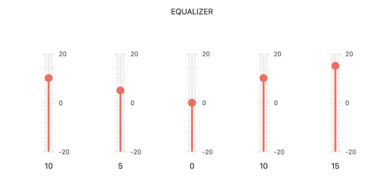
The Telerik UI for ASP.NET Core Slider component is an input control for selecting a numeric value. You can configure the value to increment in steps or match a certain set of criteria, such as being divisible by or greater than a number. The control is completely customizable in terms of appearance and offers flexible configuration options as orientation, ticks functionality, tooltips and more.
See the ASP.NET Core Slider in action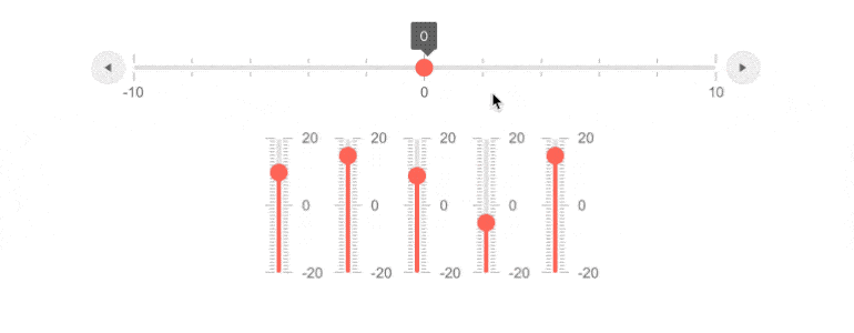
-
Orientation
The visual representation of the Slider component can be augmented for any specific scenario – it can stand horizontal or vertical with a switch of a setting. -
Tooltip
The tooltip of Telerik ASP.NET Core Slider enables the user to see the value of the slider's thumb while dragging it. Easily enable or disable the ToolTip in the Slider component in a single setting. -
HTML & Tag Helpers
Telerik UI for ASP.NET Core Slider offers two options for declaring UI components – through HTML or Tag Helpers. You can choose which approach to use based on preference, technology background or team development practice. Both HTML and Tag helpers allow you to lay out the Slider and its configuration with a simple and easy-to-read HTML-like or Razor syntax.
-
Flexible client-side API
The ASP.NET Core Slider provides a flexible client-side API allowing you to change all exposed properties, as well as instantiate a Slider control directly on the client.
Check the ASP.NET Core Slider API demo to learn more.
-
RTL Support
Right-to-left support is available for languages like Arabic and Hebrew, in which users read from right to left. You can satisfy any cultural preference with the ASP.NET Core Slider by toggling between left-to-right and right-to-left alignment with only a few settings.
See how RTL Support works in the ASP.NET Core Slider demo
-
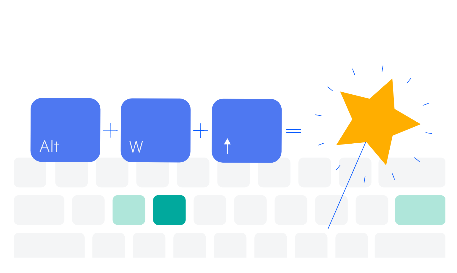
Keyboard Navigation
Users who prefer to use their mouse as little as possible would appreciate the built-in keyboard support for the Slider. The component is fit to be navigated with only a keyboard by several key bindings:
-
Arrows move the value in the corresponding direction
-
PageUp/PageDown move the value using a larger step
-
Home/End immediately maximizes/minimizes the given value with its defaults
-
