
UI for ASP.NET Core
ASP.NET Core TreeView
- Use the ASP.NET Core TreeView component to visualize hierarchical data in a tree-like structure.
- Part of the Telerik UI for ASP.NET Core library along with 120+ professionally designed UI components.
- Includes support, documentation, demos, virtual classrooms, Visual Studio Code Extensions and more!
-
Display Data in a Tree-Like Structure
The Telerik UI for ASP.NET Core TreeView component lets you display hierarchical data in a tree structure. It allows single or multiple item selection, drag and drop of elements within the component and comes with built-in checkbox support, keyboard navigation, RTL support and templates for complete customization. You can bind the TreeView to various data sources and utilize its load on demand feature.
See the ASP.NET Core TreeView in action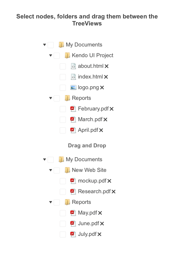
-
Data Binding
The TreeView can be bound in two ways:
- Locally on the server by passing the appropriate collection to the BindTo() method.
- Remotely by using a DataSource configuration object.

-
Images and Sprites
For a more intuitive user experience, the TreeView component allows you to add images or sprites in front of each item in the TreeView hierarchy. This lets you customize the look of the control to fit your customer’s design requirements.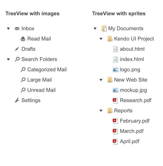
-
Animation Effects
Couple of animation effects can be applied to the component. You can choose to enable either the Toggle or Expand animation.
Explore the ASP.NET Core TreeView Animation Effects -
Checkboxes
The built-in checkbox support enables your TreeView nodes to come with their own checkbox elements to indicate selection—without the need to create a customized template. You can define the Checkboxes configuration option by either using a Boolean value or by using inner (detailed) configuration options.
Check out the documentation on Checkbox configuration options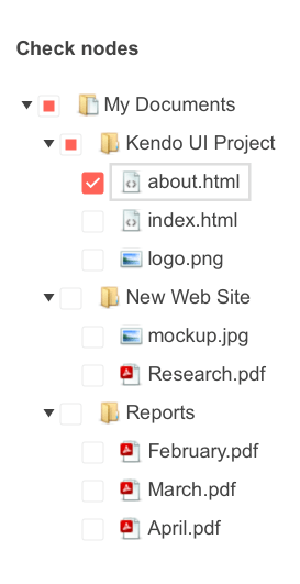
-
Events
There are multiple exposed TreeView events that let you control the programming logic for all interactions related to the TreeView, including selection, expanding, collapsing, loading, dragging and more.

-
Drag and Drop
The component comes with a drag and drop feature that can be enabled by setting the DragAndDrop parameter to true. This allows users to easily drag and drop items within the TreeView, changing their position in the hierarchy. Users can also drag and drop items between different TreeView components.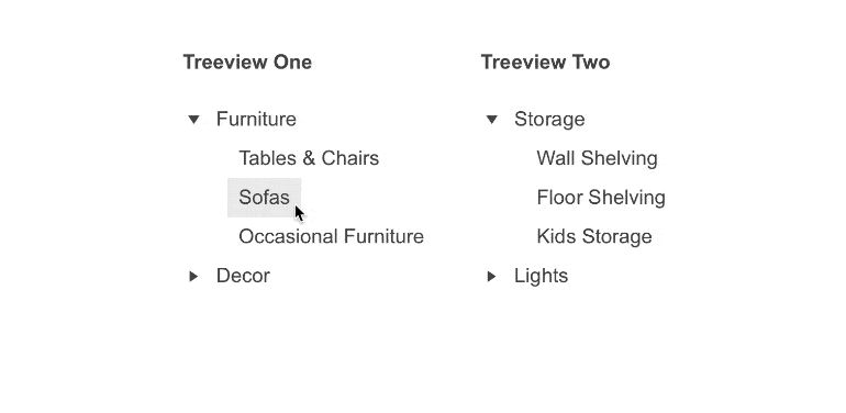
-
Templates
Completely redefine the look and feel of a standard TreeView node with custom templates. You can provide a unique appearance for each node, giving you full control of your interface.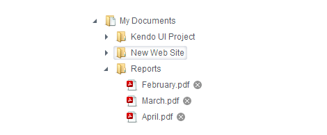
-
Server- and Client-Side API for Extra Flexibility
Telerik UI for ASP.NET Core comes with a complete server-side API. With simple API calls, you can configure all features of the ASP.NET Core TreeView. Since the server wrappers output the JavaScript, you also have full access to the client-side API for maximum control in the browser.
-
RTL Support
Right-to-left support is available for language scripts like Hebrew and Arabic, in which users read from right to left. You can satisfy any cultural preference with the TreeView component by toggling between left-to-right and right-to-left alignment with only a few settings. -
Load on Demand
Load the TreeView data only as it is needed and not all at once. Thanks to the lazy loading feature, you can increase performance by configuring child nodes to get loaded on demand only when a parent node is expanded. -
Accessibility
Rest assured that the Telerik ASP.NET Core TreeView is compliant with Section 508 and WCAG guidelines—perfect for scenarios where accessibility is a large concern.
-
Keyboard Navigation
As many other components in the Telerik UI for ASP.NET Core suite, the TreeView features out-of-the-box support for keyboard navigation. Users can press the arrows to navigate through the component, highlighting different items, and use the enter button to select the highlighted item. For a full list of supported keys and user actions, visit this demo.
Explore all supported keys and user actions in the TreeView Keyboard Navigation demo
-
TreeView Theming
The ASP.NET Core TreeView has several built-in themes, such as Material (based on the Material Design guidelines), Bootstrap, Default (our own style) and Fluent. You can easily customize any of the out-of-the-box themes with a few lines of CSS or create a new theme to match your colors and branding, using the Progress ThemeBuilder application.
-
Also Available...
The TreeView component is also available for these popular Web frameworks:
