
UI for ASP.NET Core
ASP.NET Core MultiColumn ComboBox
- The ASP.NET Core MultiColumnComboBox lets users display large sets of data in a grid-like table within a drop-down.
- Part of the Telerik UI for ASP.NET Core library along with 120+ professionally designed UI components.
- Includes support, documentation, demos, virtual classrooms, Visual Studio Code Extensions and more!
-
Overview
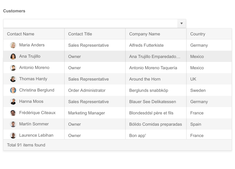
The MultiColumnComboBox is a component that displays large sets of data in a grid-like table providing additional data values for each individual item. The control comes with a lot of features and functionalities such as filtering, virtualization, grouping, templates, cascading MultiColumnComboBoxes and more, to ensure execution of all possible scenarios.
-
Data Binding
The ASP.NET Core MultiColumnComboBox supports various data binding options, such as:

-
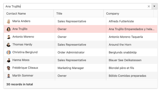
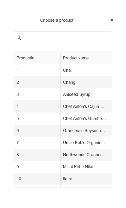
Filtering
The MultiColumnComboBox provides Client and Server Filtering as some of its many features. Filtering makes usage of this component easier, since it narrows down the items that you are looking for by typing a fraction or the whole key word in the placeholder. It then displays all related information to this item from the dropdown grid-like table.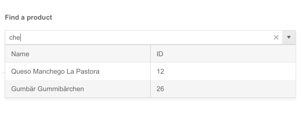
-
Virtualization
Virtualization is another feature that the MultiColumnComboBox supports. It allows you to display a fixed number of items from a large set of data and scroll to see the rest of the existing rows in the same format. Virtualization helps you implement heavy-data scenarios seamlessly. Configure the desired view and number of items to be shown at once and set the specific width of your grid columns for smoother user experience.
See how Virtualization works in ASP.NET Core MultiColumnComboBox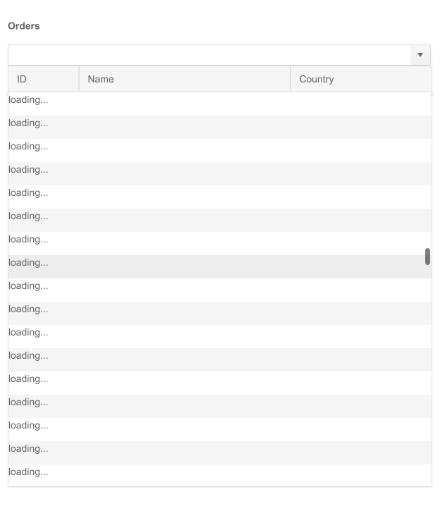
-
Grouping
The MultiColumnComboBox also supports grouping of items. Depending on how you want to categorize them, you can showcase the relevant data under a specific group. When you define the grouping option, the items will automatically be re-arranged.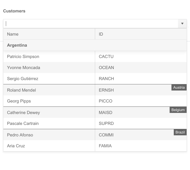
-
Floating Label
Providing a smoother and more efficient end-user experience is available to you with the MultiColumnComboBox floating label feature. It allows you to add a label that moves above the input field upon clicking, saving space and retaining the context of the form field.
See the ASP.NET Core MultiColumnComboBox Floating Label demo

-
Adaptive Mode
The MultiColumnComboBox adaptive mode enables a mobile-friendly rendering of its suggestion list popup. Simply set the AdaptiveMode parameter to AdaptiveMode.Auto and this will trigger the component to automatically adapt to the current screen size and will change its rendering accordingly. In auto adaptive mode, the MultiColumnComboBox component also allows you to define the title text rendered in the header of the popup.
See the Telerik UI for ASP.NET Core MultiColumnComboBox adaptive rendering demo
-
Templates
You can customize the content within the MultiColumnComboBox layout by using one of the three templating options - Column, Header and Footer Template. In addition to text and numbers, you are also able to visualize images, icons, and other elements in the grid-like table for a full control and customized data look.
See Demo on ASP.NET Core MultiColumnComboBox Templates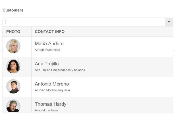
-
Cascading MultiColumnComboBoxes
Another functionality the component provides is initializing cascading MultiColumnComboBoxes. Those represent two or more MultiColumnComboBoxes and each one is filtered based on the selected item in the previous one. The child is enabled only after a value is selected in the parent MultiColumnComboBox and shows filtered options according to that value.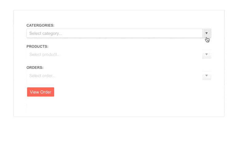
-
RTL Support
The MultiColumnComboBox is also made to be accessible for users who communicate with right-to-left languages. The RTL support allows for the component to handle usage and adapt its layout to ensure a better user experience for people who read starting from right to left such as Arabic or Hebrew.
-
Keyboard Navigation
As most of our Telerik UI for ASP.NET Core components, the MultiColumnComboBox is supported with Keyboard Navigation which allows you to navigate through it without using your mouse. Check out our demo page to see how you can open/close the popups, highlight items, scroll, and select values with the intuitive keyboard shortcuts.
-
Razor Pages
The MultiColumnComboBox is one of the many Telerik UI for ASP.NET Core controls that are supported in both MVC and Razor Pages applications. In the Razor Page scenario, you can set up the MultiColumnComboBox component bindings through configuring the CRUD (Create, Read, Update, Delete) methods of its DataSource instance. To learn more about plugging ASP.NET Core components in Razor Pages, check out the documentation article or visit the Razor Pages examples in our GitHub project repository.
