UI for ASP.NET Core
ASP.NET Core Circular Progress Bar
- Leverage the ASP.NET Core Circular Progress Bar component to show progress on a circular gauge.
- Part of the Telerik UI for ASP.NET Core library along with 120+ professionally designed UI components.
- Includes support, documentation, demos, virtual classrooms, Visual Studio Code Extensions and more!

-
Overview
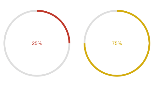
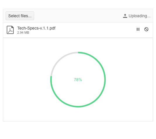
The Telerik UI for ASP.NET Core CircularProgressBar component is a type of progress bar meant to display the progress of an operation in a circular shape. It includes a color feature, an option to visualize infinite progress and the ability to render custom content in its center.
See the ASP.NET Core CircularProgressBar demo
-
Indeterminate Progress
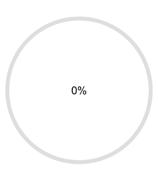
If the app cannot accurately compute the progress that should be displayed, you can take advantage of the indeterminate mode of the CircularProgressBar. In case the estimated time for completing a task is unknown or the progress cannot be represented as a physical value, the indeterminate mode will show an infinite animation until the task has finished.

-
Template
The content at the center of the CircularProgressBar component can be set to display a custom text or an HTML element.
-
Loader Colors
The loading indicator of the CircularProgressBar can be customized with colors that match the task progress. You can specify a list of colors and the component will blend them in as it loads further and further.