UI for ASP.NET Core
ASP.NET Core Timeline
- Visualize a list of events in chronological order with the Telerik UI for ASP.NET Core Timeline control.
- Part of the Telerik UI for ASP.NET Core library along with 120+ professionally designed UI components.
- Includes support, documentation, demos, virtual classrooms, Visual Studio Code Extensions and more!

-
Overview
Displaying your company’s history or the set of events that lead to your most recent product success is easy and simple with the Telerik UI for ASP.NET Core Timeline control. The widget allows for portraying a list of events in chronological order on either the vertical or the horizontal axis.
Check out the ASP.NET Core Timeline demo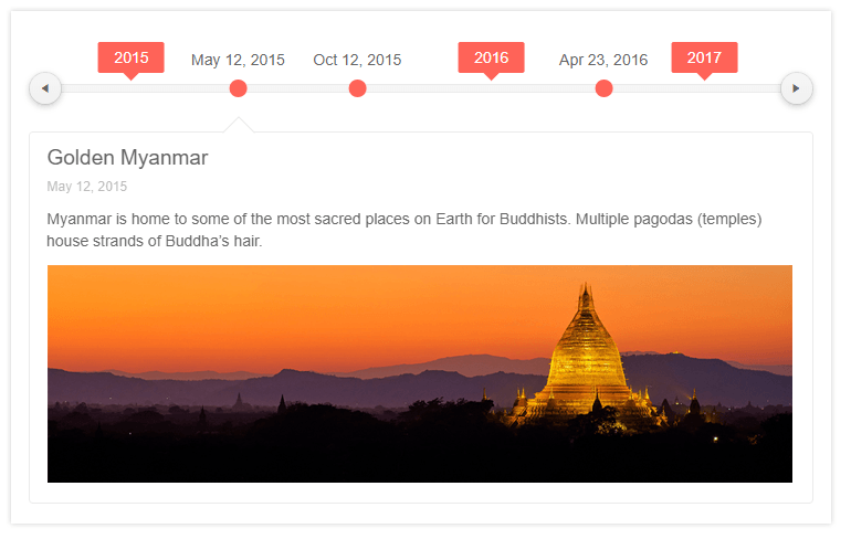
-
DataBound Component
The Timeline is a databound component, allowing you to consume data from various endpoints, such as odata or webapi. To learn more about binding the Telerik UI for ASP.NET Core Timeline component to data, visit our documentation.

-
Orientation and Rendering
The Timeline can be rendered vertically or horizontally. In horizontal mode, you can enable or disable scrolling. In vertical mode you can mark events as collapsible and you get to choose on which side of the timeline axis to visualize any particular event.
Explore the Timeline Horizontal Mode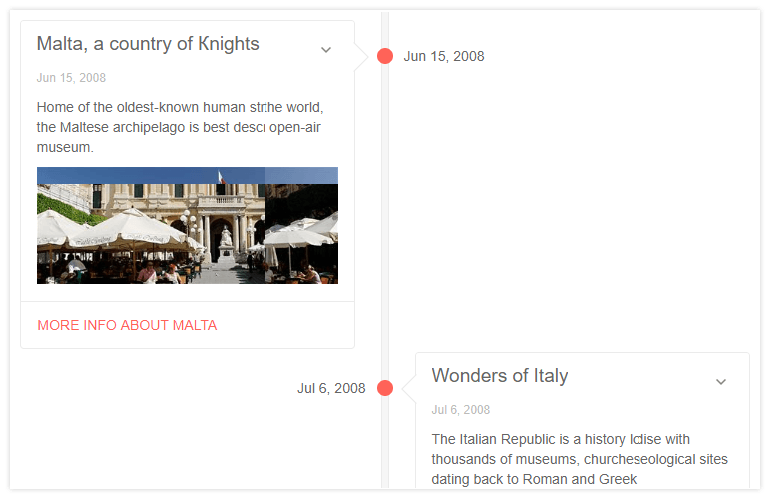
-
Event Templates
Each event in the Timeline is rendered through the Card component. This means you can define templates for them. Place any images, buttons, links or whatever is needed to best describe the event.
-
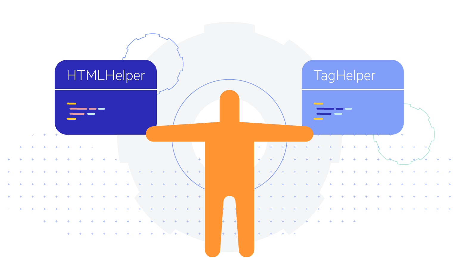
Tag Helper
The Timeline component is offered as a Tag Helper which provides an alternative way to utilize it.
-
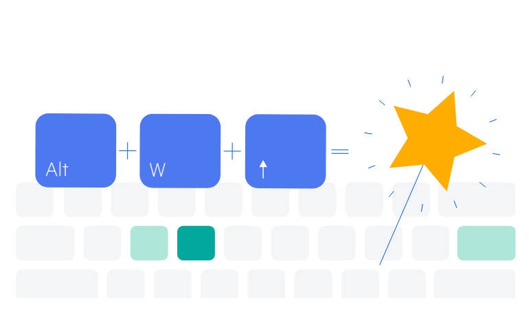
Keyboard Navigation
The Timeline component supports several key bindings to make navigation smoother. In vertical mode, use Tab/Shift+Tab to navigate between active cards or Space/Enter to expand or collapse the currently selected card.