
Telerik UI for ASP.NET Core
What's New
What's New HistoryASP.NET Core Smart Grid: Semantic Search Built into a SmartBox
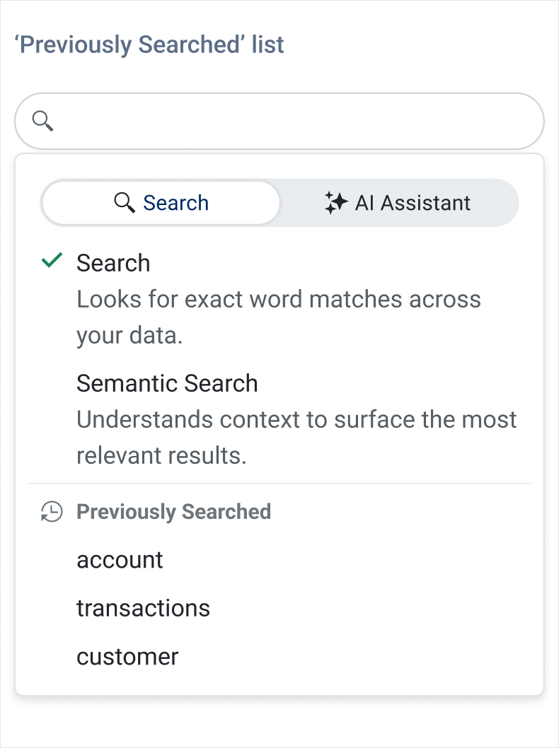
The Telerik UI for ASP.NET Core DataGrid introduces AI Semantic Search – a meaning‑based way to find what you need, even when keywords don’t match exactly. Instead of relying on exact text, Semantic Search understands intent and context, surfacing the most relevant rows across columns and related fields. It’s ideal for large datasets where users might not know the precise terms or spelling.
Complementing this, the new AI Smart Box provides a single, streamlined place to run Semantic Search and ask AI‑assisted questions. Users can search by meaning, then immediately refine, filter, or ask follow‑up questions within the same interface.
ASP.NET Core SmartPasteButton: Effortless Input Filling
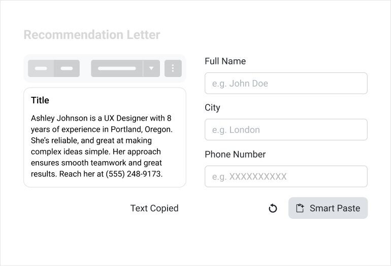
The new Telerik UI for ASP.NET Core SmartPasteButton lets users paste unstructured text, e.g. an email signature, message, or snippet, and convert it into structured data. The component sends the pasted content to an AI service, interprets the information, and automatically fills in the matching input fields. This eliminates repetitive copy‑and‑paste steps and makes data entry faster, cleaner, and more intuitive.
See the Telerik UI for ASP.NET Core SmartPasteButton demo
ASP.NET Core PromptBox: Improved Prompt Input Experience
The new Telerik UI for ASP.NET Core PromptBox component provides a dedicated input area for composing and sending prompts to AI models. It adapts to different prompt lengths with flexible sizing options and supports file attachments, speech-to-text button and input adornments, making it easy to build rich, conversational AI experiences.
See the Telerik UI for ASP.NET Core PromptBox demo

Refined ASP.NET Core Chat for a Cleaner, More Intuitive UI
The Telerik UI for ASP.NET Core Chat component receives a series of visual and usability enhancements that make chat conversations clearer, more polished, and easier to follow. Message metadata now aligns cleanly on a single line with status indicators, and the header has been modernized by replacing the AppBar with the Toolbar component for a more consistent look and feel. The Chat also adopts the new PromptBox control for a richer prompt‑input experience, while attachment menus and download buttons have been refined with a smaller visual footprint. Pinned messages now stay sticky for better visibility, and suggestion lists introduce new scroll buttons with gradient styling for smoother browsing.
See the Telerik UI for ASP.NET Core Chat revamped demo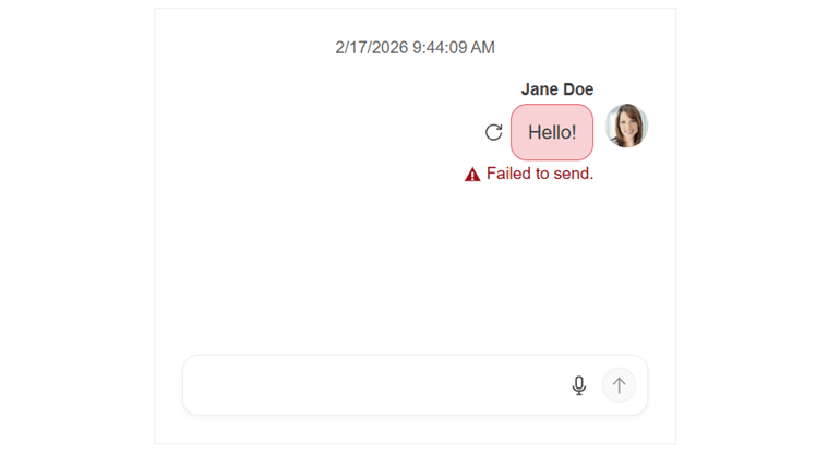
ASP.NET Core Smart Grid – AI Chat Integration
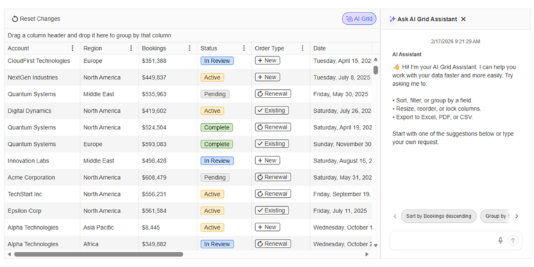
The Telerik UI for ASP.NET Core Grid now integrates seamlessly with the ASP.NET Core AI Chat capabilities, giving users a conversational way to explore and interact with Grid data. Instead of relying on manual filtering and navigation only, users can ask natural‑language questions that the Chat Assistant interprets using the Grid’s schema, context, and current view. This makes data discovery faster, more intuitive, and accessible even to users who are unfamiliar with the underlying structure of the dataset.
See the Telerik UI for ASP.NET Core Grid-Chat integration demo
More Precise Diagramming in Telerik UI for ASP.NET Core
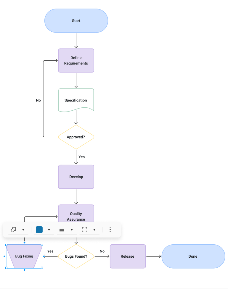
The Diagram now offers more interactive editing experience with connector text, tooltips, and improved connection handling through larger grab points, resizable segments, and better snapping. Users also benefit from dynamic scrollbars, full keyboard navigation, and resizable shapes, making diagram creation smoother and more flexible than ever.
See the Telerik UI for ASP.NET Core Diagram revamped demo
Document Processing Libraries 2026 Q1 Enhancements
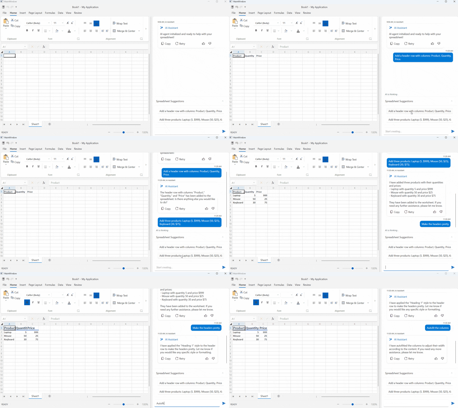
- [Preview] Agentic tools: Build intelligent document processing workflows with ease. The DPL Agentic Tools let users extract structured data, edit content, convert formats, generate new Excel or PDF files and perform analysis on Excel documents directly inside your .NET app with no separate services required.
- Core enhancements: New MIME type support for embedded files allows you to explicitly define how attachments like XML, JSON, or CSV payloads are represented inside PDFs, while automatic file‑format detection makes it easier to load documents from byte arrays. Compliance is further improved through EU DSS‑aligned digital signing, ensuring PDFs meet official European Commission validation standards. Additionally, Timestamp Server support in PdfStreamSigner enables trusted, verifiable timestamps for long‑term signature validity.
Telerik UI for ASP.NET Core - 2026 Q1
- ASP.NET Core Smart Grid: Semantic Search Built into a SmartBox
- ASP.NET Core SmartPasteButton: Effortless Input Filling
- ASP.NET Core PromptBox: Improved Prompt Input Experience
- Refined ASP.NET Core Chat for a Cleaner, More Intuitive UI
- ASP.NET Core Smart Grid – AI Chat Integration
- More Precise Diagramming in Telerik UI for ASP.NET Core
- Document Processing Libraries 2026 Q1 Enhancements
New features & Roadmap
Have a feature request?
Post your feedback via the ASP.NET Core UserVoice portal or the Public forums
What's new across all Telerik products?

Next Steps
See Telerik UI for ASP.NET Core in action and check out how much it can do out-of-the-box.
Check out the offers. Purchase an individual suite, or treat yourself to one of our bundles.
Try Telerik UI for ASP.NET Core with dedicated technical support.

