UI for ASP.NET Core
ASP.NET Core DropDownTree
- Display hierarchical data in a tree-like structure with the ASP.NET Core DropDownTree.
- Part of the Telerik UI for ASP.NET Core library along with 120+ professionally designed UI components.
- Includes support, documentation, demos, virtual classrooms, Visual Studio Code Extensions and more!
-
Overview
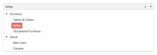
The ASP.NET Core DropDownTree component takes the best of the TreeView and the DropDown and represents hierarchical data in a tree-like structure with options to select multiple items and render custom nodes. You can use the built-in features to add images or checkboxes to your DropDownTree items as well as bind to local or remote data.
See the ASP.NET Core DropDownTree in action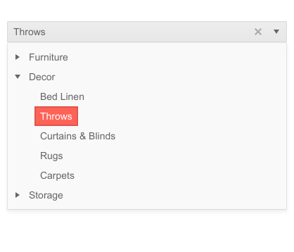
-
Data Binding
You can insert data into the UI component by declaring all items within the HTML helper. However, you can also use the data-binding approach to local data – on the server, or remote data – through the DataSource configuration object.
-
Images
Choose how to display your DropDownTree items and include visuals in addition to or instead of just text. You have the option to customize the look and feel of your data by inserting images or sprites next to the text elements.
See how Images work in ASP.NET Core DropDownTree Demo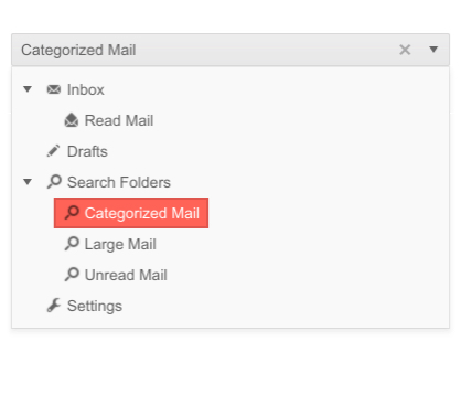
-
Checkboxes
The DropDownTree also supports a checkbox functionality as another way to select one or multiple items from the dropdown menu. It offers a few configuration options - you can define it through a Boolean value, through inner detailed options defining a Name attribute, or by using a Template option that requires defining a script for rendering the checkboxes. The component also supports checkboxes in indeterminate state. Refer to our documentation page to find more about the Checkbox functionality.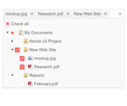
-
Floating Label
Save space without losing the context of your form fields with the DropDownTree floating label feature. Ensure a smoother and more efficient end-user experience by adding a label that slides above the input field upon clicking.
-
Adaptive Mode
The DropDownTree adaptive mode enables a mobile-friendly rendering of its suggestion list popup. Simply set the AdaptiveMode parameter to AdaptiveMode.Auto – this will trigger the picker component to automatically adapt to the current screen size and will change its rendering accordingly.
See the Telerik UI for ASP.NET Core DropDownTree Adaptive Rendering Demo
-
Templates
Choose from the five templating options - Item, Value, Header, Footer or No-Data Template, for having a full control over the way a node, a selected value, a pop-up header, or footer is rendered in the DropDownTree component.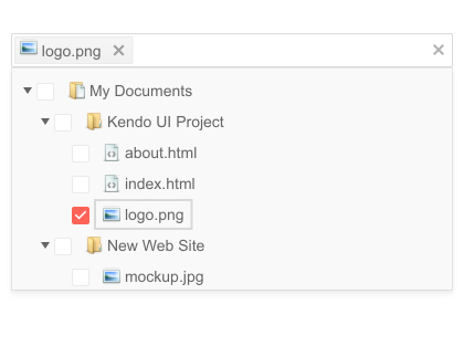
-
Declarative Initialization
Declarative initialization—a feature that serializes the component declaration as an MVVM declarative configuration instead of an inline initialization script—is supported in Telerik UI for ASP.NET Core DropDownTree. It is beneficial in cases when the Content Security Policy (CSP) is enabled as it eliminates the requirement to call the methods that defer the initialization script generated after the component's HTML markup.
See Telerik UI for ASP.NET Core DropDownTree declarative initialization demo
-
HTML and Tag Helpers
Initialize the DropDownTree component by using HTML-like syntax through HTML or Tag helpers. The Telerik UI for ASP.NET Core provides the two approaches, and you can choose the more convenient way to add the control based on your development preference, practice and technology background.
-
RTL Support
As most of our Telerik components, the DropDownTree offers RTL support for users who communicate in right-to-left languages such as Arabic, Hebrew, Chinese, or Japanese.
See how RTL Support works in ASP.NET Core DropDownTree Demo
-
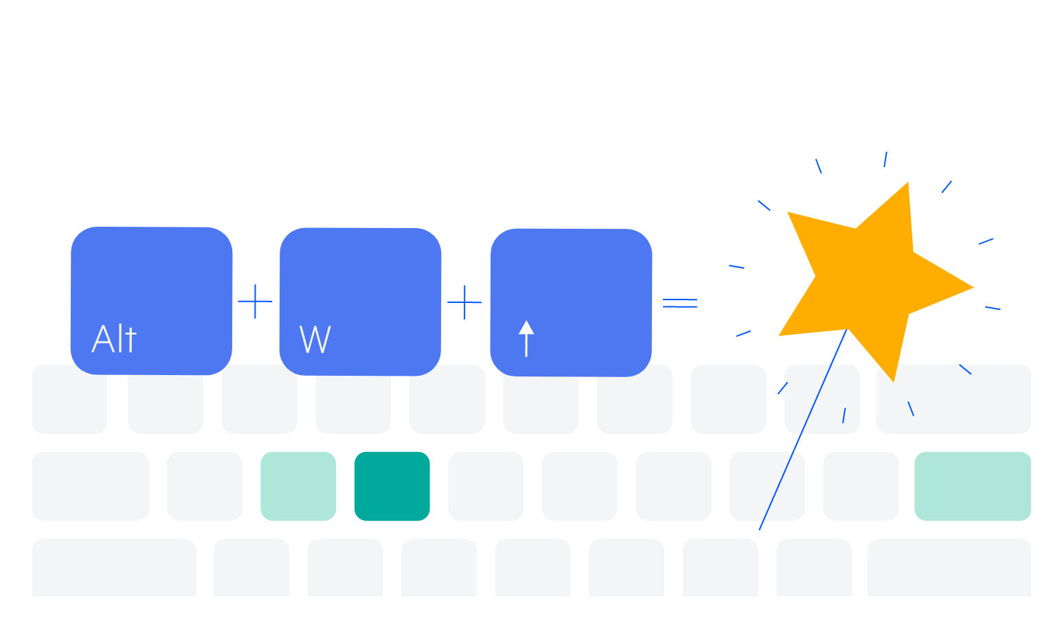
Keyboard Navigation
The DropDownTree is made to be accessible for all users and that is why, it supports Keyboard Navigation. Refer to our demo page for detailed information on how to open/close the popups and navigate inside the tree with the intuitive keyboard shortcuts.