UI for ASP.NET Core
ASP.NET Core Stepper
- Use the ASP.NET Core Stepper component to split complex actions like purchases into smaller steps.
- Part of the Telerik UI for ASP.NET Core library along with 120+ professionally designed UI components.
- Includes support, documentation, demos, virtual classrooms, Visual Studio Code Extensions and more!

-
Overview
The Stepper in Telerik UI for ASP.NET Core is a control that helps you split complicated interactions on your web application in several steps so to not overwhelm the user with fields and forms. A well-placed Stepper can significantly reduce cognitive burden when the user is required to do a bunch of work at once. For example, they might be going through the steps of purchasing a product and need to confirm their cart’s content, confirm their billing address and then pay via a third-party service. The Stepper is invaluable when it comes to simplifying navigation.
Check out the ASP.NET Core Stepper demo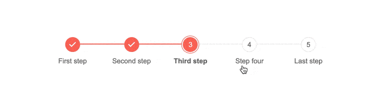
-
Operation Models
A badly designed stepper would force the user to always complete every step before advancing to the next. With Telerik UI for ASP.NET Core’s Stepper, you get to
- Mark steps as optional
- Allow the user to go back to a previous step or skip several steps at once and fill them later
- Display errors and warnings about incorrectly filled in data directly in the stepper
-
Orientation, Layout and Customization
Like our other controls, the Stepper is highly customizable. You can pick whether the stepper is oriented horizontally or vertically. Each step’s label can be aligned with the step number or offset next to it. Icons, fonts and colors can all be changed to merge the stepper with your application’s theme.

-
Keyboard Navigation and Accessibility
Controls come in all shapes and sizes but so do users. It’s crucial that each of them can interact with the Stepper, so it is designed to work without a mouse with intuitive keyboard shortcuts (like arrows for previous/next steps and HOME/END for first/last). It can go right-to-left so it feels natural to RTL language speakers and provides ARIA attributes which makes it accessible to screen readers.
See how keyboard navigation works in the ASP.NET Core Stepper