
UI for ASP.NET Core
ASP.NET Core AutoComplete
- Flexible and intuitive ASP.NET Core AutoComplete component for input-based suggestions.
- Part of the Telerik UI for ASP.NET Core library along with 120+ professionally designed UI components.
- Includes support, documentation, demos, virtual classrooms, Visual Studio Code Extensions and more!

-
Overview
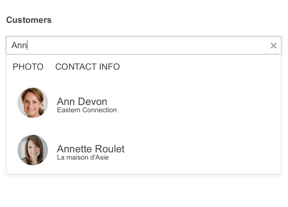
The ASP.NET Core AutoComplete component is a textbox that provides suggestions based on the text typed by the user. The full-featured UI component can be bound to data and comes with multiple built-in features, such as server or client filtering, grouping and keyboard navigation. It can be customized by using templates and you change its appearance by applying one of the 20+ available themes.
See the ASP.NET Core AutoComplete demo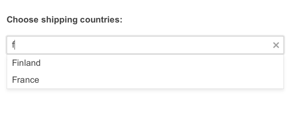
-
Data Binding
There are several ways to bind the AutoComplete component to data:
- AJAX binding
- Server binding
- Custom data binding
- Model binding - Local data or Remote data

-
Events
The ASP.NET Core AutoComplete component exposes a variety of events OnSearch. Some of the available events include open, close, filter, change, group and others. For a full list of the supported events, visit the component documentation.
-
Grouping
To let users easily navigate through long lists of options, the AutoComplete component comes with built-in grouping functionality. It can be enabled through the GroupField parameter.
See the ASP.NET Core AutoComplete Grouping demo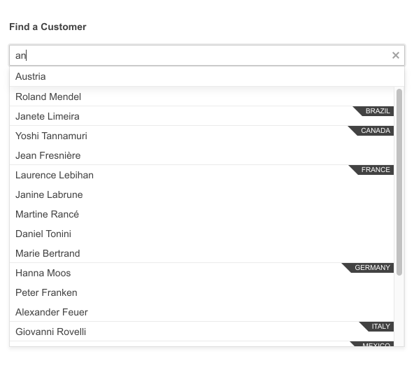
-
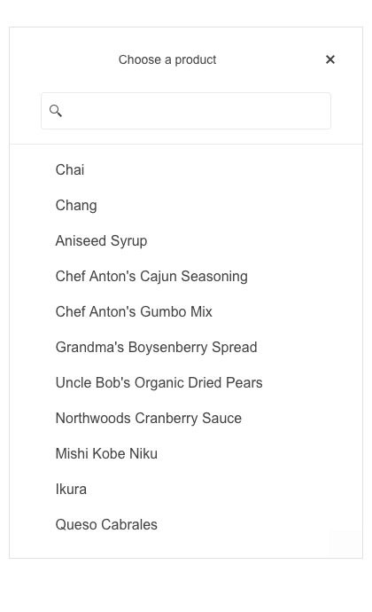
AutoComplete Virtualization
The component supports virtualization, which comes in handy with large datasets. The AutoComplete renders a fixed number of items at first and, when scrolled, takes the rest of the items and displays them in the same format.
-
Adaptive Mode
Enable a mobile-friendly rendering of the AutoComplete suggestion list popup by simply setting the AdaptiveMode parameter to AdaptiveMode.Auto. The picker component automatically adapts to the current screen size and changes its rendering accordingly.
See the Telerik UI for ASP.NET Core AutoComplete Adaptive Rendering Demo
-
Floating Label
Create smoother and more efficient end-user experiences with the AutoComplete floating label feature. The floating label moves above the input field when it is focused, saving space and retaining the context of the required field input.

-
Templates
The AutoComplete component and the rendering of its items can be easily customized by using one of the following templating options:
- Item Template manages the way the list items of the component are rendered; thus, lets you customize their appearance.
- Header Template lets you customize the popup header.
- Footer Template manages the way the popup is rendered. The footer is re-rendered on every change of the Data Source.
-
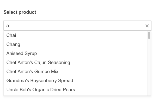
Server and Client Filtering
Leverage the various modes of filtering, both on the server and client-side of your Core application. These filter modes can include starts with or contains, and can customize how and when the results are displayed.
-
Razor Pages
The AutoComplete is one of the many Telerik UI for ASP.NET Core controls that are supported in both MVC and Razor Pages applications. To view the complete list of Telerik components that you can plug in ASP.NET Core Razor Pages projects, check out the documentation article or visit the Razor Pages examples in our GitHub project repository. -
HTML and Tag Helpers
Telerik UI for ASP.NET Core provides two ways for you to declare UI components—by using HTML or Tag helpers. You can choose either of these approaches to help you implement the AutoComplete component in your project.

-
Declarative Initialization
Declarative initialization—a feature that serializes the component declaration as an MVVM declarative configuration instead of an inline initialization script—is supported in Telerik UI for ASP.NET AutoComplete. It is beneficial in cases when the Content Security Policy (CSP) is enabled as it eliminates the requirement to call the methods that defer the initialization script generated after the component's HTML markup.
See Telerik UI for ASP.NET Core AutoComplete declarative initialization demo
-
RTL Support
The Telerik UI for ASP.NET Core AutoComplete component supports right-to-left configuration. The RTL functionality is supported my most of our components to accommodate users who communicate in a right-to-left language script, such as Arabic and Hebrew.
-
Accessibility
The ASP.NET Core AutoComplete component is compliant with Section 508 and WCAG guidelines, thus it can satisfy the needs of all users.
-
Keyboard Navigation
The AutoComplete is one of the many components in the Telerik UI for ASP.NET Core suite with keyboard navigation support. You can use the up and down arrows to highlight the previous or next item in the list, press enter to select the highlighted item or use page up/page down to scroll further through the list.
See the ASP.NET Core AutoComplete Keyboard Navigation demo
-
Theming
The AutoComplete component has 20+ built-in themes from which you can choose. If neither fits your needs, you can easily customize any out-of-the-box theme with a few lines of CSS or you create new themes using the Telerik SASS ThemeBuilder application.
