
UI for ASP.NET Core
ASP.NET Core DateInput
- Leverage the Telerik UI for ASP.NET Core DateInput component to enter date and time values.
- Part of the Telerik UI for ASP.NET Core library along with 120+ professionally designed UI components.
- Includes support, documentation, demos, virtual classrooms, Visual Studio Code Extensions and more!
-
Overview
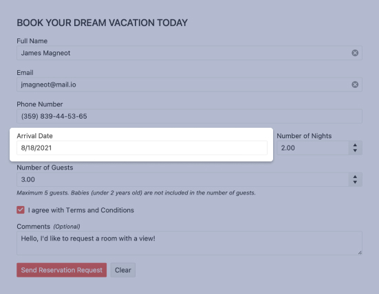
The DateInput widget represents an HTML input field that recognizes and formats values commonly used for date selection or scheduling. The component provides separate sections for days, months, years, hours, and minutes.
See the ASP.NET Core DateInput in action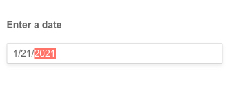
-
Floating Label
Saving space without losing the context of the form field is a breeze with the ASP.NET Core DateInput floating label. Ensure a smoother and more efficient experience for end-users by adding a label that moves above the input upon clicking.

-
HTML and Tag Helpers
The Telerik UI for ASP.NET Core offers two approaches to declare the DateInput or any other component – choose HTML or Tag helpers based on your preference, practice and technology background, and add this advanced input element to any new or existing form.

-
DateInput Integration
You can seamlessly use DateInput with other controls such as DatePicker, TimePicker and DateTimePicker. To achieve this behavior, you should enable the DateInput property of the respective component. Find out how to integrate it with the DatePicker control from this documentation article.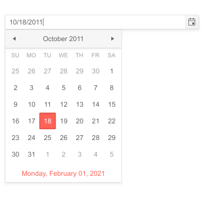
-
Date Editing
Leverage the date editing options in the Telerik UI for ASP.NET Core DateInput to easily configure the behavior of the component while editing the date. These configuration options include:
- AutoSwitchParts results in automatic move to the next segment after a valid value is entered.
- AutoSwitchKeys configures a custom key that triggers the move to the next segment.
- EnableMouseWheel increases or decreases segment values with the use of a mouse wheel.
- AutoCorrect automatically corrects the value if it is out of range.
- Steps configures the steps for incrementing and decrementing the various available date segments.

-
Declarative Initialization
Declarative initialization—a feature that serializes the component declaration as an MVVM declarative configuration instead of an inline initialization script—is supported in Telerik UI for ASP.NET Core DateInput. It is beneficial in cases when the Content Security Policy (CSP) is enabled as it eliminates the requirement to call the methods that defer the initialization script generated after the component's HTML markup.
See Telerik UI for ASP.NET Core DateInput declarative initialization demo
-
Globalization
The DateInput UI component is designed to work and be used in multiple cultures. Through Globalization you can set the culture and the correct date formats will be inherited from it, adjusting the input data.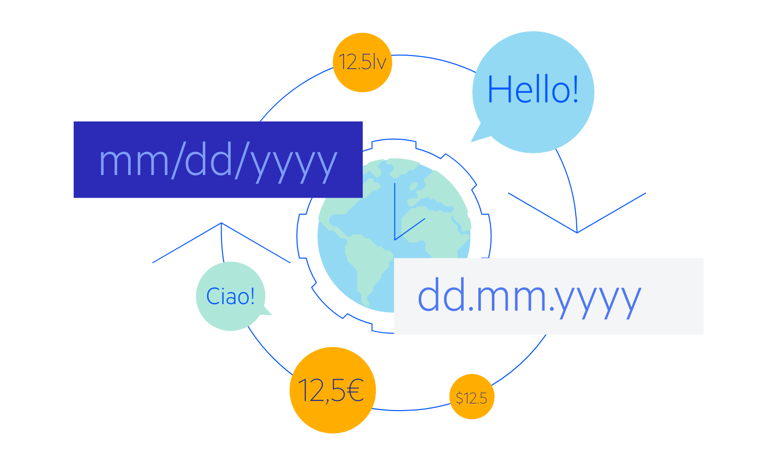
-
RTL Support
The DateInput also supports the RTL functionality and adapts its layout to ensure better user experience for users who communicate through right-to-left languages.
See how RTL Support works in the ASP.NET Core DateInput Demo
-
Keyboard Navigation
As most of the Telerik UI for ASP.NET Core components, the DateInput supports Keyboard Navigation. Check out our demo page and find out how you can open the popup, highlight parts, clear, increase and decrease dates by using just your keyboard.
All ASP.NET Core Components
Data Management
- Grid
- Filter
- ListView
- Pager
- PivotGrid
- PivotGrid v.2
- PropertyGrid
- Rating
- Spreadsheet
- TaskBoard
- TreeList
Scheduling
Editors
- AutoComplete
- Captcha
- CheckBoxGroup
- Color Picker
- ColorGradient
- ColorPalette
- ComboBox
- Date & Time Pickers
- DateInput
- DateRangePicker
- DropDownList Updated
- DropDownTree
- Editor
- FlatColorPicker
- Image Editor
- ListBox
- MaskedTextBox
- MultiColumnComboBox
- MultiSelect
- Numeric TextBox
- OTP Input
- RadioGroup
- Signature
- Switch
- TextArea
- TextBox
- TimeDurationPicker
- TimePicker
Navigation
Data Visualization
Layout
- Avatar
- Badge
- Dialog
- DockManager
- Form
- GridLayout
- Notification
- Popover
- Responsive Panel
- Splitter
- StackLayout
- TileLayout
- Tooltip
- Window
- Wizard
File Upload & Management
Interactivity & UX
- Chat (Conversational UI)
- Circular Progress Bar
- Loader
- Progress Bar
- Ripple
- Skeleton Container
- Slider
- Sortable
- Template
Productivity Tools
Media
Geo Visualization
Document Processing
MVC & Razor Pages
