
UI for ASP.NET Core
ASP.NET Core Button Group
- Use the ASP.NET Core Button Group to add a series of buttons together on a single line in your application.
- Part of the Telerik UI for ASP.NET Core library along with 120+ professionally designed UI components.
- Includes support, documentation, demos, virtual classrooms, Visual Studio Code Extensions and more!

-
Overview
The Telerik UI for ASP.NET Core ButtonGroup component allows you to add a series of buttons, usually performing similar actions, in a single line. It can be easily customized by adding badges, icons, choosing between single and multiple selection, and enabling or disabling the buttons. The control comes with out-of-the-box support for keyboard navigation, RTL, and globalization.
-
Badges and Icons
You can easily customize the ButtonGroup component by adding custom badges, text and icons. Make any combination of the three to tailor the component to your project’s style.

-
Disabled ButtonGroup
There may be cases when you need to prevent the users from clicking any button, that is why the ButtonGroup provides options for setting its enabled and disabled state.
-
Selection
The ButtonGroup component allows single and multiple selection. For cases when you want the user to select only one button you can restrict multiple selection by changing the Selection() property to “single”.
Check out the ButtonGroup Selection demo
-
HTML and Tag Helpers
The Telerik UI for ASP.NET Core suite offers two approaches to declare the ButtonGroup or any other component – choose HTML or Tag helpers based on your preference, practice, and technology background, and add this advanced input element to any new or existing form.
-
RTL Support
Right-to-left support is available for cultures where people read from right to left. You can satisfy any cultural preference with the ASP.NET Core ButtonGroup component by changing the alignment between left-to-right and right-to-left with only a few settings.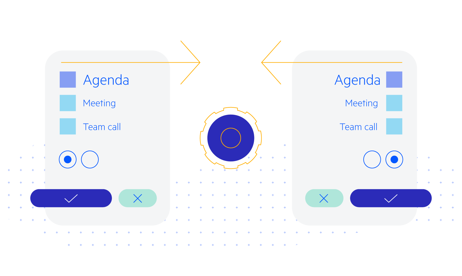
-
Accessibility
The Telerik UI for ASP.NET Core ButtonGroup component is compliant with the Section 508 and WCAG 2.1 guidelines, thus it can satisfy the needs of all users.
-
Keyboard Navigation
The Button Group component supports keyboard navigation; thus users can utilize their keystrokes to select the button(s) of their choice.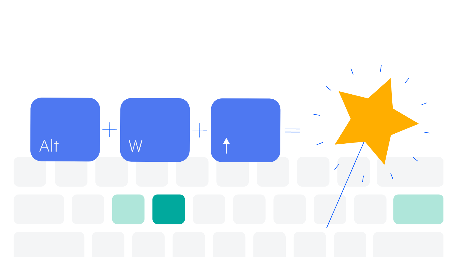
-
Theming
The Telerik UI for ASP.NET Core ButtonGroup has four built-in themes and various swatches, including Default (Main Dark, Nordic, Purple), Material (Arctic, Lime Dark, Nova), Bootstrap (Urban, Vintage etc.) and Fluent. You can easily customize any out-of-the-box themes with a few lines of CSS or create new themes to match your colors and branding by using the Progress SASS ThemeBuilder application.

-
Razor Page
The ButtonGroup is one of the many Telerik UI for ASP.NET Core controls that are supported in both MVC and Razor Pages applications. To learn more about plugging ASP.NET Core components in Razor Pages, check out the documentation article or visit the Razor Pages examples in our GitHub project repository.
