
UI for ASP.NET Core
ASP.NET Core MultiSelect
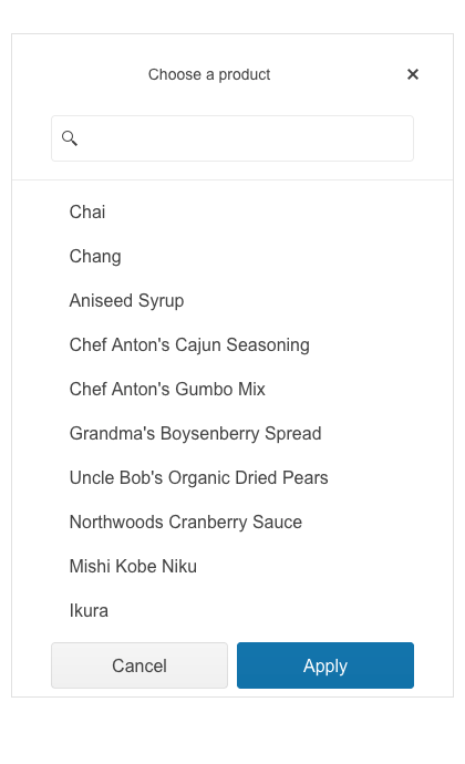
- Provide suggestions based on typed text and let users select multiple value entries with the ASP.NET Core MultiSelect.
- Part of the Telerik UI for ASP.NET Core library along with 120+ professionally designed UI components.
- Includes support, documentation, demos, virtual classrooms, Visual Studio Code Extensions and more!

-
Selecting Multiple Items from a DropDown List Made Easy
The Telerik UI for ASP.NET Core MultiSelect component allows users to select multiple items from a dropdown list. It supports both local and remote data binding, client and server filtering, virtualization for performance enhancement, tag mode and it is easily customizable through templates.
Check out the Telerik UI for ASP.NET Core MultiSelect demo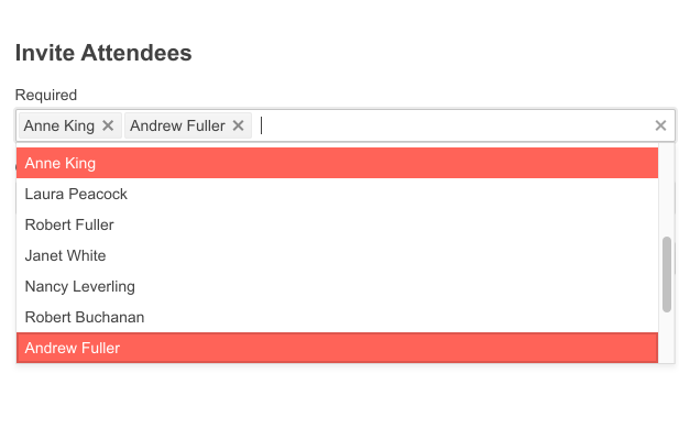
-
Data Binding
The MultiSelect component provides various options for data binding, you can choose whichever fits your use case scenario:
- Ajax binding
- Server binding
- Custom data binding
- Model binding

-
Server and Client Filtering
Leverage the various modes of filtering, both on the server and client-side of your Core application. These filter modes can include “starts with” or “contains” and can customize how and when the results are displayed.
-
Grouping
The Telerik UI for ASP.NET Core MultiSelect component has a built-in grouping feature meant to contribute to an ultimate user experience by dividing the list items in different categories and making it easier to browse.
See more about the ASP.NET Core MultiSelect Grouping feature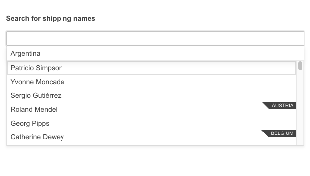
-
Tag Mode
The ASP.NET Core MultiSelect component comes with two tag modes – single and multiple. The single mode displays one tag counting the number of items selected, and the multiple mode shows all selected items as tags in the textbox of the component. In the second mode users can see more clearly their selection and remove any unwanted items with one click. -
MultiSelect Virtualization
The Telerik UI for ASP.NET Core MultiSelect also supports virtualization of data which displays a fixed set of items defined by the user and renders the rest of the content within the same items size frame when the list is scrolled. To enable it, create Read and Value Mapper actions and set the desired number of items to be rendered as shown in the demo. The virtualization feature is useful for performance optimization when handling a large amount of data. -
Floating Label
Provide a smoother and more efficient end-user experience with the ASP.NET Core MultiSelect floating label feature. Add a compact form label that floats above your input fields and save space while ensuring users don’t lose the form context.
-
Adaptive Mode
Enable a mobile-friendly rendering of the MultiSelect suggestion list by simply setting the AdaptiveMode parameter to AdaptiveMode.Auto. This will allow automatic adaptation of the picker component to the current size of the screen. The rendering will be changed accordingly as well.
Check the Telerik UI for ASP.NET Core MultiSelect Adaptive Rendering Demo
-
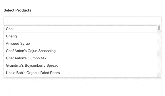
MultiSelect Templates
The MultiSelect component is highly customizable, so it can be implemented in any project. You can customize its items, tags or enable a pop-up header to tailor it to your needs. For example, you can list different products, including both an image and product description, or you can use it to list all customers with photos and contact information as in this demo.
-
Events
The MultiSelect component exposes a set of OnClick events, some of which include Open, Close, Change, Select and more.

-
HTML and Tag Helpers
Telerik UI for ASP.NET Core offers two options for declaring UI components – through HTML or Tag Helpers. You can choose which approach to use for the MultiSelect component based on preference, technology background or team development practice. Both HTML and Tag helpers allow you to lay out the components and their configuration with a simple and easy-to-read HTML-like syntax.

-
RTL Support
The Telerik UI for ASP.NET Core MultiSelect supports RTL users, and it can be easily adapted by changing the alignment from left-to-right and right-to-left with only a few settings.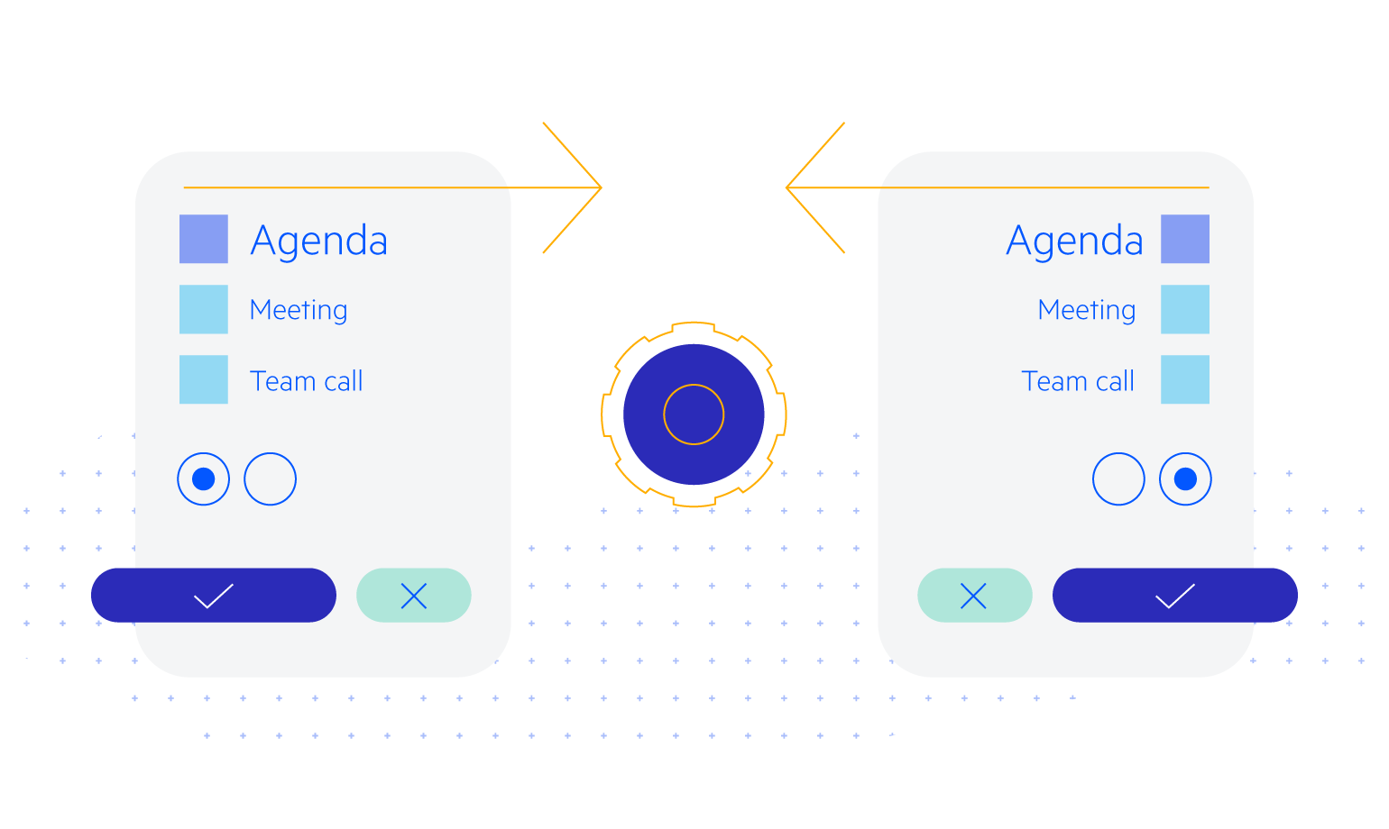
-
Keyboard Navigation
Out-of-the-box keyboard navigation is supported by the ASP.NET Core MultiSelect component. It allows users to open and close the popup and select their desired items. To see a full list of keyboard controls and user actions visit this demo.
-
MultiSelect Theming
The ASP.NET Core MultiSelect is one of the many components in the suite that have 4 built-in themes and 20+ swatches. You can easily customize any of out-of-the-box themes with a few lines of CSS to match your customer’s design requirements, or you create new themes by using the Progress ThemeBuilder application application.
-
Also Available
The MultiSelect component is also available for these web development frameworks:
