
UI for ASP.NET MVC
ASP.NET MVC MultiSelect
- Provide suggestions based on users input and enable multi-value selection with the ASP.NET MVC MultiSelect component. Supporting local and remote binding, item and tag templates and configurable settings for controlling the list behavior.
- Part of the Telerik UI for ASP.NET MVC library along with 120+ professionally designed UI components.
- Includes support, documentation, demos, virtual classrooms and more!
-
Overview
The Telerik UI for ASP.NET MVC MultiSelect component gives end-users the ability to select multiple value entries from a dropdown list. It comes with out-of-the-box support for both local and remote data binding, client and server filtering, virtualization for performance enhancement, tag mode and it is easily customizable through templates.
See the ASP.NET MVC MultiSelect in action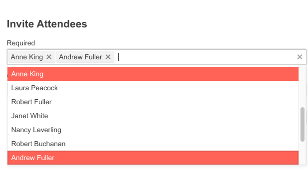
-
Data Binding
The ASP.NET MVC MultiSelect component can be bound to various data sources, including:
- Ajax binding
- Server binding
- Custom data binding
- Model binding
- Local binding
- Remote binding

-
Server and Client Filtering
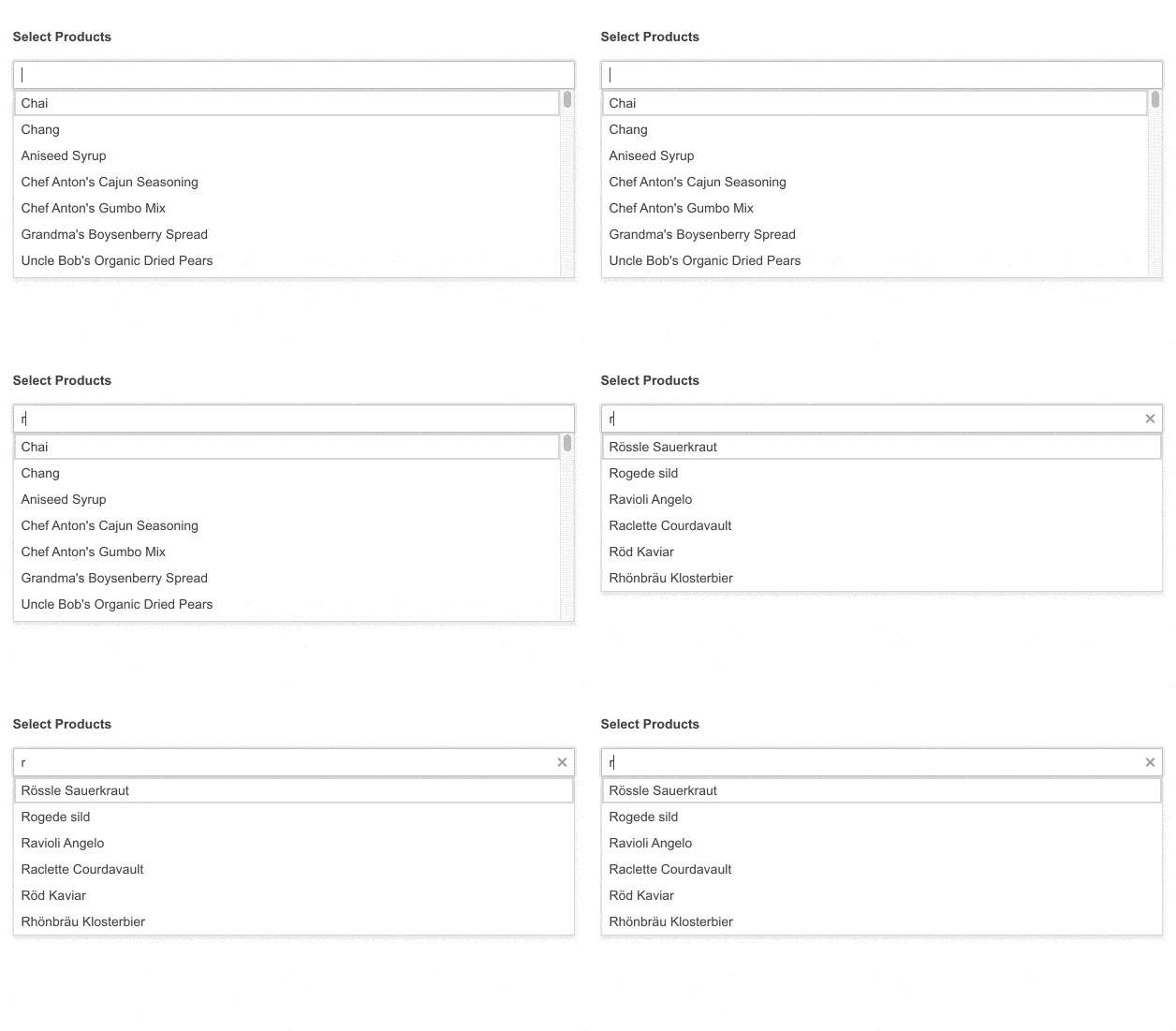
Leverage the various modes of filtering, both on the server and client-side of your MVC application. These filter modes can include starts with or contains, and can customize how and when the results are displayed.
-
MultiSelect Grouping
Take advantage of the ASP.NET MVC MultiSelect grouping feature to divide the items of the dropdown list into categories so users can easily navigate and find their item of interest.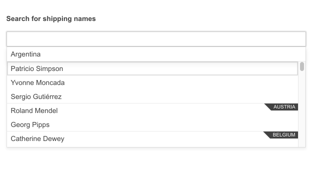
-
Templates
Customize the look-and-feel for the MVC MultiSelect items and tags using templates. Enable a pop-up header to satisfy any customer requirement in no time.
-
Floating Label
Leverage the UI for ASP.NET MVC MultiSelect floating label feature to deliver smoother and more efficient form UX. Add a label that floats above the input to save form space while ensuring users don’t lose context of the input field.

-
Adaptive Mode
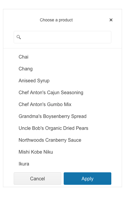
Enable a mobile-friendly rendering of the MultiSelect suggestion list by simply setting the AdaptiveMode parameter to AdaptiveMode.Auto. This will allow automatic adaptation of the picker component to the current size of the screen. The rendering will be changed accordingly as well.
Check the Telerik UI for ASP.NET MVC MultiSelect Adaptive Rendering Demo
-
Virtualization
The MultiSelect component supports virtualization which comes in handy when dealing with large data sets. It initially loads a fixed set of items and renders the rest only when needed. This contributes to faster loading and better user experience.
-
RTL Support
The MultiSelect control is one of the many Telerik UI for ASP.NET MVC components with support for RTL configuration. The RTL functionality accommodates users who communicate through a right-to-left language such as Arabic or Hebrew.
-
Keyboard Navigation
The ASP.NET MVC MultiSelect comes with out-of-the-box keyboard navigation support. Users can utilize the arrows to navigate to their item of interest in the dropdown list.
-
Theming
The ASP.NET MVC MultiSelect component has multiple built-in themes and swatches. Explore the Default (our own styling), Material (based on the Material Design guidelines), Bootstrap (which looks like the Bootstrap styling to integrate better) and Fluent (based on Microsoft Fluent UI) themes and choose the swatch that best meets your design requirements. You can easily customize any theme with a few lines of CSS or create a new one to match your colors and branding with the Progress SASS ThemeBuilder application.
All ASP.NET MVC Components
Data Management
- ASP.NET MVC Grid Control
- Filter
- ListView
- Pager
- PivotGrid
- PivotGrid v.2
- PropertyGrid
- Spreadsheet
- TaskBoard
- TreeList
Scheduling
Editors
- AutoComplete
- Captcha
- CheckBoxGroup
- Color Picker
- ColorGradient
- ColorPalette
- ComboBox
- Date & Time Pickers
- DateInput
- DatePicker
- DateRangePicker
- DateTimePicker
- DropDownList Updated
- DropDownTree
- Editor
- FlatColorPicker
- Image Editor
- ListBox
- MaskedTextBox
- MultiColumnComboBox
- MultiSelect
- Numeric TextBox
- OTP Input
- RadioGroup
- Rating
- Signature
- Switch
- TextArea
- TextBox
- TimeDurationPicker
- TimePicker
Data Visualization
- ArcGauge
- ASP.NET MVC Charts Control
- Barcode
- Chart Wizard
- Circular Gauge
- Gauges
- HeatMap
- LinearGauge
- OrgChart
- Pyramid Chart
- QR Code
- RadialGauge
- Sankey Chart
- StockChart
- Timeline
- TreeMap
- Trendline Chart
File Upload & Management
Interactivity & UX
- Chat (Conversational UI)
- CircularProgressBar
- Loader
- Progress Bar
- Ripple
- Skeleton
- Slider
- Sortable
- Template
Navigation
Layout
- Avatar
- Badge
- DockManager
- ExpansionPanel
- Form
- GridLayout
- Notification
- Popover
- Responsive Panel
- Splitter
- StackLayout
- TileLayout
- Tooltip
- Window
- Wizard
Diagramming
Geo Visualization
Document Processing
Media
Forms & Dialogs
