
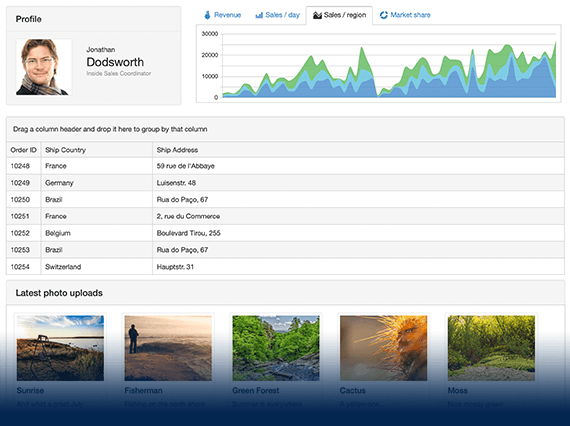
UI for ASP.NET MVC
ASP.NET MVC AutoComplete
- Intuitive ASP.NET MVC AutoComplete component for input-based suggestions. Offers selection, text and token visualization, templates and more.
- Part of the Telerik UI for ASP.NET MVC library along with 120+ professionally designed UI components.
- Includes support, documentation, demos, virtual classrooms and more!
-
Overview
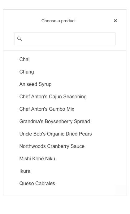
The Telerik UI for ASP.NET MVC AutoComplete component provides suggestions based on the text typed by the user. Familiar and intuitive, Telerik AutoComplete offers single and multiple selection, filtering and grouping, text and token visualization and an optimized performance.
-
Grouping
The built-in grouping functionality separates different items into the categories they belong. For example, it shows cities under the country they are located in, which allows users to quickly navigate to a needed item.
Explore the ASP.NET MVC AutoComplete Grouping feature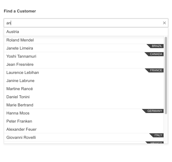
-
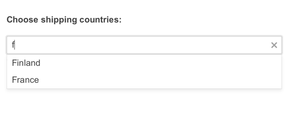
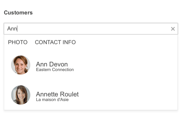
Server and Client Filtering
Leverage the various modes of filtering, both on the server and client-side of your MVC application. These filter modes can include starts with or contains, and can customize how and when the results are displayed.
-
Floating Label
Provide smoother and more efficient end-user experiences with the AutoComplete floating label option. The floating label moves above the input when it is focused, saving space and retaining the context of the form field.

-
Adaptive Mode
Enable a mobile-friendly rendering of the AutoComplete suggestion list popup by simply setting the AdaptiveMode parameter to AdaptiveMode.Auto. The picker component automatically adapts to the current screen size and changes its rendering accordingly.
See the Telerik UI for ASP.NET MVC AutoComplete Adaptive Rendering Demo
-
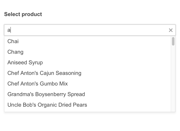
AutoComplete Virtualization
The ASP.NET MVC AutoComplete supports virtualization for those of you dealing with large sets of data. For faster performance, it initially renders a fixed number of items and when scrolled loads the rest of them and displays them in the same format. -
Data Binding
The component supports various options for data binding:
- AJAX binding - for remote data binding
- Server binding - for local data binding
- Custom binding - for custom DataSource binding
- Model binding - can be implemented for both local and remote data binding

-
Declarative Initialization
Declarative initialization—a feature that serializes the component declaration as an MVVM declarative configuration instead of an inline initialization script—is supported in Telerik UI for ASP.NET MVC AutoComplete. It is beneficial in cases when the Content Security Policy (CSP) is enabled as it eliminates the requirement to call the methods that defer the initialization script generated after the component's HTML markup.
See Telerik UI for ASP.NET MVC AutoComplete declarative initialization demo
-
Templates
The Telerik UI for ASP.NET MVC AutoComplete component provides full control over the way items, headers and footers look. This is possible thanks to the three types of templates – Item Template, Header Template and Footer Template.
-
RTL Support
The AutoComplete component, like many others from the Telerik UI for ASP.NET MVC suite, supports RTL configuration. The RTL functionality is supported by most of our components to respond to users who communicate through a right-to-left language such as Arabic or Hebrew.
-
Keyboard Navigation
The AutoComplete is one of the many components in the Telerik UI for ASP.NET MVC suite with keyboard navigation support. You can use the arrows to navigate between the items in the list, you can press enter to select the highlighted item or use page up/page down to scroll further through the list.
-
Theming
To make the AutoComplete component fit to your client’s design requirements you can style it by choosing from multiple built-in themes and swatches the component comes with. Some of them include Default (our own styling), Material (based on the Material Design guidelines), Bootstrap (which resembles the Bootstrap styling to integrate better) and Fluent (based on Microsoft Fluent UI). If you like you can further customize the available themes with a few lines of CSS or by using the Progress SASS ThemeBuilder.
