UI for ASP.NET MVC
ASP.NET MVC Wizard
- Break down lengthy processes into simple steps with the ASP.NET MVC Wizard component. Offers built-in form validation and a progress indicator for easy user navigation.
- Part of the Telerik UI for ASP.NET MVC library along with 120+ professionally designed UI components.
- Includes support, documentation, demos, virtual classrooms and more!
-
Overview
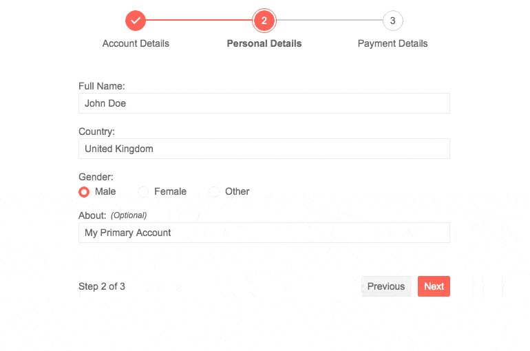
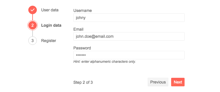
Split long forms into subforms and ease the cognitive burden on your user with the Telerik UI for ASP.NET MVC Wizard component. By filling just one form at a time, users pay more attention and feel less overwhelmed. Wizard steps have their own content (form or other HTML), are built with out-of-the-box validation (via Form component integration) and a progress indicator displaying the number of steps left towards completing the process.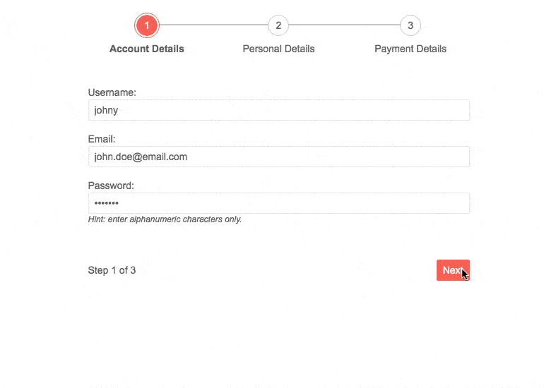
-
Wizard Component Form Integration
The Telerik UI for ASP.NET MVC Wizard and Form components are integrated tightly. Each Wizard step uses an underlying Form component and because of that all of the features of the Form component are available to the wizard too. An example on setting up and using the underlying Form component is available in our Wizard Form demo.
-
Loading Content
The content of the steps of the Wizard can be defined as an HTML string or a DOM element but it can also be fetched from a separate location via AJAX. Our docs contain details instructions on setting up the component to work with the different options.
-
Layout
The Wizard’s progress indicator can be moved and oriented in several ways. There are a total of 3 different layouts - horizontal orientation above the content of the Wizard, vertical left or vertical right side.
-
Accessibility and Keyboard Navigation
The component is accessible to all and any thanks to our built-in Keyboard Navigation that will allow easy navigation and interaction with the steps and inputs of the component using keyboard. It also comes with out-of-the box support for accessibility standards such as WCAG, Section 508 and WAI-ARIA attributes, that let users with disabilities use the Telerik Wizard with ease.

-
Theming
The Telerik ASP.NET MVC Wizard has several built-in themes such as Default (our own styling), Material (based on the Material Design guidelines), Bootstrap (which looks like the Bootstrap styling to integrate better) and Fluent (based on Microsoft Fluent UI). You can easily customize any of out-of-the-box themes with a few lines of CSS, or create new theme to match your colors and branding by using the Telerik SASS ThemeBuilder application.