
UI for ASP.NET MVC
ASP.NET MVC Chip
- Create compelling UX with the dynamic UI building blocks for displaying information within Telerik UI for ASP.NET MVC Chip component.
- Part of the Telerik UI for ASP.NET MVC library along with 120+ professionally designed UI components.
- Includes support, documentation, demos, virtual classrooms and more!
-
Overview
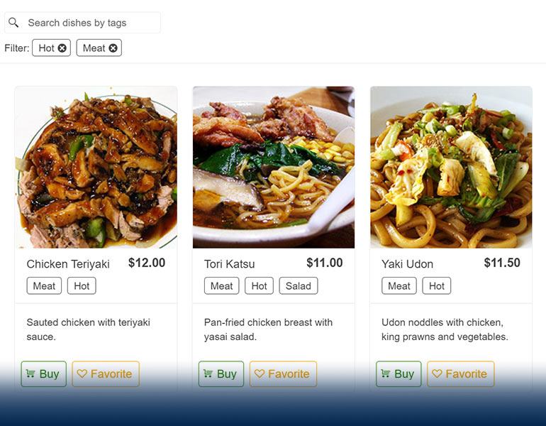
List items and create engaging user experience with the Telerik UI for ASP.NET MVC Chip component. The dynamic building blocks within the component enable you to display information in stylish containers called chips or pills. These can contain text, optional close or delete icon, or images and are the perfect choice when used in social media platforms or emails, where you need to indicate the different users in the recipient’s field of the message.
.png?sfvrsn=263d5b37_1)
-
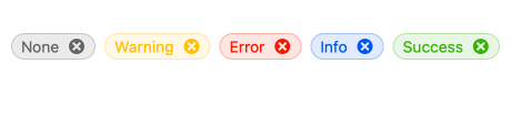
Chip Types
Leverage the multiple ready to use chip types available within the Telerik UI for ASP.NET MVC Chip component. Each chip type – base, info, error, success and warning – comes with its own unique style and allows you to save time and efforts.
-
Appearance
Choose from the two predefined appearance options to align the chip with your visual preferences by utilizing the FillMode and Rounded settings.. The Filled Chip sets a background color to its content, while the Outlined Chip – a transparent background color and an outline.

-
Customization
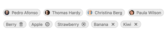
Customize the Telerik UI for ASP.NET MVC Chip component by adding icons, images, avatars, custom icons, links, or any other content to the chip.
-
Removable Chip
Provide users with the ability to remove a chip by using the removable property within the Telerik UI for ASP.NET MVC component. It will set a built-in and actionable “X” icon in the chip content. If you set the property to false, the ASP.NET MVC Chip will render without the icon.

-
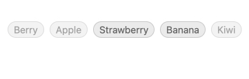
Disabled Chip
Disabling the ASP.NET MVC Chip component is possible if the case requires it, e.g., when items from a certain list are not available at the time. The Chip component is enabled by default but if you need to make specific items non-selectable, you can always leverage the disabled property and vice versa.
-
Events
To ensure smooth interaction, the Telerik UI for ASP.NET Core Chip component exposes different events related to user interaction:
- Click event that fires when the user clicks the content of the Chip or activates it with the Enter or Space keys
- Select event that fires when the selection of a selectable Chip toggles
- Remove event that fires when the user clicks the Remove icon of the Chip
-
Chip Theming
The Telerik UI for ASP.NET MVC Chip component has four built-in themes including Default (our own styling), Material (based on the Material Design guidelines), Bootstrap (which looks like the Bootstrap styling to integrate better) and Fluent (based on Microsoft Fluent UI).
You can easily customize any of out-of-the-box themes, style a specific component instance or create new theme to match your colors and branding by using the Telerik SASS ThemeBuilder application.
