UI for ASP.NET MVC
ASP.NET MVC SplitButton
- The UI for ASP.NET MVC SplitButton component allows users to click a default action or a drop-down menu for secondary options. The Split Button comes with multiple configuration, customization and theming options
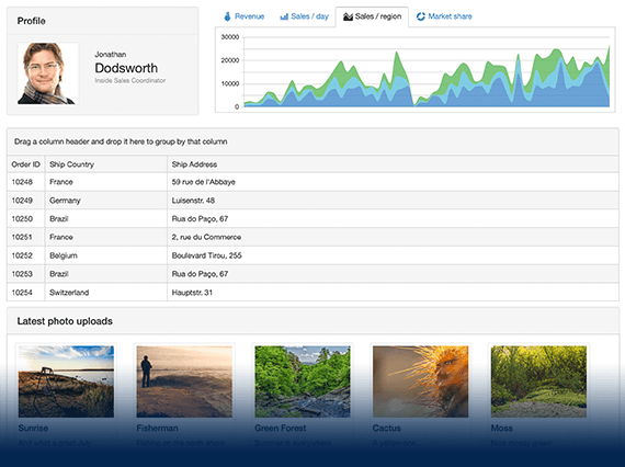
- Part of the Telerik UI for ASP.NET MVC library along with 120+ professionally designed UI components.
- Includes support, documentation, demos, virtual classrooms and more!
-
SplitButton Overview
The Telerik UI for ASP.NET MVC SplitButton gives users the option to execute the primary action of a rendered button or choose a secondary command from a related dropdown list. The SplitButton component comes with built-in support for icons, varied sizes, fill mode, theme color, disabling items, RTL support and multiple UI customization options.
See the ASP.NET MVC SplitButton UI component demo.

-
SplitButton Icons & Items
The ASP.NET MVC SplitButton allows rendering of text, icons or a combination of both. You can add icons to the button and to each of the items in the dropdown list. You can easily configure each of the SplitButton items individually and apply styling to its text, add an icon or disable it altogether.
-
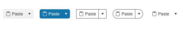
SplitButton Appearance Customizations
You can configure the appearance of the ASP.NET MVC SplitButton by setting its size, theme color, fill mode and border radius.
Try out the different appearance settings for the ASP.NET MVC SplitButton component.
-
SplitButton Accessibility
The ASP.NET MVC SplitButton control is compliant with Section 508 and follows all WCAG 2.1 guidelines to be easily accessed by all users.

-
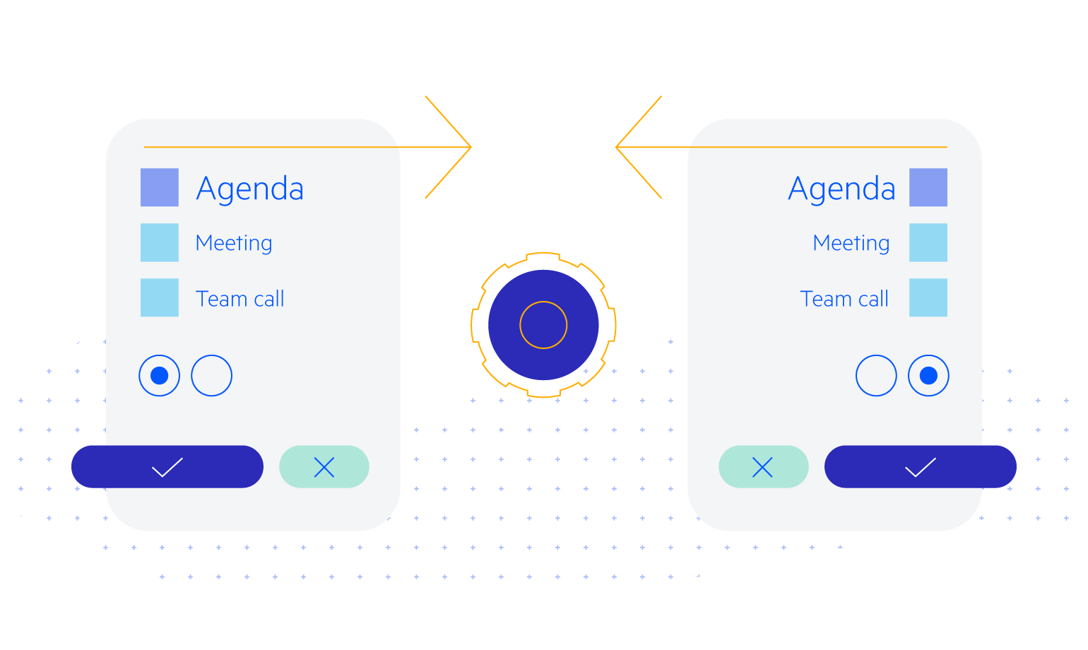
SplitButton RTL Support
You can satisfy any cultural preference with the Telerik UI for ASP.NET MVC SplitButton component by toggling between left-to-right and right-to-left language support.
See an example of right-to-right text rendering in the ASP.NET MVC SplitButton.
-
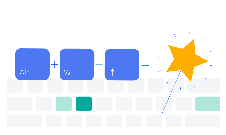
SplitButton Keyboard Navigation
The Telerik UI for ASP.NET MVC SplitButton comes with built-in keyboard support like the rest of the UI components in the library.
Try out the keyboard shortcuts for the ASP.NET MVC SplitButton UI component.
-
SplitButton Theming
The ASP.NET MVC Split Button component has several built-in themes, such as Default (our own styling), Material (based on the Material Design guidelines), Bootstrap and Fluent (based on Microsoft Fluent UI). You can easily customize any of the out-of-the-box themes with a few lines of CSS or create a new theme to match your branding by using the Telerik SASS ThemeBuilder application.