
UI for ASP.NET MVC
ASP.NET MVC GridLayout
- Delivering hassle-free, yet appealing grid layout with rows and columns is a breeze with the Telerik UI for ASP.NET MVC GridLayout component.
- Part of the Telerik UI for ASP.NET MVC library along with 120+ professionally designed UI components.
- Includes support, documentation, demos, virtual classrooms and more!
-
Overview
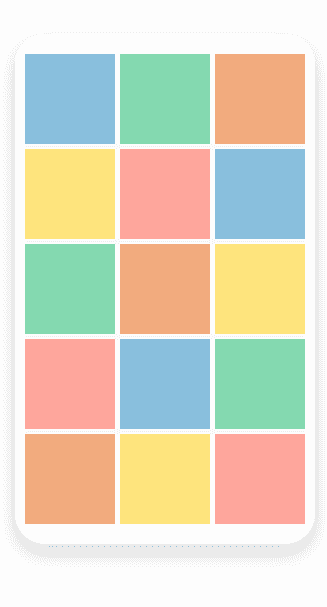
Delivering a higher quality user experience by automating one of the most time-consuming UI implementation tasks – the CSS grid layout – is a breeze with the ASP.NET MVC GridLayout component. The component leverages a grid-like system to arrange your content in columns and rows and applies the same rules across your entire application. We’ve also thought about customization, therefore the GridLayout comes with various options such as row and column spacing, vertical and horizontal alignment, row and column span and more.

-
Customization
You can modify the ASP.NET MVC GridLayout to suit your design requirements. The component comes with multiple customization options, including row and column spacing, options for aligning columns horizontally and vertically, row height, column width, and more.
-
Adaptive
Simply adjust the responsive Telerik UI for ASP.NET MVC GridLayout component to match the different screen sizes.
-
Layout
Effortlessly control the three elements of the component’s layout: Rows and Columns, Gap, and Alignment. Rows and Columns allow you to define the number and size of each. Gap allows you to specify the spacing between items. Last but not least, Alignment sets the position of the content within a cell.
-
Theming
With the ASP.NET MVC GridLayout component you can choose between the four built-in themes such as Default (our own styling), Material (based on the Material Design guidelines), Bootstrap (which looks like the Bootstrap styling to integrate better) and Fluent (based on Microsoft Fluent UI) on the components within the layout.
You can further customize any of the out-of-the box themes, style a specific chart component or create new theme to match your colors and branding by using the Telerik SASS ThemeBuilder application.
