
UI for ASP.NET MVC
ASP.NET MVC Pager
- Effortlessly split your data collection into pages and load items on demand with the ASP.NET MVC Pager component.
- Part of the Telerik UI for ASP.NET MVC library along with 120+ professionally designed UI components.
- Includes support, documentation, demos, virtual classrooms and more!
-
ASP.NET MVC Pager Component Overview
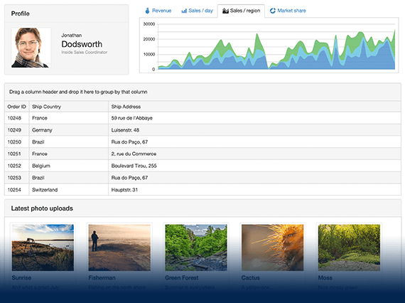
Splitting content is important to avoid overloading the user with information. The Telerik UI for ASP.NET MVC Pager component separates content into pages which the user can browse through. This is best used with components which are prone to displaying large amounts of data like the ListView. The Pager supports a ton of customization on many of its elements and has built in support for Localization.

-
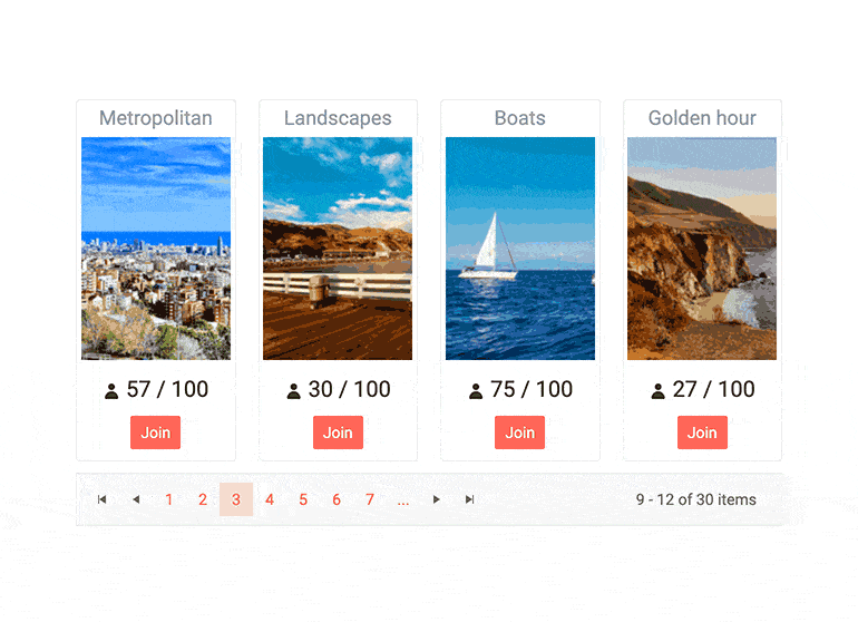
Pager Configuration and Settings
The Pager component will automatically generate a number of buttons and also display an input element so that users can input their own page numbers. You can enable/disable either of these elements and the same is also true for several more elements of the control. You have control over most other elements including a dropdown for the page size, a refresh button, buttons for navigating to the first, last, previous and next pages.
-
ASP.NET MVC Pager Templates
The generated page number links which the pager displays have a default appearance which can be overridden by providing a template. Two different templates can be supplied – one controls the visual appearance of the button for the currently selected page, one controls all other page buttons.
-
Pager Responsiveness
The Pager is responsive by default and operates on any resolution. When viewed on smaller screens, it will hide some of its elements in order to save space for what’s most important. In some cases, that might be undesirable (e.g. you might want to preserve everything). Visit our docs to read what the exact rules of scaling are and how to disable responsiveness if necessary.
-
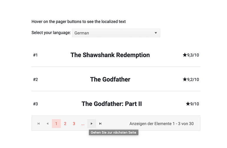
Pager Component Localization
All text elements of the Pager Component are localizable – navigation links, tooltips, etc. As with the rest of our Telerik UI for ASP.NET MVC suite, every language on the globe can be supported so you can build a truly global application.
-
Accessibility and Keyboard Navigation
The Telerik UI for ASP.NET MVC Pager is compliant with the WCAG 2.1 and Section 508 accessibility standards. The built-in keyboard support lets you navigate the component and select the desired item without having to touch a pointing device.
See the ASP.NET MVC Pager keyboard navigation demo
-
Pager Theming
The Telerik ASP.NET MVC Pager has several built-in themes such as Default (our own styling), Material (based on the Material Design guidelines), Bootstrap (which looks like the Bootstrap styling to integrate better) and Fluent (based on Microsoft Fluent UI). You can easily customize any of out-of-the-box themes with a few lines of CSS, or create new theme to match your colors and branding by using the Telerik SASS ThemeBuilder application.
-
Adaptive Mode
The Telerik UI for ASP.NET MVC Pager supports Adaptive Mode that enhances its responsive behavior across different screen sizes. When the AdaptiveMode is set to Auto, the page size drop-down dynamically adjusts its rendering based on the device. On medium screens, it appears as a bottom-docked modal, while on smaller screens it transforms into a full-screen dialog, ensuring optimal usability. For larger screens, the familiar anchored popup remains in place.
