
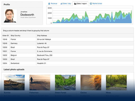
UI for ASP.NET MVC
ASP.NET MVC Dialog
- Use the ASP.NET MVC Dialog component to prompt users for an input or ask them to make a decision. Take advantage of its out-of-the-box support for keyboard navigation and RTL adaptation.
- Part of the Telerik UI for ASP.NET MVC library along with 120+ professionally designed UI components.
- Includes support, documentation, demos, virtual classrooms and more!
-
Overview
The Dialog control is a modal popup that brings information to the user. It also provides reactionary behavior through its action buttons to prompt the user for input or to ask for a decision. It’s similar to the Window component but with added functionality for actions and predefined dialogs.
-
Modal and Non-Modal ASP.NET Pop-Up Dialogs
You can seamlessly leverage the flexible modal feature of Telerik ASP.NET Popup Dialog by creating uniform, visually appealing popups that provide user interactions with the background while they are active.
-
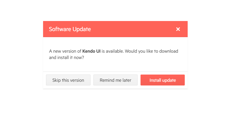
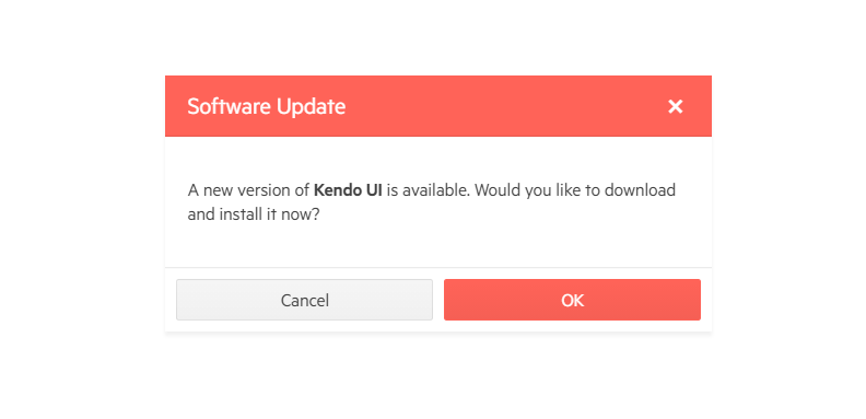
Predefined Dialogs
Predefined dialogs are similar to the browser dialogs—Alert, Confirm and Prompt. Through their stunning UI these dialogs integrate flawlessly with your web application. You can customize the look and feel of the predefined dialog windows by making modifications in the template, such as removing the OK button, changing the Alert icon, etc.
-
Dialog and other components
The ASP.NET MVC Dialog can serve as a container for various components such as Gird, TreeView, TreeList and more.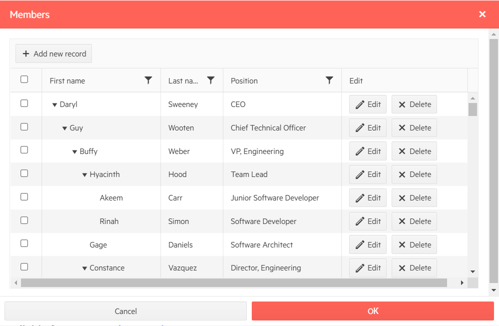
-
Dimensions
By default, the Dialog component does not have preset height or width. Thus, its size depends only on its content. If it serves as a container for a horizontally expandable block-level elements, it can expand horizontally to the point of touching the right edge of the browser and sticking to it.
To learn how to further specify dimensions and position the component visit our documentation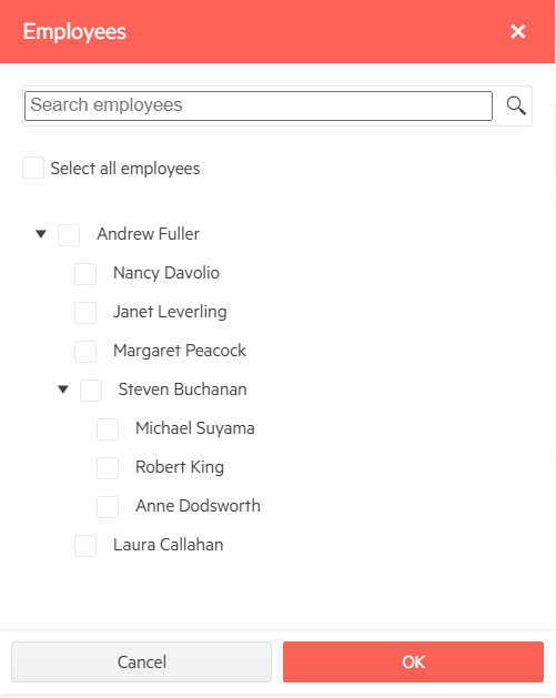
-
Client-Side Rendering for Enhanced Responsiveness
Dialog enhances the performance of your app by allowing you to create popups dynamically on the client without the need to send information to the server. This can save bandwidth and speed up your application, especially if it uses a large number of Dialogs.
-
Popup Blockers Don’t Impede Dialog
Unlike the default browser dialogs, Dialog cannot be stopped by popup blockers. You can be sure that the Telerik ASP.NET Dialog Window will always appear and work as expected.
-
RTL Support
The ASP.NET MVC Dialog features RTL support. The RTL functionality is present in most of our ASP.NET MVC components to respond to users who communicate through a right-to-left language such as Arabic or Hebrew.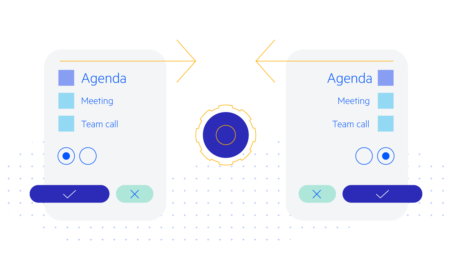
-
Keyboard Navigation
The component comes with built-in keyboard navigation support. Users can easily make a their choice or input the needed information by using only their keyboards.
-
Theming
The ASP.NET MVC Dialog is one of the many UI components you can style using one of the multiple built-in themes and swatches. You can easily customize any of out-of-the-box themes with a few lines of CSS, or create new themes to match your colors and branding by using the Progress SASS ThemeBuilder application.
