
UI for ASP.NET MVC
ASP.NET MVC Pyramid Chart
- Smoothly showcase data within a pyramidal structure with Telerik UI for ASP.NET MVC Pyramid Chart.
- Part of the Telerik UI for ASP.NET MVC library along with 120+ professionally designed UI components.
- Includes support, documentation, demos, virtual classrooms and more!
-
Visualize Data Within a Pyramidal Structure
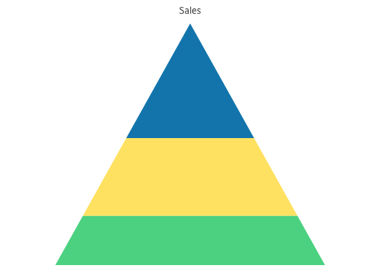
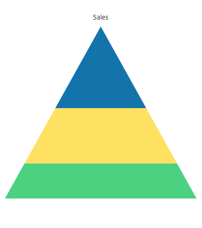
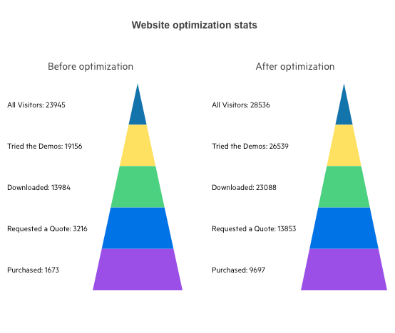
Leverage the Telerik UI for ASP.NET MVC Pyramid Chart to visualize a single series of data in progressively increasing proportions. These data series are organized into horizontal segments where one represents the value for the particular item from the series. The values of the items also influence the height and the shape of the corresponding segments.
Pyramid Charts are suitable when you want to compare and contrast your data, communicate data in an easy-to-read format, understand large amounts of data quickly or display the relative proportions of different items. This Chart series is often used to represent stages in a priority process, population visualization, singular datasets, etc.
-
Pyramid Labels
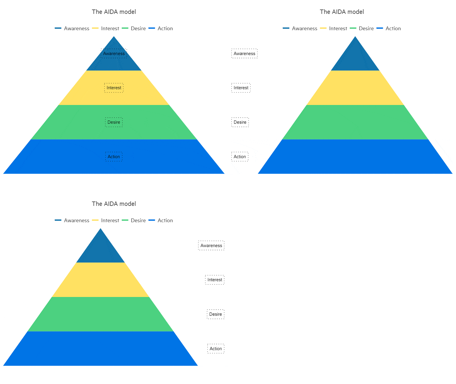
Effortlessly customize the Telerik UI for ASP.NET MVC Pyramid Chart labels by playing with the built-in properties for visibility, position and alignment, font color and size.
See the Telerik UI for ASP.NET MVC Pyramid Chart labels demo
-
Pyramid Chart Remote Data Binding
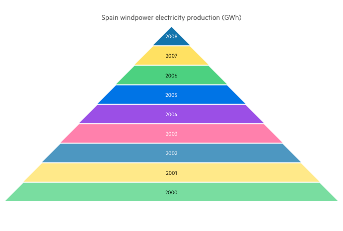
For remote data binding simply specify a remote endpoint or web service returning data in JSON/JSONP format and use the DataSource as a mediator between the chart and the underlying data. To make the connection to the remote endpoint and process data properly, the data source needs information about the web service URL(s), the request type, the response data type and the structure of the response, in case it is more complex than a plain array of objects.
See the Telerik UI for ASP.NET MVC Pyramid Chart remote data binding
-
Pyramid Chart Local Data Binding
The Telerik UI for ASP.NET MVC Pyramid chart can also be instructed to display data from local data storage using its built-in data-binding capabilities.
See the Telerik UI for ASP.NET MVC Pyramid Chart local data binding
All ASP.NET MVC Components
Data Management
- ASP.NET MVC Grid Control
- Filter
- ListView
- Pager
- PivotGrid
- PivotGrid v.2
- PropertyGrid
- Spreadsheet
- TaskBoard
- TreeList
Scheduling
Editors
- AutoComplete
- Captcha
- CheckBoxGroup
- Color Picker
- ColorGradient
- ColorPalette
- ComboBox
- Date & Time Pickers
- DateInput
- DatePicker
- DateRangePicker
- DateTimePicker
- DropDownList Updated
- DropDownTree
- Editor
- FlatColorPicker
- Image Editor
- ListBox
- MaskedTextBox
- MultiColumnComboBox
- MultiSelect
- Numeric TextBox
- OTP Input
- RadioGroup
- Rating
- Signature
- Switch
- TextArea
- TextBox
- TimeDurationPicker
- TimePicker
Data Visualization
- ArcGauge
- ASP.NET MVC Charts Control
- Barcode
- Chart Wizard
- Circular Gauge
- Gauges
- HeatMap
- LinearGauge
- OrgChart
- Pyramid Chart
- QR Code
- RadialGauge
- Sankey Chart
- StockChart
- Timeline
- TreeMap
- Trendline Chart
File Upload & Management
Interactivity & UX
- Chat (Conversational UI)
- CircularProgressBar
- Loader
- Progress Bar
- Ripple
- Skeleton
- Slider
- Sortable
- Template
Navigation
Layout
- Avatar
- Badge
- DockManager
- ExpansionPanel
- Form
- GridLayout
- Notification
- Popover
- Responsive Panel
- Splitter
- StackLayout
- TileLayout
- Tooltip
- Window
- Wizard
Diagramming
Geo Visualization
Document Processing
Media
Forms & Dialogs
