
UI for ASP.NET MVC
ASP.NET MVC Splitter
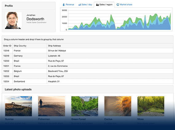
- Separate your pages into sections for a more intuitive flow with the ASP.NET MVC Splitter component. Allow users to control the pane size, expansion orientation and visibility.
- Part of the Telerik UI for ASP.NET MVC library along with 120+ professionally designed UI components.
- Includes support, documentation, demos, virtual classrooms and more!
-
Overview
The ASP.NET MVC Splitter control delivers a clean and elegant way to separate content on a web page. Define an interactive layout with resizable, expandable and collapsible panes, all with the ability to set a minimum and maximum pane size.
-
Auto-Resizing
The Splitter can automatically respond to changes in the size of the window and the content, making it a super handy component for all your projects. You can easily program it to auto-resize as the window is resized and adapt to the content width and height.
Read more in our documentation -
Customization
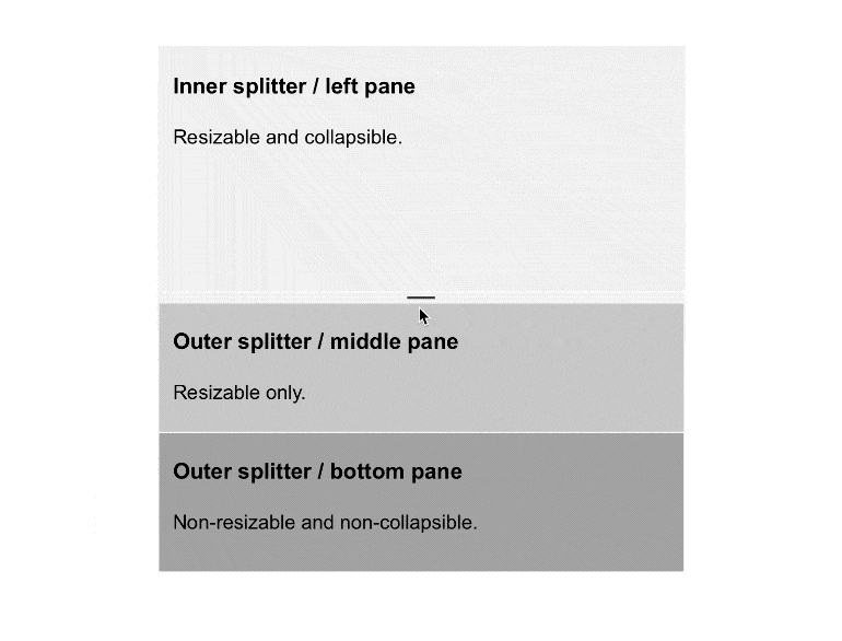
The Splitter component offers several customization options. You can set its orientation to be either horizontal or vertical and further configure the control and the panes using a CSS class to alter their default, minimum and maximum sizes and define whether they can be resized and collapsed.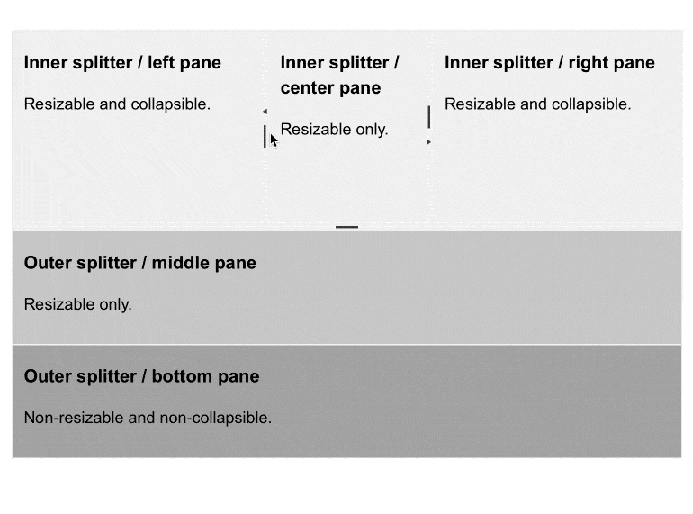
-
Content Operations
You can choose from two options when setting the content of the panes:- Static Content
- Asynchronously Loading Content
-
Persisting Pane Size
The component allows you to set its pane size in percentages relative to the window size so that it can respond well when a user resizes the window. -
RTL Support
Right-to-left support is available for users who read from right to left. You can satisfy any cultural preference with the Splitter component by changing the text direction from left-to-right to right-to-left and vice versa with only a few settings.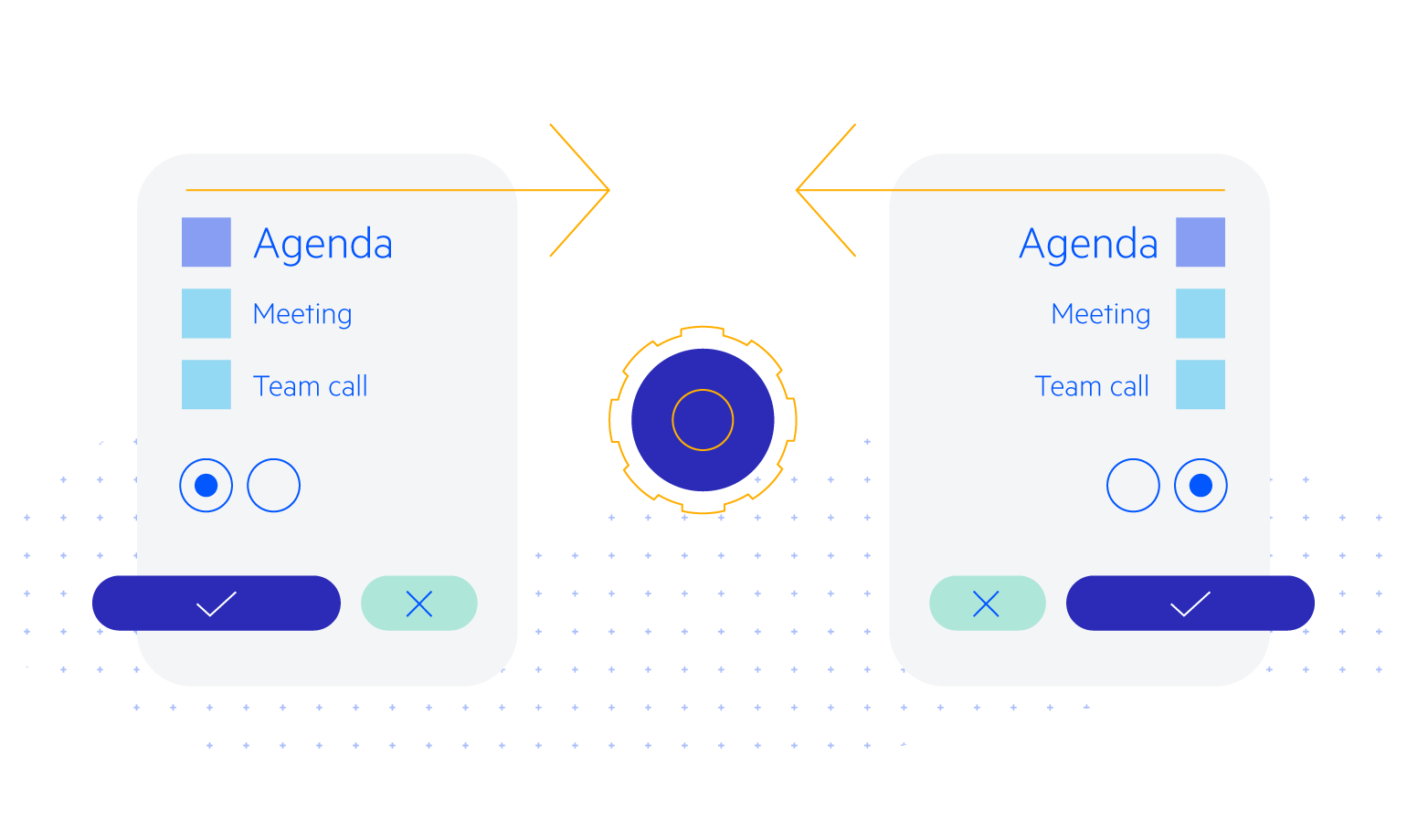
-
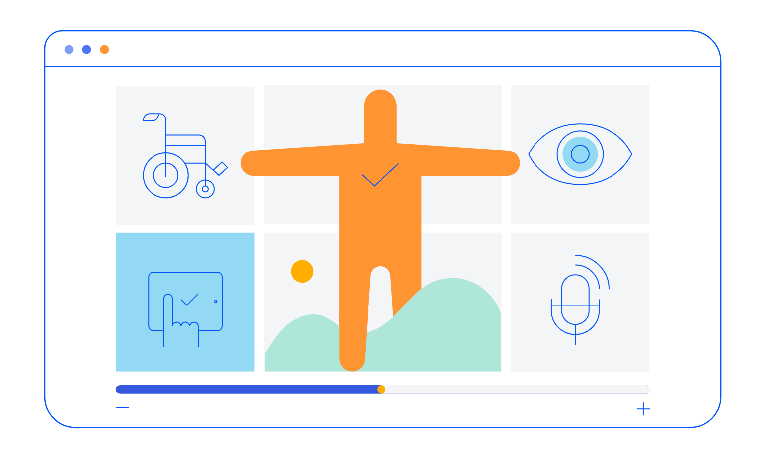
Accessibility
Accessibility can be a large concern in any application. Thanks to the Telerik Splitter component being Section 508 and WCAG 2.1 guidelines compliant, you can rest assured when adding the component to your application.
-
Keyboard Navigation
Out-of-the-box keyboard navigation is supported by the Splitter component. It allows users to navigate panes using the arrows or collapse and expand a pane of their choice. To see a full list of keyboard controls and user actions visit this demo.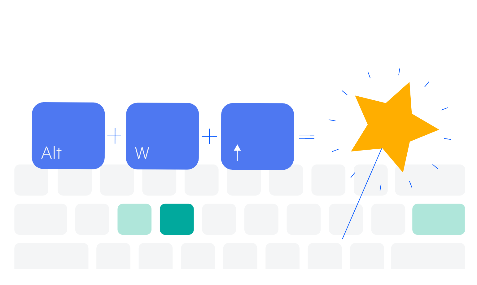
-
Theming
You can style the Splitter component with one of the multiple built-in themes and swatches. Easily customize any of out-of-the-box themes with a few lines of CSS, or create a new theme to match your colors and branding by using the Progress SASS ThemeBuilder application.
