
UI for ASP.NET MVC
ASP.NET MVC PanelBar
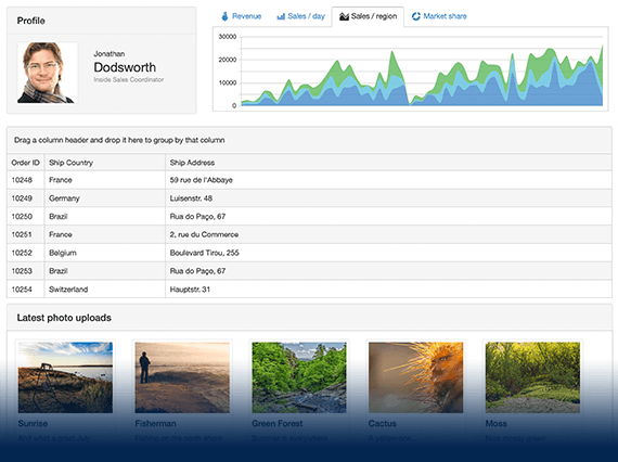
- Logically separate app content for a more intuitive user flow using the ASP.NET MVC PanelBar. An Outlook-style navigation system with built-in animations and multiple customization options.
- Part of the Telerik UI for ASP.NET MVC library along with 120+ professionally designed UI components.
- Includes support, documentation, demos, virtual classrooms and more!
-
Overview
The Telerik UI for ASP.NET MVC PanelBar is a collapsible component that contains a number of panels the user can expand to reveal their content area. The control is suitable for both mobile and desktop use and perfect for information-rich applications which need a less crowded UI and can benefit from the show/hide functionality of the PanelBar. The component offers several ways for data binding and customization options, such as expand modes, use of images, animations and more.
See the ASP.NET MVC PanelBar in action
-
Data Binding
The ASP.NET MVC PanelBar supports several options for data binding. For small datasets, you can use the local data-binding approach. When you need to handle larger datasets, you can choose the remote data-binding option. Use the DataSource configuration object and learn more about data binding from the documentation page.
-
Expand Modes
The ASP.NET MVC PanelBar offers single and multiple options for expanding the panel items. Using the ExpandMode property, you can configure how many panels to expand at a time, based on the amount of content included and the screen space you want the panels to take up. Refer to the documentation page to learn more about the feature.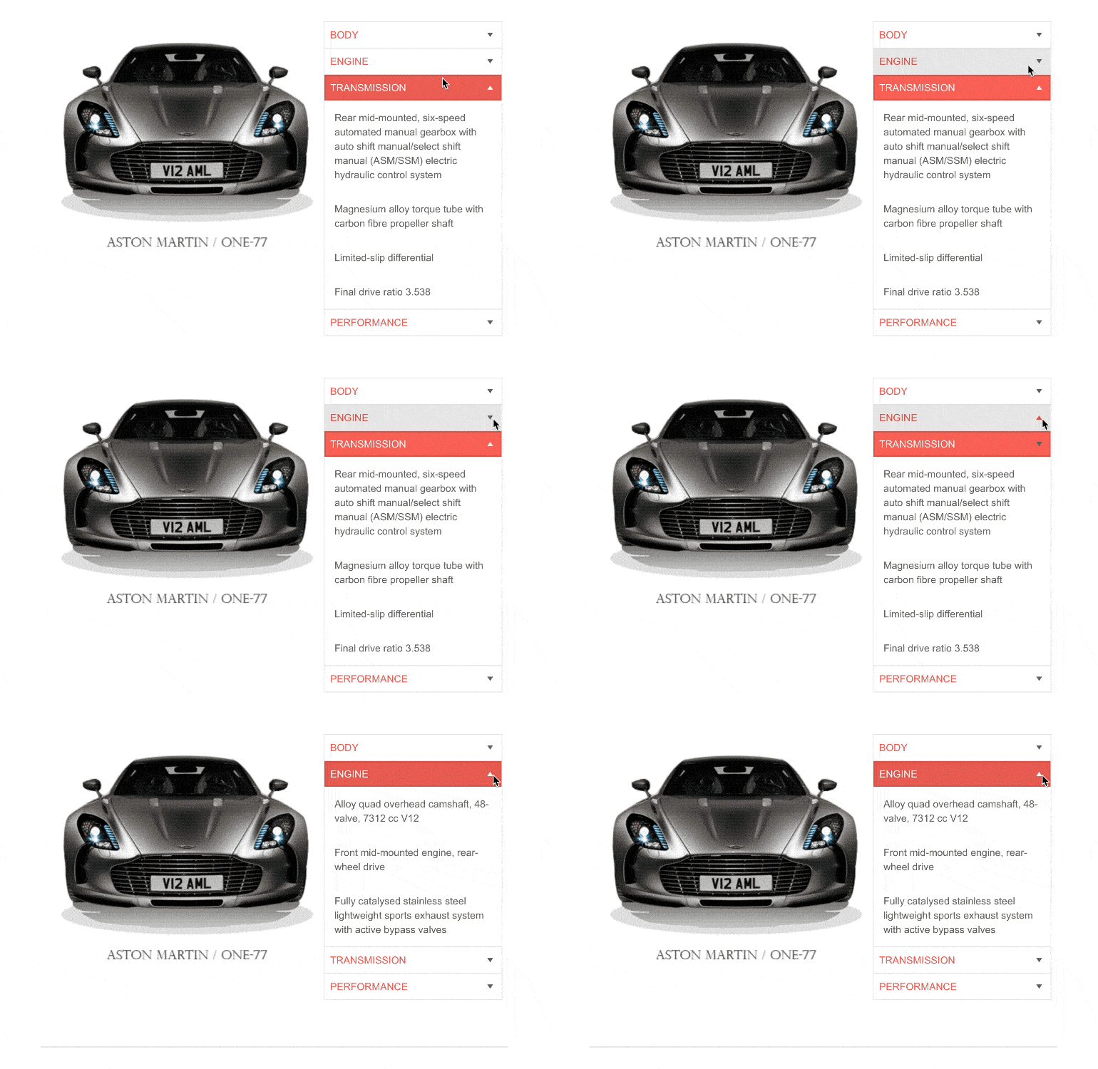
-
Images
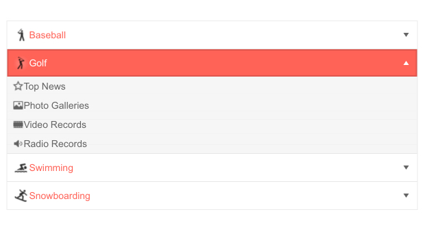
You can customize the look and feel of the PanelBar by including images and sprites within the panel items. Choose from a wide variety of visuals, such as national flags and sports categories, to match the requirements of your application and further enhance your PanelBar component.
-
Animations
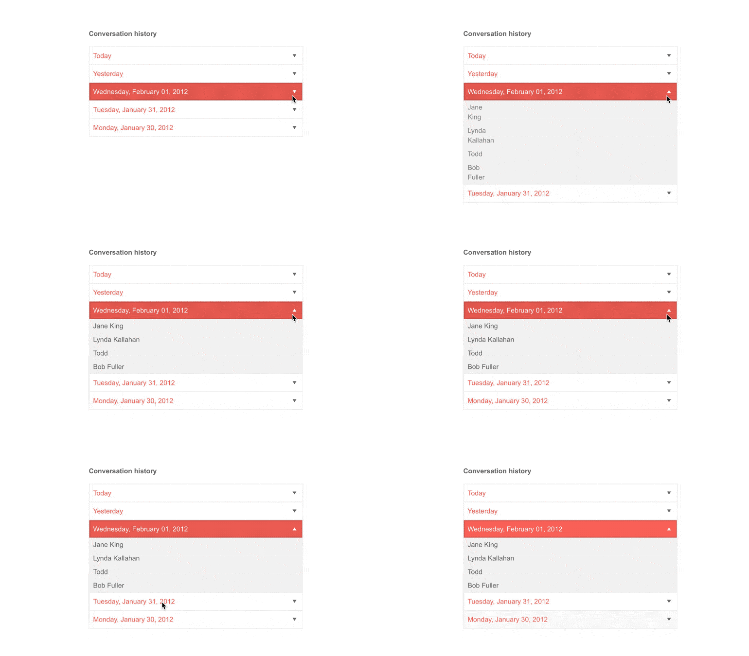
The ASP.NET MVC PanelBar component comes with built-in animation effects for expanding and collapsing the panel items, enabling smooth interactions and visually appealing indications of when you show and hide area contents.
-
Templates
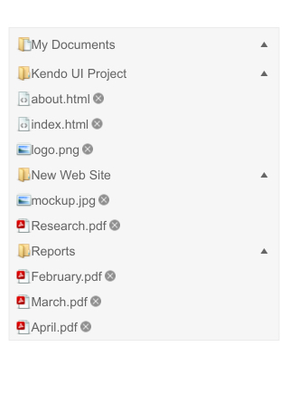
You can further customize the PanelBar control with the available template options to match the look and feel of your application—apply unique templates for certain items or for all of them.
-
Security Trimming
The Telerik UI for ASP.NET MVC PanelBar component comes with out-of-the-box security trimming functionality, enabled by default. Thus, if the URL to which the PanelBar item points is not authorized, the item is hidden.
Read more about the MVC PanelBar Security Trimming -
Flexible Client and Server-side API
You can use the rich PanelBar server- and client-side API functions to implement advanced and specific scenarios. The available public methods, properties and events offer multiple functionalities, such as enable/disable panels, expand/collapse or add/remove selected panel items.
-
RTL Support
Right-to-left support is available for users who communicate in languages written from right to left. By toggling between left-to-right and right-to-let rendering, you can satisfy any local preference and facilitate user interaction with the ASP.NET MVC PanelBar component.
See how RTL Support works in ASP.NET MVC PanelBar
-
Keyboard Navigation
Like most Telerik UI for ASP.NET MVC controls, the PanelBar is also designed to be accessible to all users. Through the available keyboard navigation, the component allows easy interaction without the use of a mouse. Once focused, users can easily navigate through the component and its elements with the supported keyboard shortcuts.

All ASP.NET MVC Components
Data Management
- ASP.NET MVC Grid Control
- Filter
- ListView
- Pager
- PivotGrid
- PivotGrid v.2
- PropertyGrid
- Spreadsheet
- TaskBoard
- TreeList
Scheduling
Editors
- AutoComplete
- Captcha
- CheckBoxGroup
- Color Picker
- ColorGradient
- ColorPalette
- ComboBox
- Date & Time Pickers
- DateInput
- DatePicker
- DateRangePicker
- DateTimePicker
- DropDownList Updated
- DropDownTree
- Editor
- FlatColorPicker
- Image Editor
- ListBox
- MaskedTextBox
- MultiColumnComboBox
- MultiSelect
- Numeric TextBox
- OTP Input
- RadioGroup
- Rating
- Signature
- Switch
- TextArea
- TextBox
- TimeDurationPicker
- TimePicker
Data Visualization
- ArcGauge
- ASP.NET MVC Charts Control
- Barcode
- Chart Wizard
- Circular Gauge
- Gauges
- HeatMap
- LinearGauge
- OrgChart
- Pyramid Chart
- QR Code
- RadialGauge
- Sankey Chart
- StockChart
- Timeline
- TreeMap
- Trendline Chart
File Upload & Management
Interactivity & UX
- Chat (Conversational UI)
- CircularProgressBar
- Loader
- Progress Bar
- Ripple
- Skeleton
- Slider
- Sortable
- Template
Navigation
Layout
- Avatar
- Badge
- DockManager
- ExpansionPanel
- Form
- GridLayout
- Notification
- Popover
- Responsive Panel
- Splitter
- StackLayout
- TileLayout
- Tooltip
- Window
- Wizard
Diagramming
Geo Visualization
Document Processing
Media
Forms & Dialogs
