
UI for ASP.NET MVC
ASP.NET MVC Rating
- Collect measurable feedback on your products and services with the ASP.NET MVC Rating control. Let users share their opinion by selecting the precise score with a single click in an intuitive way.
- Part of the Telerik UI for ASP.NET MVC library along with 120+ professionally designed UI components.
- Includes support, documentation, demos, virtual classrooms and more!
-
Overview
The Telerik UI for ASP.NET MVC Rating component allows users to intuitively rate items in their applications. It features multiple options to customize its rendering and behavior: rating scale (including handling avg. values), custom icons (stars, hearts, circles and more), single and continuous selection of items, keyboard navigation and accessibility.
-
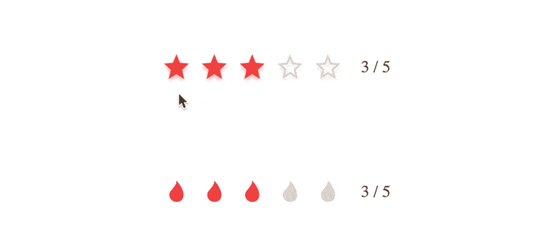
Selection
The widget allows the user to control the selection behavior by configuring the
selectionoption:- single - allows selecting a single item.
- continuous - allows selecting all items from the start to the end.

-
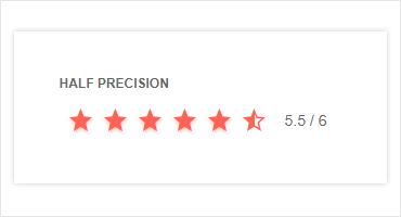
Precision
The widget allows the user to control the precision with which an item is selected by configuring the
precisionoption:- Item for selecting the whole item.
- Half for selecting half of the item.
-
Handling Average Values
The component allows the user to set values with one decimal point (e.g., 0.4, 0.5, 0.5, etc.) for scenarios where an average rating needs to be displayed. The number is rounded during the rendering phase for the purpose of displaying full or half-full items based on the value (> .5 shows full star, <= .5 shows half star). The value itself is displayed in the label of the control. -
Label
The Rating component allows you to add a label next to the stars (or other preferred icons), showing the current rating value in digits and in the following formats: either as “2/5” or “2 out of 5”. In case you do not want a label, you can disable that option of the component. -
Templates
You can easily customize the Rating component with templates. There are three properties for modification of the items: Item Template, Selected Template and Hovered Template that render the items, the selected state and the hovered state, respectively. If the properties are not specified, the Rating items will be displayed with star icons by default.
Explore the Telerik UI for ASP.NET MVC Rating templates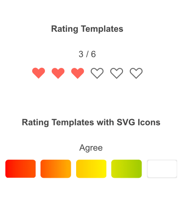
-
Tooltip
Each rating item displays a tooltip that is enabled by default and contains text equal to the item's value. Its content can be modified through the tooltip template option. Setting tooltip to false prevents displaying the tooltip.
See the Telerik UI for ASP.NET MVC Rating Tooltip -
Events
The Telerik UI for ASP.NET MVC Rating component fires various OnClick and OnHover events, including Select, ChangeValue, Tooltip and more.

-
RTL Support
The Rating component supports right-to-left users, and you can easily adapt it for them by easily changing the alignment from left-to-right to right-to-left.
-
Accessibility
The Rating component is compliant with Section 508 and WCAG 2.1 guidelines to unsure your application is accessible to all users.
-
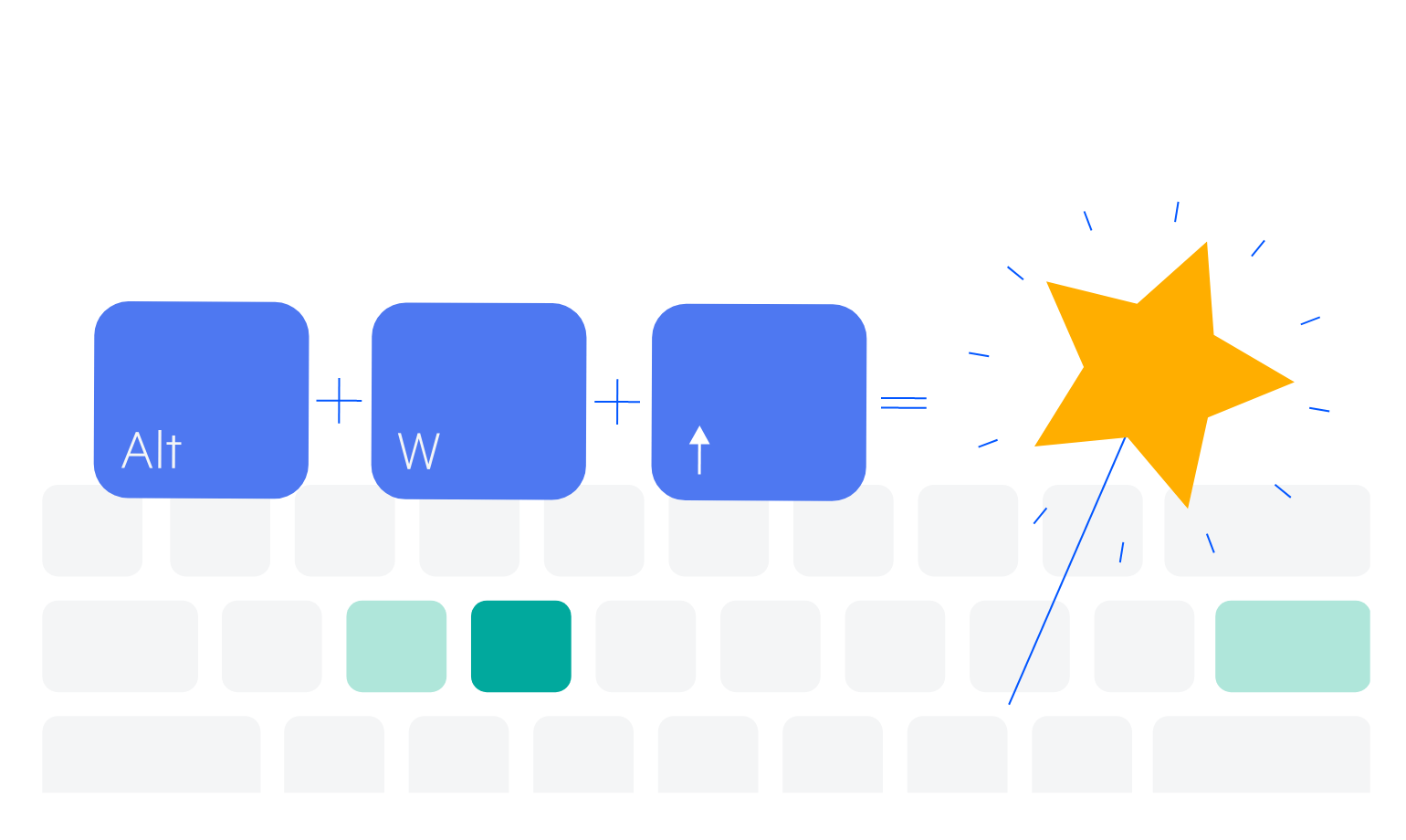
Keyboard Navigation
Out-of-the-box keyboard navigation is supported by the ASP.NET MVC Rating component. It allows users to change their rating using the arrows. To see a full list of keyboard controls and user actions, visit this demo.
-
Theming
You can style the ASP.NET MVC Rating component with the help of the multiple built-in themes and swatches the component comes with. Explore the Default (our own styling), Material (based on the Material Design guidelines), Bootstrap (which resembles the Bootstrap styling to integrate better) and Fluent (based on Microsoft Fluent UI) themes and choose the swatch that best suits your application.
You can easily customize the available themes with a few lines of CSS or create a new one with the Progress SASS ThemeBuilder application to meet your client’s design requirements.
