UI for ASP.NET MVC
ASP.NET MVC Slider
- Use the ASP.NET MVC Slider component to easily select numerical values from a defined range. Featuring orientation, ticks, and tooltips for a smooth user experience in any app scenario.
- Part of the Telerik UI for ASP.NET MVC library along with 120+ professionally designed UI components.
- Includes support, documentation, demos, virtual classrooms and more!

-
Overview
The Telerik UI for ASP.NET MVC Slider component allows users to select a numeric value by dragging a handle along a bar. You can configure the value to increment in steps or set it to follow certain criteria, such as to be greater than or divisible by a specific number. The control comes with built-in features to customize its appearance and orientation, as well as to configure ticks, tooltips and more functionalities.
See the ASP.NET MVC Slider in action
-
Orientation
You can change the orientation of the Slider component to fit any scenario. You can configure the Slider to display horizontally or vertically with a single setting.
-
Tooltip
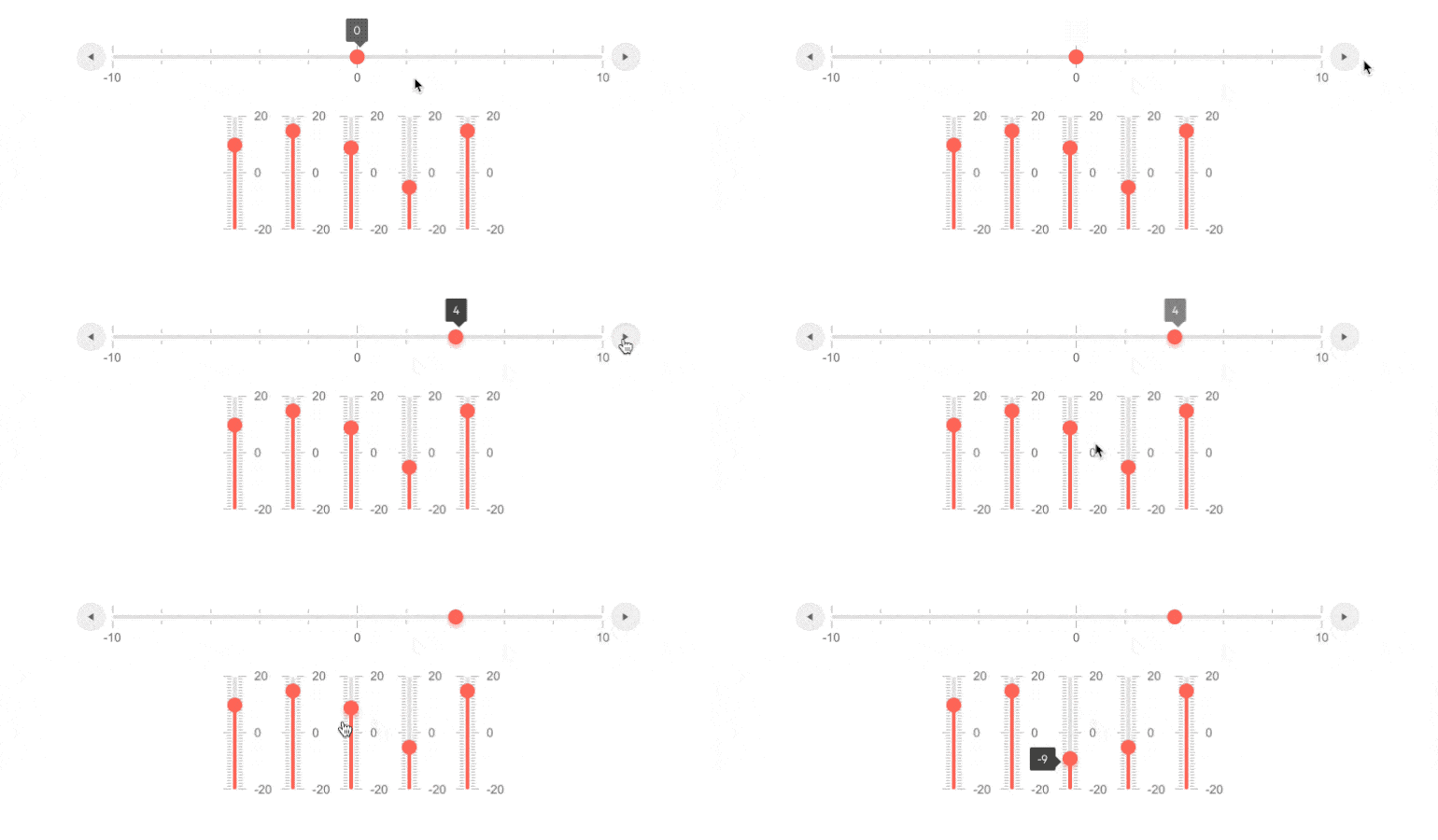
The ASP.NET MVC Slider tooltip feature allows users to see the value of the slider's thumb while dragging it. You can easily enable or disable the tooltip in the Slider control with a single setting.
-
Flexible Client-Side API
The Slider component offers multiple API functions that let you change all exposed properties, as well as instantiate a Slider control directly on the client. Check out the ASP.NET MVC Slider API demo to learn more.

-
RTL Support
The Slider component supports right-to-left scripts to allow an optimal experience for users who communicate and read in languages written right to left. You can satisfy any cultural preference with the ASP.NET MVC Slider by toggling between left-to-right and right-to-left alignment with only a few settings.

-
Keyboard Navigation
The ASP.NET MVC Slider control comes with built-in keyboard navigation for users who prefer to navigate through the component without using their mouse. The keyboard shortcuts allow you to perform all the necessary actions such as focusing the component, changing the values with smaller and larger steps and more. Refer to ASP.NET MVC Slider demo to learn more about the keyboard navigation functionality.

All ASP.NET MVC Components
Data Management
- ASP.NET MVC Grid Control
- Filter
- ListView
- Pager
- PivotGrid
- PivotGrid v.2
- PropertyGrid
- Spreadsheet
- TaskBoard
- TreeList
Scheduling
Editors
- AutoComplete
- Captcha
- CheckBoxGroup
- Color Picker
- ColorGradient
- ColorPalette
- ComboBox
- Date & Time Pickers
- DateInput
- DatePicker
- DateRangePicker
- DateTimePicker
- DropDownList Updated
- DropDownTree
- Editor
- FlatColorPicker
- Image Editor
- ListBox
- MaskedTextBox
- MultiColumnComboBox
- MultiSelect
- Numeric TextBox
- OTP Input
- RadioGroup
- Rating
- Signature
- Switch
- TextArea
- TextBox
- TimeDurationPicker
- TimePicker
Data Visualization
- ArcGauge
- ASP.NET MVC Charts Control
- Barcode
- Chart Wizard
- Circular Gauge
- Gauges
- HeatMap
- LinearGauge
- OrgChart
- Pyramid Chart
- QR Code
- RadialGauge
- Sankey Chart
- StockChart
- Timeline
- TreeMap
- Trendline Chart
File Upload & Management
Interactivity & UX
- Chat (Conversational UI)
- CircularProgressBar
- Loader
- Progress Bar
- Ripple
- Skeleton
- Slider
- Sortable
- Template
Navigation
Layout
- Avatar
- Badge
- DockManager
- ExpansionPanel
- Form
- GridLayout
- Notification
- Popover
- Responsive Panel
- Splitter
- StackLayout
- TileLayout
- Tooltip
- Window
- Wizard
Diagramming
Geo Visualization
Document Processing
Media
Forms & Dialogs
