UI for ASP.NET MVC
ASP.NET MVC MultiColumnComboBox
- The ASP.NET MVC MultiColumnComboBox component lets you display large sets of data in a grid-like table within a drop-down. Offers filtering, grouping, templates and more.
- Part of the Telerik UI for ASP.NET MVC library along with 120+ professionally designed UI components.
- Includes support, documentation, demos, virtual classrooms and more!
-
Overview
The MultiColumnComboBox component displays large sets of data in a grid-like table providing additional data values for each individual item. The control offers a number of features and functionalities, such as filtering, virtualization, grouping, templates, cascading MultiColumnComboBoxes and more, to ensure execution of all possible app scenarios.
-
Data Binding
The Telerik UI for ASP.NET MVC MultiColumnComboBox provides a set of four options for binding it to data:

-
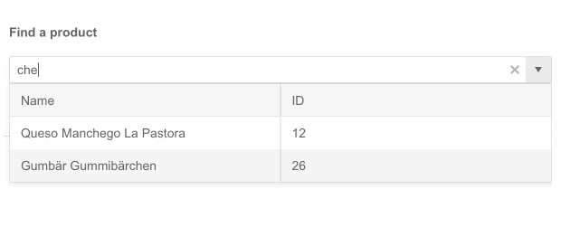
Filtering
The ASP.NET MVC MultiColumnComboBox provides Client and Server Filtering for a seamless interaction. It allows users to filter the available items by their text, so they can find the one they need faster. It then displays all the information related to this item from the dropdown grid-like table.
-
Floating Label
Providing a smoother and more efficient form experience to end-users is possible with the MultiColumnComboBox floating label option. It enables you to add a label that floats above the input upon clicking, saving space and retaining the context of the form field.

-
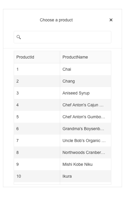
Adaptive Mode
The MultiColumnComboBox adaptive mode enables a mobile-friendly rendering of its suggestion list popup. Simply set the AdaptiveMode parameter to AdaptiveMode.Auto and this will trigger the component to automatically adapt to the current screen size and will change its rendering accordingly. In auto adaptive mode, the MultiColumnComboBox component also allows you to define the title text rendered in the header of the popup.
See the Telerik UI for ASP.NET MVC MultiColumnComboBox adaptive rendering demo
-
Virtualization
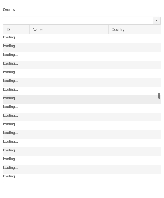
Some users prefer to scroll through data items instead of using a pager. With large data sets, this can easily slow down your application. You can enable the MultiColumnComboBox virtualization to avoid loading delays as it will render only the data rows from the current page and swaps them as the user scrolls, instead of rendering a row for every item in the data source.
-
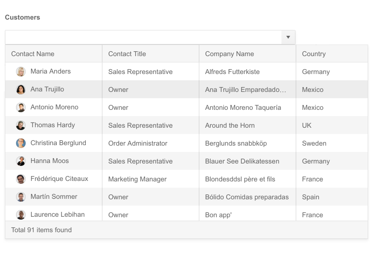
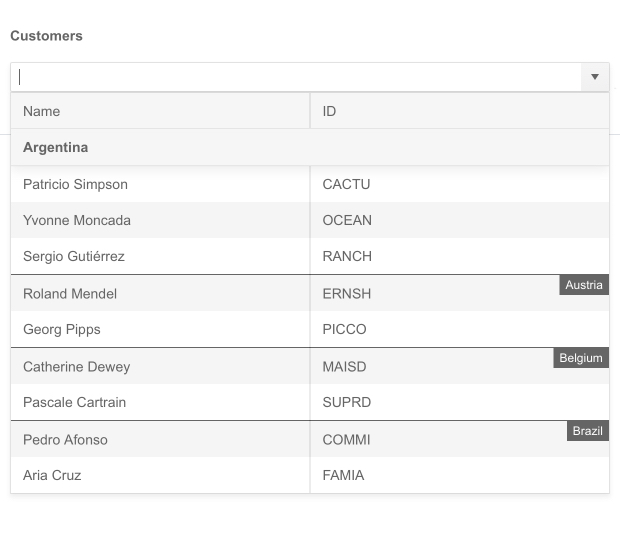
Grouping
The MultiColumnComboBox control can group its items based on developer-provided criteria. By grouping items, you give users easy access to the information they need. When the grouping option is defined, the items will be automatically rearranged. Check out the demo to configure grouping.
-
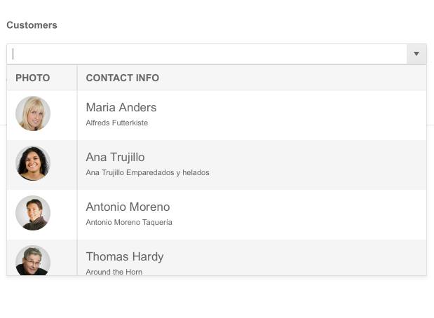
Templates
The content within the MultiColumnComboBox can be further customized by one of the three templating options—Column, Header and Footer templates. In addition to text and numbers, you can also display other elements, such as images and icons, in a grid-like table for full control and a customized data look.
See how templates work in the ASP.NET MVC MultiColumnComboBox demo.
-
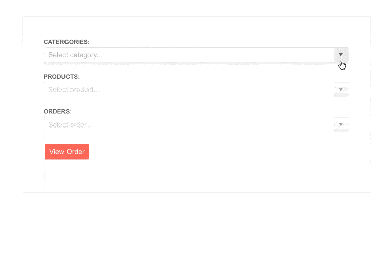
Cascading MultiColumnComboBoxes
Cascading MultiColumnComboBoxes represent two or more boxes, each filtered based on the selected item in the previous one. The child is enabled only after a value is selected in the parent MultiColumnComboBox and shows filtered options according to that value.
-
RTL Support
The MultiColumnComboBox right-to-left support is available for languages like Arabic and Hebrew, in which users read from right to left. You can satisfy any script preference and facilitate user interaction by toggling between left-to-right and right-to-let alignment with only a few settings.

-
Keyboard Navigation
The ASP.NET MVC MultiColumnComboBox supports keyboard navigation, allowing users to navigate through it without using the mouse. Check out the demo page to see how you can open/close the component popups, highlight items, scroll and select values with the intuitive keyboard shortcuts.