
UI for ASP.NET MVC
ASP.NET MVC DateTimePicker
- Part of the Telerik UI for ASP.NET MVC library along with 120+ professionally designed UI components.
- Includes support, documentation, demos, virtual classrooms and more!
-
Client-Side API
With its rich client-side API, you can easily modify and interact with the DateTimePicker component in JavaScript. With events allowing you to hook into any interaction, and API methods enabling you to alter the TreeView as needed, you can add a lot of client-side interactivity.
-
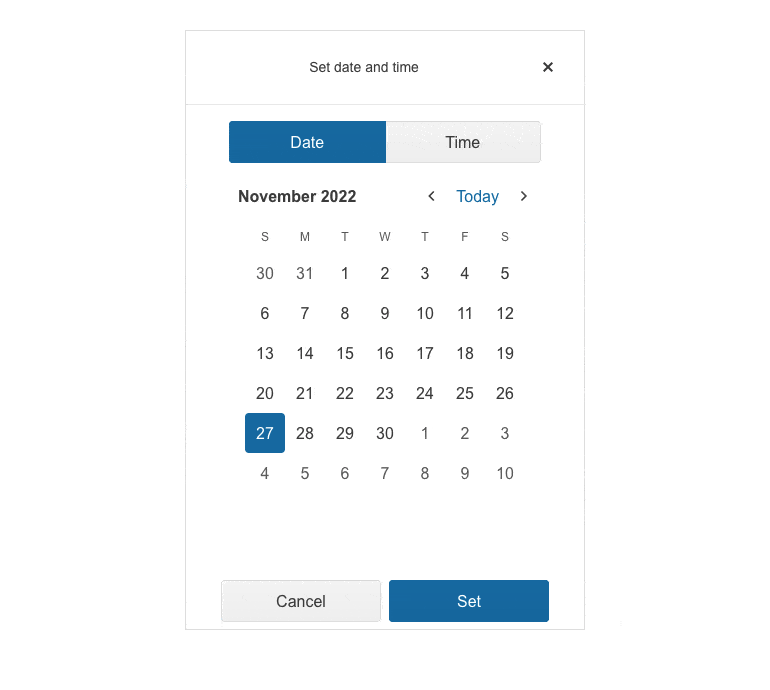
Modern Rendering
Modern Rendering
The visual quality of our controls is one of our highest priorities and we want to give you options to explore. That’s why we provide two separate rendering modes for the Telerik UI for ASP.NET MVC DateTimePicker component. The secondary (modern) look can be activated by changing an attribute on the component.
-
Floating Label
The floating label feature in the Telerik UI for ASP.NET MVC DateTimePicker ensures you save form space while retaining the context of the form field. Provide a smoother and more effective form experience for end-users by adding a label that floats above the input upon clicking.

-
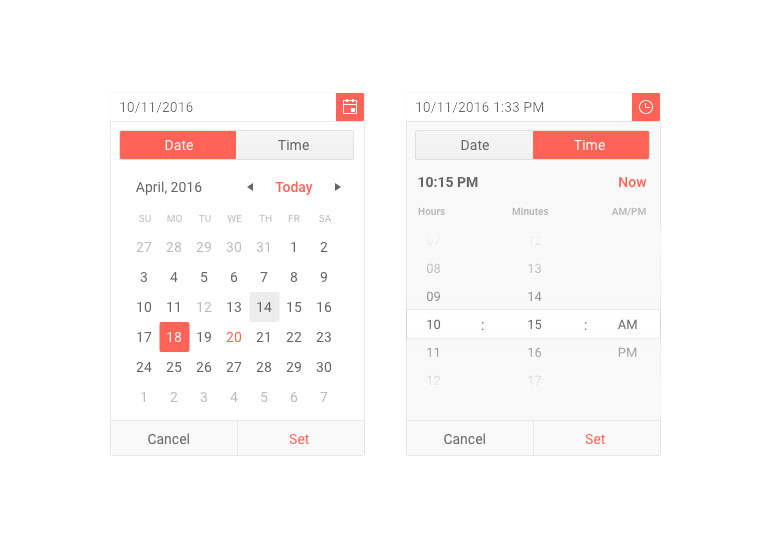
Adaptive Mode
The Telerik UI for ASP.NET MVC DateTimePicker adaptive mode enables a mobile-friendly rendering of its date and time selector popup. Simply set the AdaptiveMode parameter to AdaptiveMode.Auto and this will trigger the picker component to automatically adapt to the current screen size and will change its rendering accordingly. In auto adaptive mode, the DateTimePicker component also allows you to define the title text rendered in the header of the popup.
Check out the Telerik UI for ASP.NET MVC DateTimePicker adaptive rendering demo
-
Start Time and End Time Configuration
The Telerik UI for ASP.NET MVC DateTimePicker component enables effortless configuration of the start and end times of the TimeViewer. Easily set a time range and then apply it to all dates if the case requires so.
See the Telerik UI for ASP.NET MVC DateTimePicker start and end times demo
-
Customization of DateInput Messages
With the Messages option in the DateInput UI component, it is now simple to personalize the message placeholder of the date input in the Date & Time Picker components. Additionally, the component offers the .Format() feature, which can be utilized to establish the date format for parsing and formatting the machine date.
-
Accessibility
Telerik Kendo UI DateTimePicker is compliant with Section 508 and WCAG guidelines, perfect for scenarios where accessibility is a concern. -
Keyboard Support
Use the keyboard for almost any action triggered by a mouse, with Kendo UI DateTimePicker. This includes navigating to a different view, traversing visible appointments, creating a new item, opening an existing item and more.
