UI for ASP.NET MVC
ASP.NET MVC Avatar
- Easily add a familiar avatar to represent profiles or other types of accounts with the Telerik UI for ASP.NET MVC Avatar.
- Part of the Telerik UI for ASP.NET MVC library along with 120+ professionally designed UI components.
- Includes support, documentation, demos, virtual classrooms and more!
-
Overview
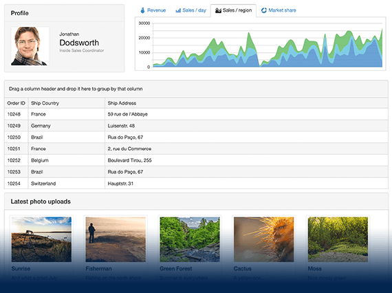
The ASP.NET MVC Avatar is a great way for displaying identity placeholders in your apps with small photos, custom icons, avatars or initials.
See demo of the Avatar UI component for ASP.NET MVC.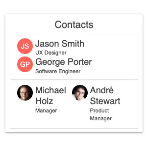
-
Avatar Types
The Avatar exposes a Type parameter with three predefined options: text (default), icon and image and allows further customization of the imageURL, icon name, actual text and more.
-
Configuration and Appearance
The MVC Avatar UI component and its contents can be displayed as a circle, square, rectangle or with rounded corners. It provides additional parameters for setting its size to small, medium (default) or large, appearance fill style, border, alt text, theme color and more.
See how to change the Avatar component appearance.
-
Avatar Theming
You can choose one of the multiple built-in themes and swatches, including Default (our own styling), Material (based on the Material Design guidelines), Bootstrap and Fluent (based on Microsoft Fluent UI) to style the appearance of the Avatar UI component for ASP.NET MVC. You can easily customize any of the available themes with a few lines of CSS or create a new theme to match your colors and branding with the Progress SASS ThemeBuilder application.