
Kendo UI for Vue
Vue MultiSelect
- Displays a list of options, allows multiple selections and supports custom rendering of popup items.
- Part of the Kendo UI for Vue library along with 110+ professionally-designed components.
- Includes support, documentation, demos, virtual classrooms, learning resources and more!
-
Overview
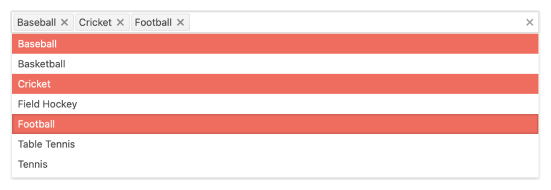
The Kendo UI for Vue MultiSelect is a powerful component that displays a list of predefined options which can be selected on user interaction. Each selected option from the popup appears as a tag in the input of the component.
The MultiSelect has a wide range of customization options:
- Define custom design for the header element inside its popup
- Define custom design for the footer element inside its popup
- Use a custom renderer to style the component’s overall appearance.
For the scenarios with a big number of popup items, the MuliSelect also provides data virtualization.
See Kendo UI for Vue MultiSelect Overview Demo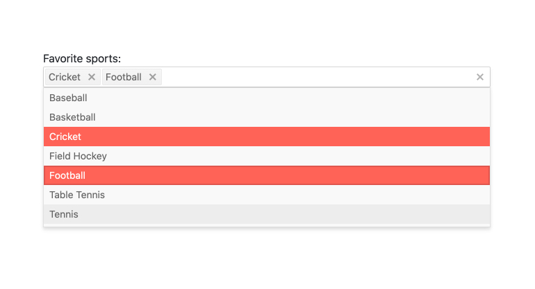
-
Data Binding
The Kendo UI for Vue MultiSelect supports binding to datasets of objects, arrays of primitive values, or single value properties.
See Kendo UI for Vue MultiSelect Data and Value Binding demo
-
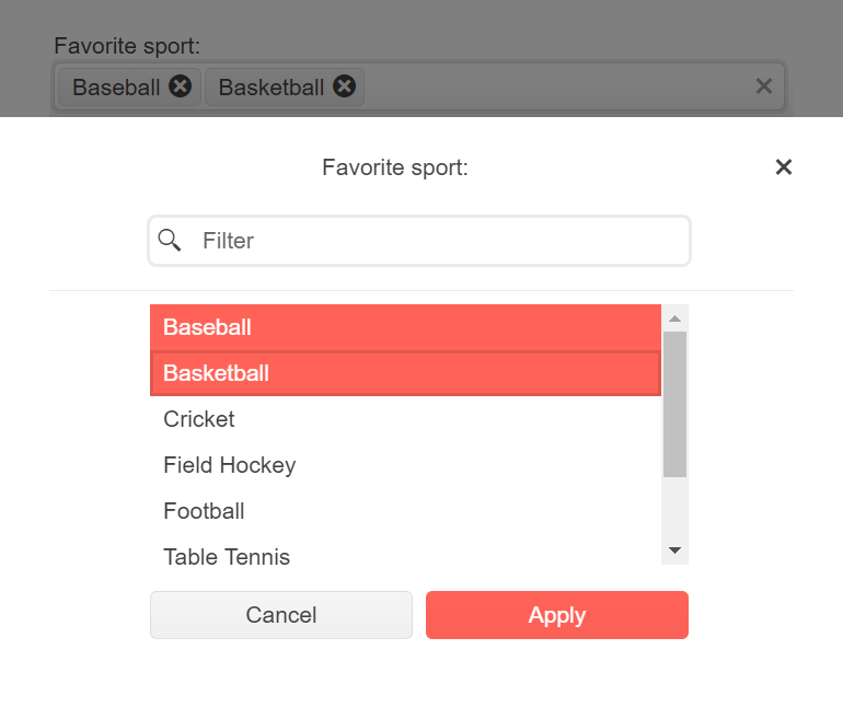
Adaptive Rendering
The Vue MultiSelect supports an adaptive mode which provides a mobile-friendly rendering of its popup. When enabled, the component will automatically adapt to the current screen size and will change its rendering accordingly.
-
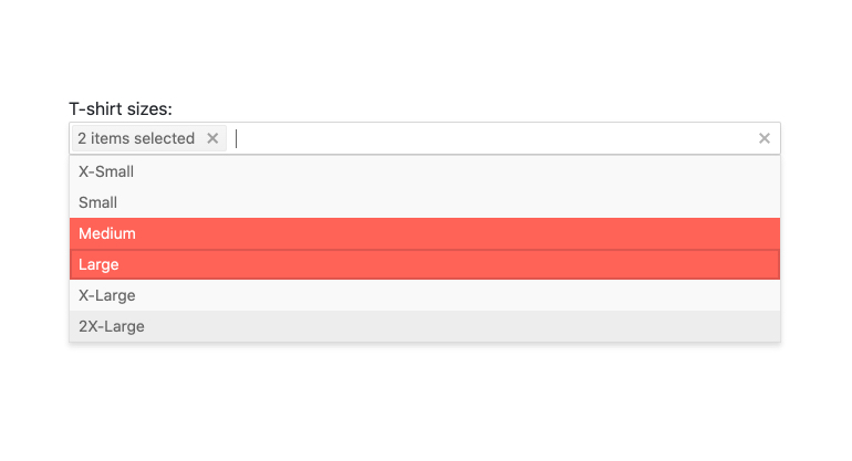
Grouping
Group similar data items in logical categories to help users quickly and easily navigate through the drop-down list. Define the field responsible for each category while you bind your dataset to the Vue MultiSelect component.
See the Vue MultiSelect Grouping demo
-
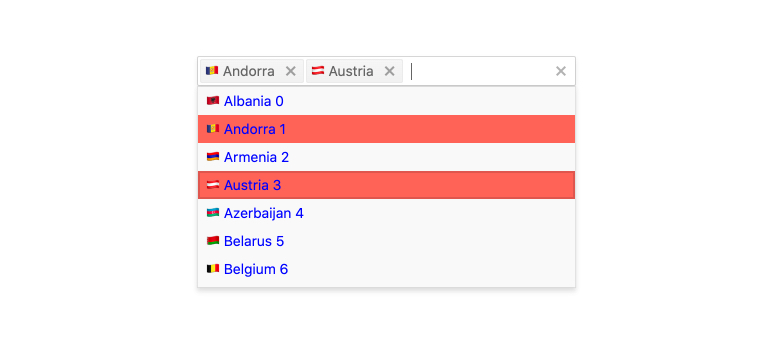
Filtering
The Kendo UI for Vue MultiSelect comes with a built-in filtering mechanism for reducing the choices in the component’s dropdown. The data in the popup can be filtered with a various number of operators like “contains”, “starts with”, etc., covering the requirements of every filtering scenario.
Kendo UI for Vue MultiSelect Filtering example
-
Forms Support
The Kendo UI for Vue MultiSelect is shipped with built-in styles for displaying invalid data state. The component also provides the option for displaying custom validation messages. Add the MultiSelect to any HTML form and instantly enjoy all of its built-in features.
Kendo UI for Vue MultiSelect Forms Support example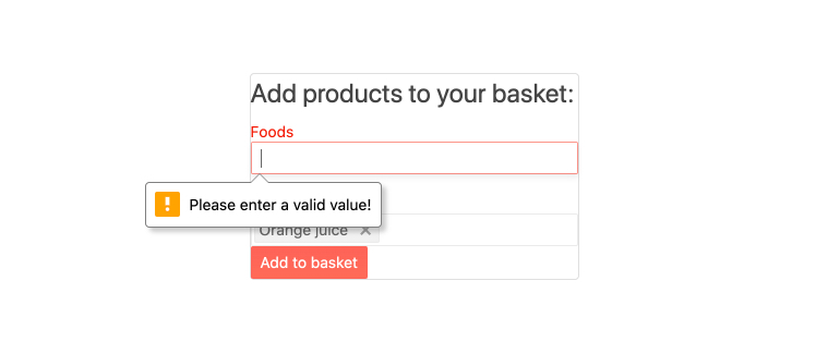
-
Custom Tags
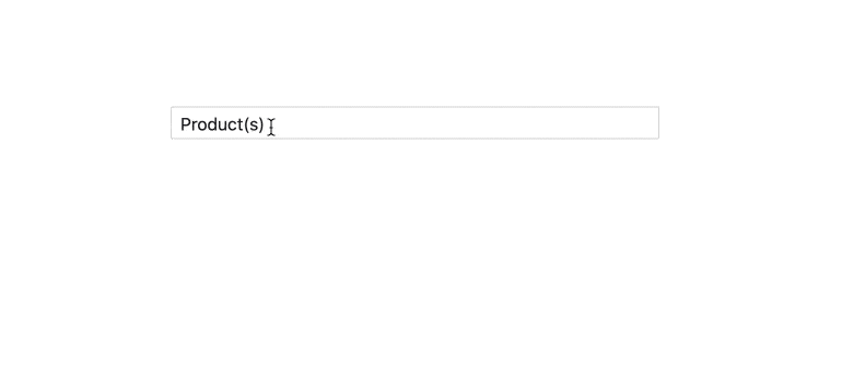
Each value selected in the MultiSelect is displayed as a tag in its input. The component provides an option for customizing the way the selected tags will be displayed. Custom tags can be defined for both scenarios when multiple tags or a single tag that represents all selected options should be displayed in the component.
-
Custom Rendering
With the MultiSelect, we can customize the way the options in the dropdown list will be displayed. This option fulfills the other customization possibilities supported by the component:
- Custom renderers for the tags of the selected items
- Custom renderers for the header and footer elements of the popup
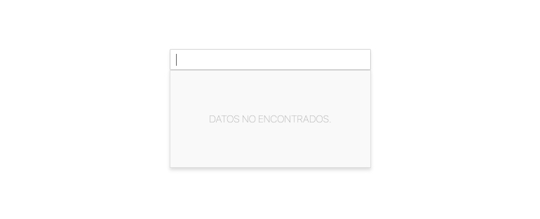
- Custom renderers for the message that is displayed when there is not data bound to the component.
-
Virtualization
Kendo UI for Vue MultiSelect can contain thousands of options in its popup list. With the Virtualization option enabled, the scrolling of many records won’t аffect the smooth work of the component.
Kendo UI for Vue MultiSelect Virtualization example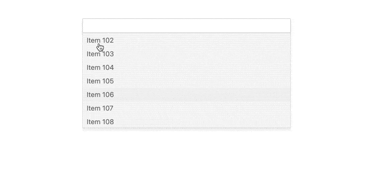
-
Floating Labels
After gaining popularity in recent years, the floating label functionality is also available in the MultiSelect. What you should do to activate it is to set a single configuration property. The rest will be done by the component.
-
Keyboard Navigation & Accessibility
The implementation of the MultiSelect component follows the WAI-ARIA and Section 508 standards. It is accessible by screen readers and other assistive technologies. The component also has an integrated Keyboard Navigation. This navigation enables the users to traverse and select items within the MultiSelect using only the keyboard.
Kendo UI for Vue MultiSelect Keyboard Navigation example
-
Globalization
The language of the built-in messages and the text direction in the MultiSelect can be easily changed by setting different user locales.

Get Started with Kendo UI for Vue
